18th Century Twist to Contemporary Work space Scheme
The Design Insider focus for this month is Workplace and with that in mind, we’d like to share a recent project completed by interior architecture and design agency, align.
align has designed a striking, elegant and highly-contemporary workspace scheme for a financial services company client, with a unique 18th century visual twist.
The client is based in a central London building with a Grade I-listed façade and a new-build structure directly behind and the new project specifically relates to the redesign of one entire floor. The scheme had to be delivered in three phases, with staff moving round the space to allow working to continue throughout. A flowing and open floor plan was a key tenet of the brief. The remit was to incorporate three closed meeting spaces; a small number of private offices; a series of open collaboration spaces and a kitchenette/tea-point area, incorporating additional seating and meeting space.
The 18th century twist came in links between the building and a great eighteenth-century portrait and landscape painter. The brief given to the award-winning workspace design team was to introduce some connection to the painter in the scheme, but without fighting against the essentially modern structure of the building, nor creating anything pastiche.
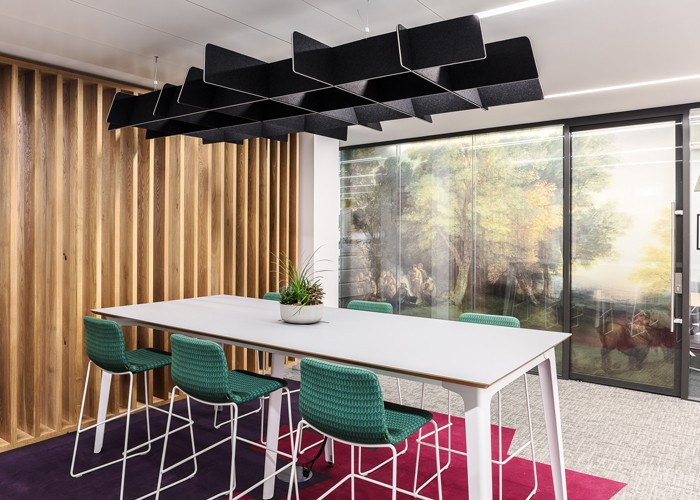
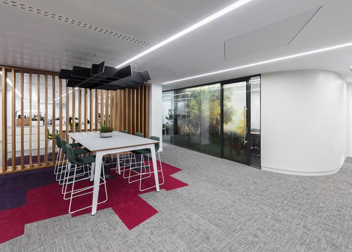
In order to create this painterly connection, align suggested a graphic route, using some of the painter’s works in the form of floor-to-ceiling matt translucent film, applied to the glass walls of the three meeting rooms and one office, as well as informing the meeting room naming strategy. After identifying options from the painter’s landscape work for this, the design team proceeded to apply for copyright from a number of leading galleries to use the chosen images, including Tate Britain and the National Gallery, ending up with the right to use four paintings. These then informed the names of two of the meeting rooms.
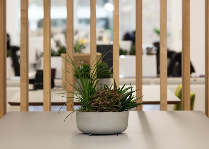
Further aspects of the brief given to the designers were to incorporate plenty of fresh, green planting and to reference the company’s branding colourway by injecting bold splashes of colour throughout. The brief also asked for British suppliers and products to be used, wherever possible.
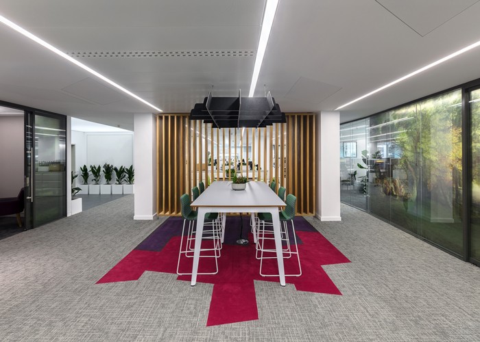
The new space plan devised by align for the scheme takes the form of a single and continuous arrangement, with clear through-views from one end of the space to the other, creating linear connectivity for all staff. This was reinforced by a new lighting scheme, which forms part of the brand-new ceiling structure, featuring continuous lines of recessed, flush-mounted LED lights by Future Designs. The lights are arranged in a grid, running between white metal ceiling tiles (a bespoke resizing of an existing product by SAS), with accessible plasterboard tiling between the grid lines to allow access for services. White, trapezoidal, fabric-wrapped acoustic panels by Fabritrak were also set into the plasterboard to ensure effective acoustic management in such an open and flowing space. The enclosed meeting rooms also feature further acoustic panels in sets of four. These resemble textured artworks and are the Botanic, Bella and Scrunch designs by Offecct.
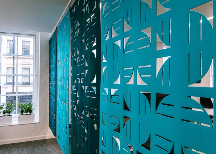
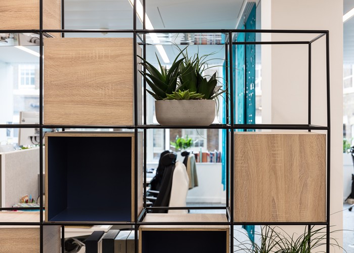
‘Not only did we underline the linear connectivity of the space via the lighting scheme, but we also made sure that major design features in the space, such as the oak slatted wall between the first two collaboration spaces, the bespoke black metal and timber-box storage frame and the two-tone hanging wall of felted acoustic panels at the rear of the space all had integrated gaps or cut-outs in them, so that there are no blocks to the flow of space or to the sightlines from one end of the office to the other.’ Nigel Tresise, Director & Co-Founder of align
Photo credit: Adam Woodwood
Contact align
