A Conversation Between: Jim Biddulph & Aberrant Architecture
You tend to know when you’re experiencing an Aberrant Architecture project. Not because they are always the same or centred around a specific style, but because of how they make you feel. Bright colours and interactive elements inspire a playfulness that is only enhanced further by inquisitively produced narratives, which are often site-specific and naturally enriching to the project. The practice is the brainchild of Kevin Haley and David Chambers, a design duo whose lineage goes back to a serendipitous meeting at the Royal College back in 2007. David was coming from a fairly traditional architectural education whilst Kevin had moved from wanting to be a musician during a foundation degree, which then led him to independently build up his architectural portfolio. But they decided early on that their shared interests and drives would make them ideal business partners, not least because each balanced the other by “filling in” their respective “gaps.”

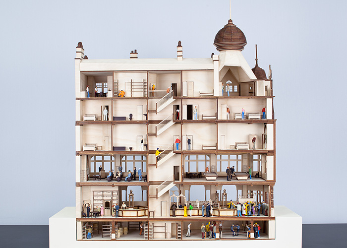
Following an incubator period where both worked part-time for various architectural practices, but while also living in the same building in Dalston, they formed their own studio in 2010. A 6-month paid residency at the V&A was a huge catalyst, allowing the pair time to delve deep into research; something that has been at the core of what they do ever since. The focus of that research centred around notions of what working life might look like in the 21st Century, with discussions regarding a work-life balance and mobile working environments now feeling acutely accurate in their predictions. Towards the end of the residency, a fortunate and timely conversation between the brother of one of Kev’s then student’s; who just so happened to own a pub in need of a refurb, led to them hatching a plan to put what they’d learned into practice. Roll forward and they’d reintroduced the Victorian style public house into the venue, acting as a work space for creatives in the day, in addition to a gallery and various multi-functional rooms alongside it. Along with this inquisitive and intelligent approach to generating ideas, the project is also a prime example of the duo’s collaborative approach; generating conversations and bringing in relevant voices and skill sets wherever necessary.
I sat down with them in their London studio to find more about how they started and how they approach their work.
JB: I’d like to start with the idea of collaboration, not least because you set up the practice together, but also because it seems to be present in all of the projects you’ve carried out.
DC: Well yes, it goes back to the very start. Right from the first project in Shenzhen, where we worked with the curator Beatrice Galilee to create an installation for the Hong Kong and Shenzhen Biennale entitled ‘Gordon Wu City Local’, which explored the ways in which peoples working lives had changed. One of the most popular things was a mobile food truck that came to your home and allowed for some shared social time as if in an office, and it was also there that we developed the idea of the gallery in a bar that later led to the El Paso project. It was an idea of pulling in other people, working with other young architects and creatives in order to get different perspectives and to break away from the architectural tendency of thinking that you can and should do it all on your own. The power of collaboration is in acknowledging that you don’t know it all and that actually the idea of the hive mind allows for different outlooks and strengths to come together. That makes any project much richer and it also very much moves away from the traditional idea of authorship, where all the work goes under the name of one person. Straight away we knew that we didn’t want to go and name ourselves ‘Chambers and Haley,’ not least because it sounds so traditional!
JB: Which is a good segue to your actual name, which I believe has a very specific and deliberate meaning?
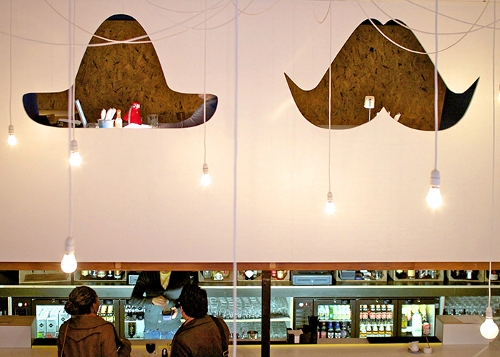
KH: Yes, it means ‘diverging from the norm.’ It underlines that whole idea of moving away from traditional approaches. Although it’s funny really, we did choose it because of that, but also, it’s ‘a-b’ which strategically we knew would mean we’d be at the top of any list at a time when nobody knew of us! We really did start things from the bottom up. At the beginning we couldn’t really afford a studio space, but we had the agility to be able to go all around Dalston, knowing exactly which coffee shop to go to at the best time to get the best seat, the best wifi, the best plug, in order to best do our work. So the ways in which people are working now were actually something that we were engaging with from the start, and that has always been present in the projects we do. For instance, recently we just did a week-long residency in a shopping centre and not so long ago did the same in Selfridges. The beauty of this, is that you can go directly to those spaces and work from there whilst learning from the overall experience. The flexibility of this means you don’t always have to hide away in the studio, you get to mix with other people, and as a result those collaborations can come more easily.
![]()
JB: Again, that’s a nice link to another big part of your output, which is all about interaction. So much of your work invites the user in and even suggests the notion of play. How deliberate is this within your approach?
KH: There’s such a link between collaboration and interaction, and in many ways playfulness is a natural expression of that. We’re designing spaces that allow people to imagine, or perhaps re-imagine, the space around them to become what they want it to be, for them. By opening them up in this way you have the ability to break down the formal nature of spatial design; you’re giving them permission to play. Kids do it naturally, but we’re designing spaces for everyone and by giving everyone this form of playful-permission we can create much more social spaces.
DC: I would say that whilst a lot of our projects have a degree of play, I think the thread is ‘playful.’ And perhaps even more specifically, ‘a playful attitude.’ Because whilst play as a function does operate in some of our work, there is always a playful attitude in everything we do. It also builds upon another key concept in our work; the moving away from the perceived notion of breaking our lives up into separate segments. Over the past number years we’ve seen that things like work, home and travel have actually started to become blended together. We’ve become concerned with things beyond just function too; things can be about enjoyment, wellness or mental health. And for us, you can do all of these things in a playful way, with this playful attitude, and that allows us to break down barriers. Take the Beacon Shopping Centre for instance. Our interventions meant that we could push the boundaries of shopping and working, as well as socialising. The playfulness allows them to come together, rather be separate actions, which is hopefully much more fulfilling. That project also links back to the idea of collaboration too, and working collaboratively with the client, because we’ve worked very closely with Legal & General who were very open from the start in not wanting to go for regular retail designers. It’s not just a case of them saying “here’s the brief” and us just doing what we’re told. It’s about developing the initial brief collaboratively, and actually working out together what the priorities are. There are many ways in which we do that, such as workshops, where we playfully draw out the desires and ideas for the space whilst even considering the best way to use a budget.
![]()
JB: There’s also a playful approach to how you weave in narratives within the spaces you’re working on, often tapping into historical angles that many wouldn’t necessarily be overly aware of.
KH: One of the core elements of our ethos is looking back over history and understanding that there are narratives that can reveal ideas, which are actually really suited to a contemporary setting. So we’ll often team up with people who have a rich knowledge of history or look at archives because we’re trying to either find ideas or narratives to pose our projects with. Searching out information about the location allows us to reveal identities that might have been overlooked or forgotten. Take shopping centres for instance; they tend to become cookie cutter style designs that are sterile and lack personality. By adding in a local narrative along with the functionally playful elements makes the space far more engaging and further develops the playful attitude for everyone. If some goes shopping today at the Beacon and sits on a pig swing but also learns more about the fact that there’s a book called Animal Farm by an author called George Orwell, who was actually lived there, it has the ability to change the perception of where they themselves live – rather than simply going to a mundane shopping centre. Although don’t get me wrong, there’s many people who go there and say “why have you painted this pink and why is there a goat there?” But it gets them talking so it’s all good!
DC: With narrative design, it’s not just about the physical objects, but also about the connections and the feeling you can potentially create between the users and those objects. It’s what we’d describe as ‘emotional durability,’ which is about people feeling that they have an emotional connection to a place.
JB: I guess we can’t really talk about your work without discussing colour too. It seems you’ve never shied away from bringing in lots of bold and vibrant colour. What is the thinking here?
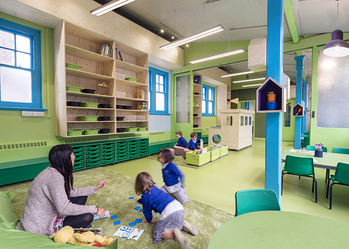
KH: We always work it into the narrative of a project, that’s for sure. In the case of the Beacon for example, the colour we’ve injected in there is based on the idea of zoning, which stems from the history of the town, which was once made up of 4 separate hamlets. Each had a distinct architectural character, so colour became the means with which to create distinction in the shopping centre, as well as moving it away from the standard sterile atmosphere. In other projects like the Rosemary Works school, ideas for colour came from an understanding that the building is Edwardian, and Edwardian’s had a colour theory related to light, but also from workshops we did with the kids. So there’s function and narrative coming together within the colour selections.
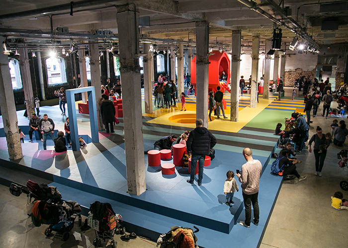
DC: And with the Landscape of Play project in Madrid we responded to the narrative research we did around the playground work of Dutch Architect Aldo Van Eyck. There’s always various threads when it comes to colour but we certainly use it to add personality and to signify something different. But also, we’re both quite experiential in our approach, and colour is a very direct and immediate way of engaging with people. But in all honesty, it’s also a strategic and cost effective use of the budget, yet one that doesn’t hinder the creative process.
KH: And we’re always learning to think more practically with colour too. With Beacon, it was a good idea to put colour up high because it will last longer, purely because people can’t come into contact with it. So we can even be more strategic when it comes to colour and the maintenance of a space.
JB: And I guess that creates more longevity in the sense that your designs last longer. How important is sustainability within your practice?
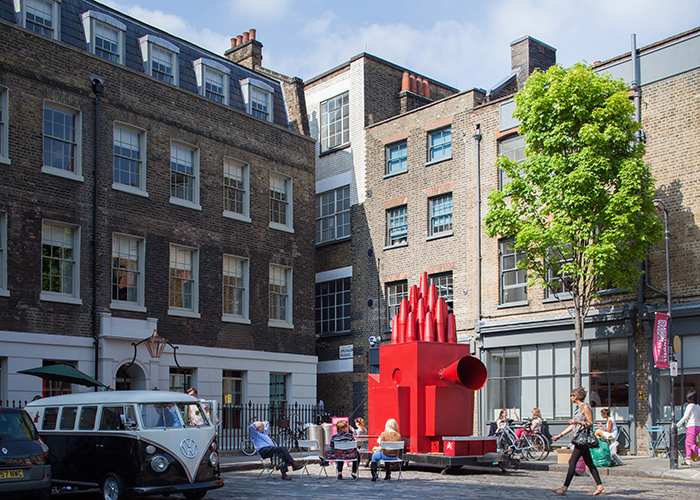
DC: It’s always been part of our canon. Take the Tiny Traveling Theatre project for Clerkenwell Design Week project as well as Lower Marsh Street Furniture in Waterloo; they both centred around reused materials, even back in 2012. But those projects allowed us to really figure out our stance with sustainability, and not just about recycling materials. It comes back to emotional durability, because again, if you have a connection to something, you’re more likely to look after it and keep it for longer. But we also work with fabricators who aim to produce zero waste, and therefore endeavour to carry this through as much as possible in every project we do. Which of course, is another form of collaboration.


