A conversation between: Jim Biddulph & Bryan Oknyansky, Dexter Moren Associates
Not many of us start on our career paths before even completing our higher education, let alone starting it. That’s certainly something you’d say for the notoriously rigorous and involved discipline of architecture. Then again, there probably aren’t too many architects out there who can say that they’re award winning footwear designers either. But Bryan Oknyansky’s career path hasn’t really followed a conventional trajectory from the very beginning.

The launch pad moment came at the tender age of 15, when the epiphany realisation that we spend the majority of our time in and around buildings cemented the idea in Bryan’s mind that he’d like his career to have a positive impact on the built environment. A Los Angeles native, he took on learning AutoCAD and got himself a job at a local architecture firm in Los Angeles specialising in residential projects that same year. 4 years later he signed up for a Bachelors of Architecture at Woodbury University in Burbank, California and having worked at a number of practices in the states udring his intial studies he then went on to take a Masters of Architecture and Urbanism at the Architectural Association, London in 2011.
Having already won an award for a shoe design he made during his first set of studies, Bryan encountered another opportunity to design footwear at the same time he was studying for his Masters. His natural flair for the industry led this to become his main occupation for the next 6 years, alongside a CAD training consultancy he had started up. But the calling of architecture that he had experienced at such a young again was strong and Bryan gravitated back to the sector, initially specialising in tall building design for projects mainly over in China, before joining world-renowned practice Dexter Moren Associates. Having shared a stage with Bryan during a talk at Clerkenwell Design Week, I took a moment to find out more about his career path and the amazing work he does working on high-end hospitality and residential projects at DMA.

Premiere Inn – New Marlborough Yard Hotel Elevation
JB: I think that given the interesting journey you’ve been on to get here, coupled with the breadth of what DMA do, maybe we could start with your job role?
MO: Well, I’m a senior designer at Dexter Moren Associates, leading the planning and design process for a range of residential, hotel and aparthotel projects across the UK. I specialise in leading clients, stakeholders and design teams in incorporating design and building technology innovations to deliver projects that meet present and future commercial and sustainability briefs. With some fairly extensive experience in digital design practice, I also aim to support DMA’s constant growth in the fields of sustainability and technology.
My role at DMA is to design buildings and lead the process to secure planning permission from local authorities to build out the designs. As I’m also a sustainability champion in the office, I get involved with projects at all stages, and the practice generally, to support sustainable design and initiatives. For example, I’ve recently become a certified Passive House designer and developed an internal CPD for my colleagues to learn more about ultra-low energy buildings. And equally as important, I organise the weekly five-a-side football for the office.

Tribe Hotel Manchester
JB: It feels like DMA are very human-centric in terms of how you design, are you able to talk about how you go about this within your approach?
BO: The end user – the person that occupies and uses a building we design – is always at the heart of what my colleagues and I do. In the hospitality sector, brands spend a lot of time and energy in learning about their customers and defining the types of guests they want to attract. They come to know which amenities their guests will want and all this helps to form the design brief. Over the years, DMA have developed a vast institutional knowledgebase of hospitality design that underpins our reputation as leaders in the sector, which brands and developers know they’re tapping into when they work with us. As a result, we’re working more and more with international hotel brands as collaborators in the evolution of their products and offerings.
The buildings we design for the hospitality sector aren’t only for the guests, though – they’re also for the communities surrounding our project sites. Beyond a set of brand standards, an end-user of the building designs I work on is also the public. In order to come up with a design that appeals to both sets of end-users, I spend a lot of time researching the local character of the communities surrounding my sites. I find that when you can link the design of a refurbishment or new-build development to characteristics of their surrounding context and history, it fosters both an explicit and implicit dialogue with the various private and public stakeholders that my projects address – whether they’re clients, local planning authorities or neighbours of the site. We typically engage with various public stakeholders at key stages of the design process to present our design proposals and get feedback, which can enrich the overall design process.

Westin, London
JB: And can the same be said when working on another of your specialisms – residential projects?
BO: When it comes to residential projects, everything I’ve just said about my approach to end-users of hospitality designs applies to residential projects with communal amenity and active street frontage. The big difference is that residential end-users inhabit their spaces for long durations of time compared to hotel guests, for example. In this case, empathy replaces a brand standard in designing successful buildings, spaces and places for residents. Whether its affordable housing or high-end residential, I ask myself if I’d be happy to live in the homes I design. It’s almost like the Hippocratic Oath doctors take, but for the built environment. Of course, so far, the buildings I design aren’t ones I’ll be living in and my lived experience and empathetic approach stands in to consider prospective end-users and their needs.
JB: You recently joined me on stage at CDW to discuss texture in architecture and shared some interesting projects and insights. Can you tell me a little about how you approach texture in your work?
BO: That was a very fun panel discussion and I’m glad I was invited to join you on stage for that. I’ve reflected a lot on the concept, role and application of texture in architecture leading up to that talk and it reminded me that texture is in everything I design. On every project I work on, at some point in the design process, texture becomes the most important consideration enabling a design to move forward. Whether I design facades with masonry, metal, timber or render cladding, the texture of the material; the affect joint lines, panel gaps and reveals have on the reading the façade as a whole; the colour variation in a pallet of bricks; the marbling of stone – all require consideration and resolution in order to evaluate whether or not a design is more or less successful and true to the design concept.
JB: During it we touched a little upon clients and the challenges that talking about texture can throw up, what’s you experience of this?
BO: Some clients are more collaborative on topics of texture than others and get involved in those discussions. When a texture can be perceived to be expensive or require greater expense to achieve, we discuss it with our clients as a matter of cost and project budget. One thing I find interesting about texture, though, is that it’s impossible to design a project that doesn’t have any. Every project is an assemblage of textures and texture is as important as form in giving character and distinctiveness to our projects.
JB: During your talk you shared some insights into some really fascinating projects, not least because of the textural choices made, could you tell me a little more about some of them?
BO: One of these projects is the Tribe Hotel in Manchester Airport, which is currently under construction. In order for this hotel development to stand out from a number of other hotels in the masterplan, we designed a bold façade that expressed a woven pattern and gradation of window frame colours. We feel the woven façade invokes Manchester’s historic textile industry as a link with the city’s past and offers an engaging façade for fast-moving vehicles on the surrounding highways and airline passengers flying overhead to experience. Like threads of varying colour in a woven textile, the columns of colourful window frames gradate from low to high colour intensity as threads in the woven façade, which furthers the potence of the animated effect it has on the facade.

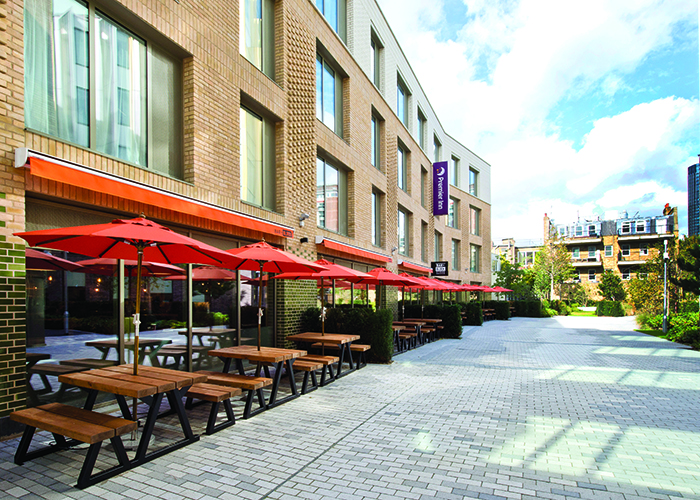
Premiere Inn – New Marlborough Yard Southwark Station Courtyard
JB: And as well as texture, colour also plays quite an important role in your work?
MO: Yes, another project is our recently opened Premiere Inn on Ufford Street in Southwark. This building uses bricks as both a cladding material and façade feature. Bricks can be used to create engaging textures when they’re shifted out of plane with the surfaces they clad over. The piers defining the fenestration bays of the façade were accented with a gradation of bricks that added a pattern of shadows along the height of the piers. But an additional element of colour was added to this effect by designing green tiles at the base of the piers, which gradually blends into the main buff brick of the façade. This has the effect of tying the greenery of the beautifully landscaped public path running through the site in the location of a historic street that once existed there to the brick piers, as if the building emerges from the landscape.

Westin, London
JB: Perhaps it’s always intrinsically linked to texture on some level, but I also noticed that pattern is a recurring theme in your output?
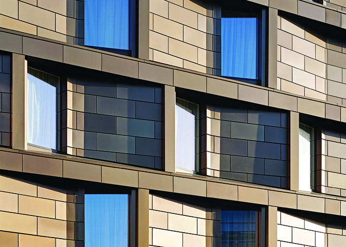
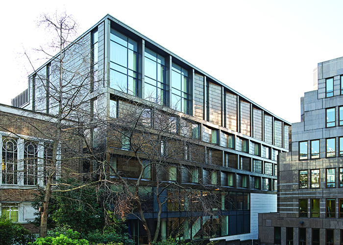
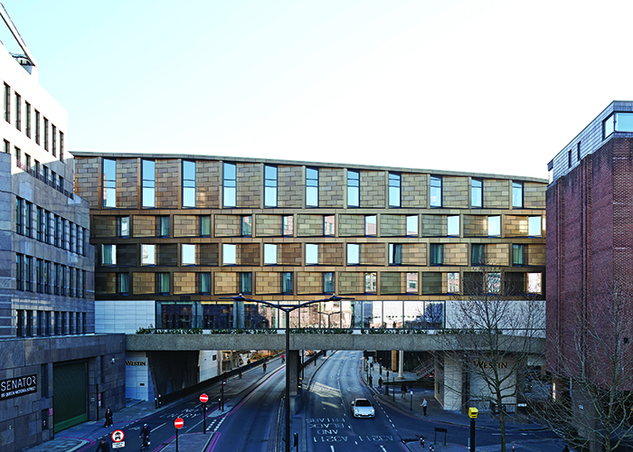
MO: True. The third project I showed is the recently opened Westin London City in the City of London. A large portion of this hotel bridges over Upper Thames Street and is clad in a bronze-coloured panelised façade with an expressed stone bond pattern. I use this project as an example of how patterns play a role in the reading of a façade texture at the architectural scale and from a distance. The size of the panels and the thickness and depth of the gaps around them are important features in the façade design that give it legibility and scale. I mentioned in my talk that I felt this bond pattern approach links the building to its historic location in the City of London with its plethora of historic stone buildings, tying the past with the present and future.

Westin, London
JB: You alluded to a love of bricks during the talk, would you say brick is important to your practice? And if so, why?
BO: I believe that, to an extent, I am material-agnostic when it comes to design. I like to consider material and texture as components of a design concept. But my colleagues and I love brick for a number of reasons. I’ve mentioned some of them in this interview but one reason for championing brick building design has become more immediate since the catastrophic Grenfell fire. Post-Grenfell, non-combustibility of facades has become more essential to demonstrate clearly and bricks do this “for free”, so to speak. Brick can be used in conservation projects as well as contemporary designs and has an intrinsic texture that brings confidence, surprise and delight to people of all ages and backgrounds.


