


A Conversation Between: Jim Biddulph & Karen Haller
“Colour is an amazing phenomenon. It is around us all the time and influences everything we do – though we are barely aware that this is happening.”
This sentence from the introduction of The Little Book of Colour neatly encompasses so much of what the book, and indeed the career of its author, Karen Haller, are all about.
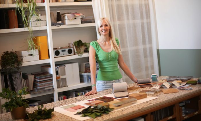
Karen Haller author of The Little Book of Colour
For while colour is quite literally an optical effect created by light, thinking of it only in terms of what we see overshadows an arguably more powerful response; how we feel about it. There are numerous books about colour on the market, but few that delve as deeply into the psychology of colour and how we might use it to help transform our lives as this one. A renowned ‘colour trouble-shooter’ in the A&D industry, Karen’s career spans two decades and alongside her writing and keynote speaking, she regularly collaborates and consults for companies looking for innovative solutions to social problems who seek new ways of improving the human experience in balance with nature.
There’s so much (ground-breaking) ground to cover with her work and we caught up to chat about the book and her unique career – which started in a rather unusual place considering her chromatic life now!
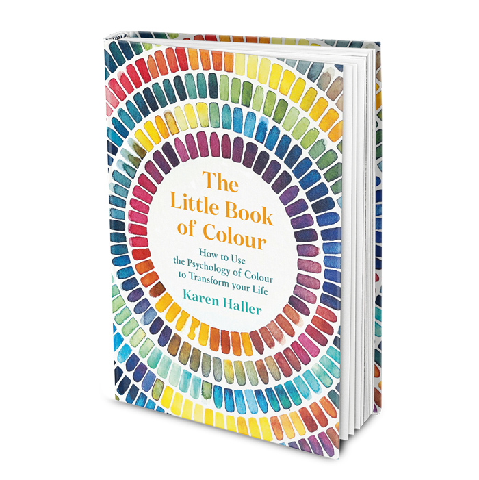
The Little Book of Colour by Karen Haller
JB: Given that you are so synonymous with colour psychology, and with it, design, I’m intrigued to hear more about your journey from IT and business analytics to the world of all things chromatic – was there a gradual retraining or did you take a big leap?
KH: I worked in IT as a business analyst project manager for large website builds, which I found really dry, but it allowed me the opportunity to travel the world. I often felt like I was leading a double life because when I wasn’t working I was travelling or studying at night to satisfy my creative side. First I studied fashion design and then millinery, and it was while I was putting chocolate brown feathers on a teal felt hat I had made that, out of nowhere, came the exclamation “Oh my God, it’s colour!”
When I look back now I realise that was the moment when I became obsessed with colour, and it’s been my passion ever since. This was my first epiphany moment. I then enrolled for a year in evening classes at Sydney’s School of Colour and Design and started to learn about the colour wheel, but I could feel it in my bones that colour went deeper than the colour wheel and surface-level aesthetics. Throughout the course, watching my own responses and those of my fellow students, I got a sense there must be a link between colour and human behaviour. So that awareness led to a lot of questions I was determined to answer.
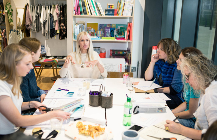
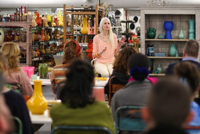
Karen Haller workshop. Image courtesy of Well I Guess This Is Growing Up
JB: So how did you delve deeper into the connections between colour and psychology and make it your full-time pursuit?
KH: I had this insatiable need to understand what it was I was observing and sensing, so I went on every colour course and workshop I could find in Australia where I was living at the time. It wasn’t until I came to the UK that I discovered Applied Colour & Design Psychology and realised that I had now found what I was looking for – this was my second epiphany moment. Still working in IT, I spent that year attending weekend classes and studying every spare moment on the effect that colour and design has on our psychology, our physiology and how that is express through design schemes, what we wear, etc. After that year I decided to take a big leap and give up my very secure career and start my own business as a Behavioural Colour & Design Consultant. What I didn’t realise at the time was that very few people knew what colour and design psychology was and what an uphill battle it would be to get it recognised. Now 15+ years in, I’m delighted that my advocacy for colour has really landed with the design industry, and designers now know how much deeper colour goes than the colour wheel, and psychologically how colour can influence how we think, feel and behave.
JB: Your book The Little Book of Colour is intended to help people understand how colour can transform their lives, and covers a lot of ground within it. But I’m interested to hear more about how you work with those who might be expected to be in the know about colour already – not least architects and interior designers.
KH: When I work with architects and interior designers, I use a process that I have crafted over the 15+ years I’ve been doing this work. What a lot of people may not realise is that applying colour and design psychology in our work as designers requires everything from in-depth analysis to understanding the client’s specific unique needs and then delivering results that are measurable.
Getting great colour and design outcomes is always best served by working on it from the very beginning of any project; consulting with architects and designers on the bigger picture and then working with them to deliver down to the nuanced details. It was really challenging when I first started talking about colour and design psychology because nobody else was and the design industry was wedded to the colour wheel. And I can understand why that was because if that’s all you’ve been taught in your design training you might think that that’s all there is, but the colour wheel doesn’t even begin to scratch the surface. In fact, the colour wheel was designed for artists to paint. It doesn’t go deep enough when it comes to the built environment. We need so much more.
A lot of designers say to me they don’t need to study colour because they use it intuitively. I understand that they do, however, the limitation of only using your intuition and not understanding the science, logic and rationale behind why you chose those colours is where designers can become unstuck when conversing with their clients about those choices. I’ve had many designers share with me they don’t know how to explain their colour choices, or that they don’t know how to manage having a different design aesthetic to their client, or even what to do if a client rejects their intuitively designed scheme.
When designers delve deeper into the theory behind colour and design psychology they get the language and the understanding they need to go further and it really opens up their ability to create a design or scheme that supports positive behaviours and aides positive mental health and well-being outcomes. Understanding colour and design psychology to a deeper level also supports designers designing for sensory needs for both neurotypical and neurodiverse and all the elements needed to create fully inclusive design.
And when it comes to the architects I work with, many of them have said to me that they feel intimidated by colour because they are required to use it in a sophisticated way and they aren’t trained in that depth, in a way that supports desired behavioural and emotional outcomes.
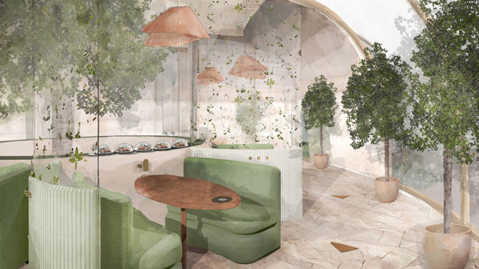
Reconnect, behavioural design restaurant concept
JB: I found your mention of Dorothy waking in the Technicolor world of Oz at the beginning of the book really interesting, and it reminded me of another colour-related book Chromaphobia, in which author and artist David Batchelor uses it as an example of our collective fear of colour. Your book is in many ways the antidote to this in that it helps to educate people about colour, thus taking away any anxiety about using it. Can you give an overview of how it goes about this process?
KH: I love this question. There is a collective fear around colour and I absolutely agree that my book is an antidote to that for the everyday person (and I’ll include designers in that as well because we are after all human first).
When we’re scared of colour it’s typically because we worry what others will think about us. As humans we want to feel accepted and loved, not judged, and that desire can sometimes come at the expense of expressing our true authentic self. So instead of choosing the colours we might want for our home or feel like wearing, we may instead choose colours that we think will make us feel acceptable.
When the book was released, we were in the midst of everybody wanting and using grey, so this book was quite revolutionary in that it showed colour wasn’t something to be afraid of. The book helps people get their colour confidence back by leading them on a journey of discovering their unique authentic self through the joy of colour. That might be for their relationships, their wardrobe, or their home and being able to communicate this through the transformational power of colour. Through this process they fall back in love with colour again.
This was my big audacious goal and I’m well on the way with the book having been translated into 14 languages so far.
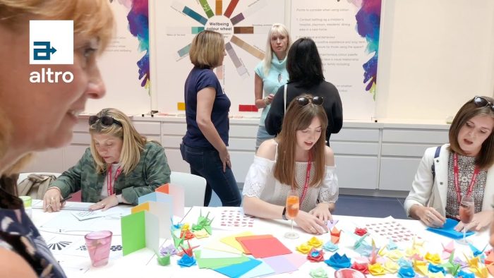
Colour workshop with Karen Haller
JB: The Oz vs Kansas analogy from The Wizard of Oz also suggests that travel can be highly enriching to our lives and outlook on the world, and I know that you’ve always made it a priority. Like Dorothy, have you had any specific chromatically life changing travel experiences?
KH: Travelling for me is adventure. Travel could be going to a new village down the road that I’ve not been to before or it could be going to a new country and experiencing a completely different culture or immersing myself in nature. I’ve travelled to over 70 countries and I’m always hunting colour.
I’ve got so many colourful moments that I could fill a book and I’m continually being inspired by scenes that I chance upon. I particularly loved the colours of Morocco with its markets and riads. The wonderful rainbow of colourful sarees of the women walking along the road in India. It was such a beautiful sight I remember asking the taxi driver to stop so I could soak it all in.
And I’ll never forget diving in the Red Sea and watching a fashion parade of nudibranchs and fish going past with all of their amazing colour combinations and patterns.
Colour workshop with Karen Haller
JB: I’m sure some of our readers will be particularly interested to hear that you also facilitate courses that help to unpick the principles of applied colour and design psychology but I wonder if you might be able to elaborate on what they involve/entail?
KH: My courses are known world-wide because what I teach within them is not being taught anywhere else, especially my mentoring programme where I share my signature frameworks and mentor designers to deepen their colour knowledge. With these I show them a completely new way to create harmonious colour palettes, introduce them to design psychology, and help them to be able to apply it to their client work.
Designers need to be able to work with colour at a much deeper level these days because clients have become savvier. They no long want just aesthetically pleasing designs. They want their designs to work harder and they want their designers to be able to explain the logic and rationale why the are choosing the colours and design style that they are. This depth of knowledge and ability to apply in any setting is not something you can read in a book or hear in a talk, which is why I’ve had designers from all over the world seek out my programmes.
In my 6-month mentoring programme I take designers through my signature four part Nature’s Harmonious System™ which gives them a comprehensive and applicable understanding of the elements required to use colour and design in any situation backing it up with the science, logic and rationale.
And I also love being on the tools myself and doing consultancy work with businesses and design professionals looking to use colour and design to improve well-being, support mental health and create positive change in the world. Another big audacious goal. Go big right!
I love working with forward-thinking brands, designers and architects who want to investigate social problems and see new ways to positively improve our human experience through the conscious use of colour and design – because when we create considered designs that improve the well-being of everyone involved, it’s good for the individual, for others and the planet.
You can download Karen’s free e-book The 10 Myths that Limit You using Colour Effectively.
And the first chapter free of The Little Book of Colour.
Follow Karen on Instagram or visit www.karenhaller.com