All-Change for Domestic & General at Wimbledon HQ with Radical New Scheme Designed by SpaceInvader
The UK’s leading appliance care specialist Domestic & General was happy with the location of its existing Wimbledon head offices – in one of London’s leafiest outlying areas, conveniently close to the railway and tube station – but when the building’s lease renewal coincided with Covid-19 and lockdown, the opportunity arose for a full review of the company’s future workplace needs. Domestic & General recognised this might be a moment for wholesale change – but only if their team were likely to share in and feel ownership of that future vision.
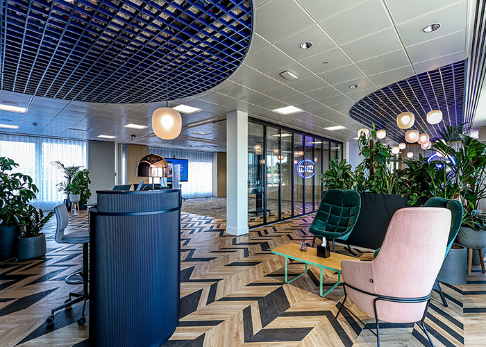
Fifth floor entrance concierge
The workplace remodelling therefore began very much from the ground up, with in-depth conversations with the internal team about how they might want to work in the future. CBRE, who manage the space for Domestic & General, subsequently brought in award-winning designers SpaceInvader to interpret the wealth of employee data that had been generated to envisage and space-plan a new workplace interior within the existing building.
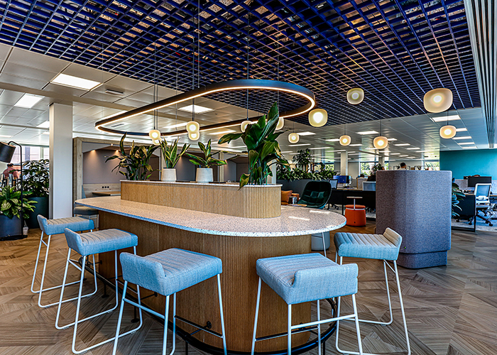
Fourth floor kitchen island and breakout, plus collaborative workzone
“In fact, the client team gave us the most brilliant brief’ said Sarah Dabbs, Associate at SpaceInvader, ‘asking us to demonstrate ‘the art of the possible’. Not only that, but the form of the building – full of curves and soft shapes – was a perfect starting canvas for a scheme that promised to embody real imagination and possibility.”
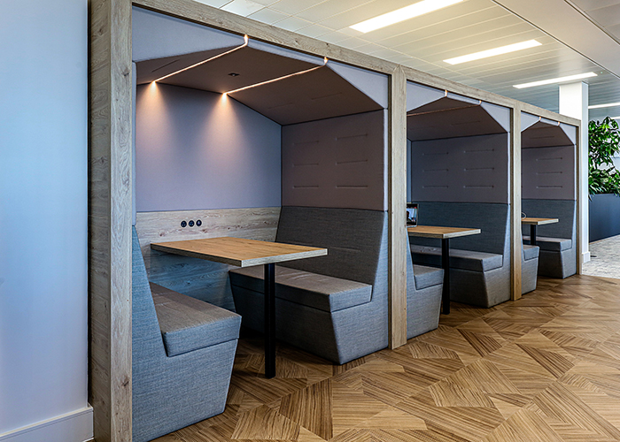
Fourth floor ‘railway carriages’ by Spacestor
As the programming was very tight, the creative process took place at unusual speed, with a highly-experienced core team at SpaceInvader working hard to design a new interior signalling a complete change of culture for Domestic & General, with the company moving from a fairly rigid traditional office set-up to not only agile and flexible working with fewer desk spaces, but also away from a white interior towards a bold and colourful hospitality sensibility, featuring new tones, textures and materials.
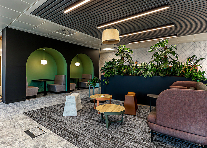
Work breakout space, fifth floor
“Both Domestic & General and CBRE were exceptionally brave and decisive on this project” John Williams, Founder of SpaceInvader commented. “They embraced the moment and the whole vision, just as proposed.”
Project Brief:
The brief to SpaceInvader was to adapt and refurbish the workplace to support a new hybrid working approach, with team members spending 2-3 days per week in the office post-pandemic and the rest of the week either WFH (working from home) or remote-working. There was a strong HR focus in the brief, with the new scheme helping retain existing staff, who would feel well-supported – and be equally attractive to new, potential candidates.
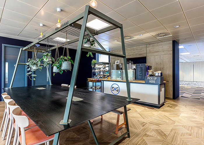
Fifth floor barista bar
A major driver for the refurbishment was to create reasons for people to want to return to the office. This meant uplifting the facilities both practically and aesthetically, as well as increasing collaboration space and integrating those who might be working remotely. Investment in good collaboration technologies became key. To support the hybrid approach, SpaceInvader appointed an AV specialist early on, so that workspaces could be booked either via an App or a desktop-based booking system. The boundaries of workstations vs alternative work settings were also pushed further, with a generous 1:10 average NIA (net internal area) ratio. The previous 1:1 ratio of desks to full-time employees was also replaced by a new 1:1.6 ratio.
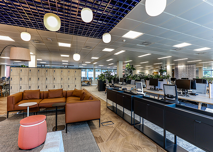
Second floor team bays and breakout zone
Concept Development:
To help develop the collaborative culture outlined in the brief, SpaceInvader created neighbourhood typologies inspired by three concept threads – Societal, Analog and Principle.
- Societal referred to ‘coming together’, whether for a meeting, event, training or even just lunch. Such spaces would be collaborative with a strong focus on wellbeing.
- Analog referred to the way the floor is designed, with interchangeable settings. These are agile spaces and can be configured in many different ways.
- Principle settings, meanwhile, whilst typical in terms of function, were not to be viewed as lesser, but as a solid base upon which to build. These would be designed using classic work settings with a more timeless feel.
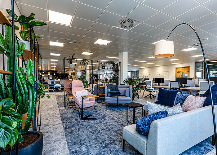
Fourth floor collaborative lounge
Getting the colour scheme right was a priority at the outset. SpaceInvader didn’t want to replicate the brand identity colours too aggressively in a non-retail environment, preferring to celebrate the company identity instead through its values and ethos. The final palette was therefore a new and bespoke creation, employing and blending a colour band of mint, emerald and sea foam green. The palette still loosely refers to Domestic & General’s brand colours, but uses a more subtle and timeless palette, with bolder tones to highlight and accentuate certain areas.
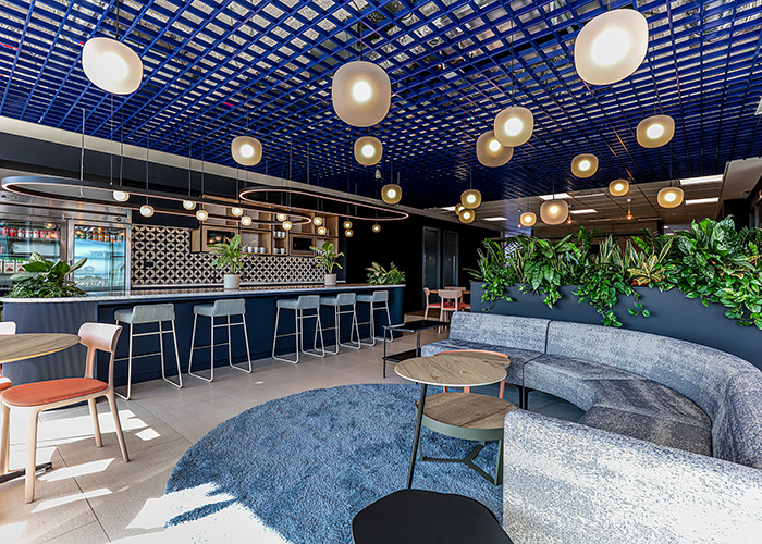
Kitchen and breakout space, fifth floor
Sarah Dabbs explained that the scheme’s material selection “was influenced by the three neighbourhood concepts, so that materiality became one way to help create a separate identity for each area, whilst common principles also ensured consistency. ‘Societal’ and ‘Principle’ areas feature texture, bold colour, light and pattern, for example, to create visual stimulation and buzz. ‘Analog’ areas, meanwhile, are more understated with subtle pops of colour and bold planting forms. Decorative wallpapers, screens, drapes and voiles were then added to the mix to create interesting textures and layers, without being overwhelming.”
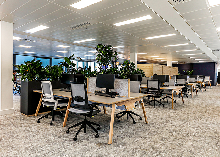
Fourth floor neighbourhood zones
Another challenge was how to create a distinct area for the digital team, whilst still maintaining a cohesive design language and encouraging interaction with the rest of the company. The digital team operates like an independent tech company, in the sense that new project groups are established every few weeks/months, and relevant experts are brought in to work closely within each team. To service this working methodology, SpaceInvader grouped banks of desks next to ‘squad meet’ rooms, providing the same number of seats, so that team members could move easily between individual working and brainstorming sessions. These were located in the centre of the floorplate, with lounge and breakout settings to either side, to encourage employees from other floors to use the space and interact with the digital teams. The styling of this space is a nod to the way Silicon Valley tech companies organise spaces for teams. Even the look and feel including the planting has been designed to be subtly different to that of the other floors whilst staying within the material palette of the overall scheme. Biophilia was a huge part of the overall scheme, with specialists Plant Plan integrating over 400 different plant types throughout the workspace.
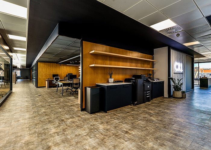
Third floor ‘CX1’ Tech Zone
The lighting scheme featured a mix of focused light to create the feeling of natural daylight. For the tech department, it was important for the lighting not to feel too high-tech or like a light-box, so track lighting was used instead with diffusers and spots, whilst the surrounding spaces were subtly-lit. Pendants were chosen for the meeting rooms, which highlights faces but not the surrounds, including lights just above screens for remote calls, so that the result light is flattering, professional and frames faces well.
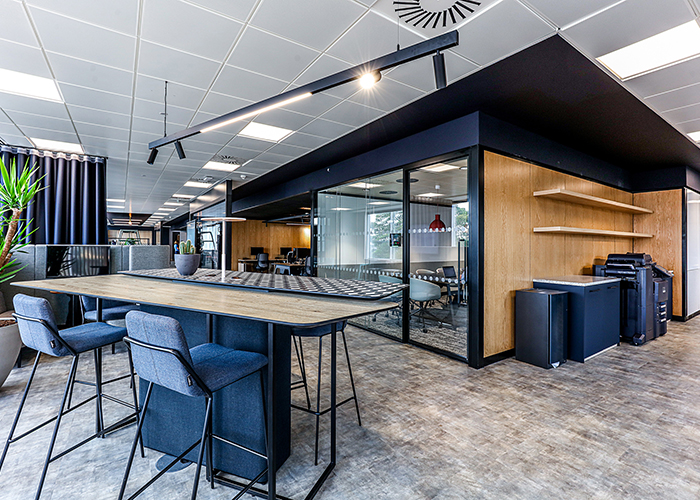
Standing tables and adjacent meeting rooms, third floor
Sustainability:
The specification of all products and materials was considered in terms of environmental credentials to ensure the scheme followed a sustainable development approach, with the most environmentally-friendly material or product choice selected. CBRE and Domestic & General also collaborated to repurpose the old office desks, chairs and furniture items, with items redistributed through the Waste to Wonder scheme to Mokwe Development Association in Cameroon and FAST Romania. In the wider context, the scheme took place against a full landlord refurbishment of the building and, together with the specification of new M&E, measures were taken to reduce the carbon footprint of the office going forward.
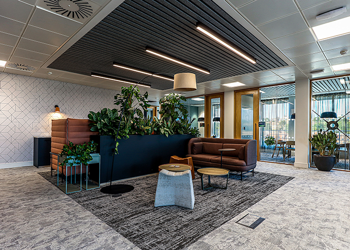
Fifth floor breakout
Final Scheme:
The final scheme is a well-considered office for agile working with spaces to suit all team members’ differing needs, including separate set-ups for the digital teams’ alternative ways of working; fully flexible conference space to adapt to endless combinations of people and a dedicated meeting floor equipped with touchdown desks to allow areas for employees to use between meetings.
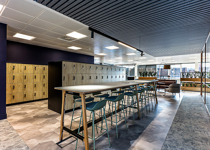
Fourth floor lockers and communal workbench
“We believe this scheme to have been a huge success” Sarah Dabbs concluded. “It was conceived and designed during a time of extraordinary change and turmoil and implemented in a period suffering from materials delays and labour shortages, but at the same time it has met the needs of a clear and direct brief that addresses employee wellbeing and agile working. The judicious use and placement of materials, joinery and FF&E have combined to create focused and calm environments to support employees’ working. It was a huge buzz to work on and the Domestic & General team’s reaction has been absolutely amazing.”
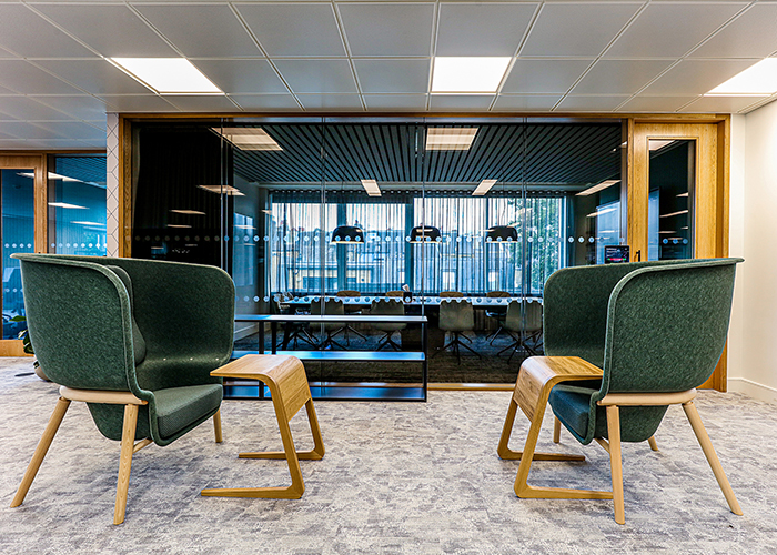
Acoustic high-back chairs on the second floor with meeting rooms in background
Matthew Crummack, CEO of Domestic & General, said, “Now the Wimbledon office has re-opened, we can really see the impact that the new design has had on our colleagues. We are delighted that the concept has come to life and is a real draw, not only attracting people back to the office after an extended period away, but also a valuable asset in attracting talent. It is a pleasure to see the space being fully utilised by those collaborating in-person and through technology in the new, highly flexible meeting areas. We have enjoyed hosting large scale events and welcoming guests to see our improved home.”
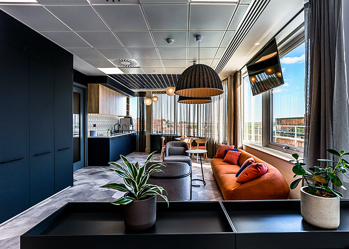
Fourth floor kitchenette, breakout and coat storage area


