


Becky Spenceley, Design Director, Senior Associate at Gensler: BE BOLD NOT BEIGE
Written by Becky Spenceley, Design Director, Senior Associate at Gensler
I’ll start by saying, I love colour. I’m a huge fan. I’m also NOT a colour expert or scientist with a PHD in pigments, but simply a designer who has spent countless hours crafting interior spaces in colour for clients. I’ve seen first hand how the right choice of colour can transform a space, elevating mood, enhancing productivity, and fostering a sense of harmony. The truth is, designing with colour is both an art and a science. And to clarify, I also love neutrals, and I’m aware that they are themselves colours too, but for the sake of this thought piece, when I refer to colour, I mean anything outside of a typically considered grey or beige.
Francis House for Edelman by Gensler. Photography Vigo Jansons
Let’s debunk a common misconception: bold colours aren’t just for kids’ rooms or quirky avant-garde artists. In fact, my typical approach to creating design schemes is to establish a relatively neutral base then add layers of colours and textures often with pops of vibrant hues. Sometimes the ideal scheme requires only small yet strategic amounts of colour, other times it will be much more saturated. For me, a layering approach to interiors is key and gives structure, allowing things to be taken away or paired back if needed.
Of course, colour is a deeply personal experience. I’ve had clients swear by the calming nature of neutrals, finding comfort in their quiet elegance. Now, don’t get me wrong- I appreciate the subtlety of neutrals, but there’s a whole world of colour waiting to be explored beyond the safety of taupe and ivory.
Francis House for Edelman by Gensler. Photography Vigo Jansons
And that’s where it gets fascinating – because behind our colour preferences lies a complex tapestry of psychological and physiological responses. From boosting productivity in the workplace to soothing the soul at home, colour has the power to shape our everyday experiences.
I believe fear often holds designers back from embracing colour fully. And I get it – it can be very tricky. I see a lot of design projects where, dare I say it, there seems to be more discord than harmony, or worse, a lot of what seems like the ‘safe choice’ in tone. But mastering the art of colour is worth the effort. It’s about finding the delicate balance between bold and subtle, mixing tones with precision, and creating spaces that provide the best user experience. This is something that should be educated. It’s something I learnt over time (and am continuously learning), and it didn’t come naturally at first.
Francis House for Edelman by Gensler. Photography Vigo Jansons
There is a compelling science behind these shades. During my time working in California, I had the pleasure of collaborating with a real ‘colour guru’ as I like to call her. Laura Guido-Clark is a colour educator and strategist who founded Love Good Colour. Her mission is “to empower people and companies to live well with colour”. I was introduced to Laura whilst I was designing Adobe’s HQ tower in San Jose, and I was blown away by the science and research behind how we can design using colour, and the research studies proving how certain colours can impact people’s productivity and wellbeing, and therefore directly benefit the companies they work for. We collaborated on the project’s interior design palette and worked closely to ensure all our material and colour schemes were purposeful and paired with each space to suit its function. We played things down using softer pastels and neutrals in focus areas, whilst colour blocking breakout areas in oranges and pinks to help energise employees. I love this meaningful approach to design which starts to remove the subjectivity of colour and design choices. When one member of the client team says they don’t like green, but their colleague says it’s their favourite colour, it doesn’t matter, because what we’ve chosen has a function that is much harder to argue.
Francis House for Edelman by Gensler. Photography Vigo Jansons
Colour psychology is a field unto itself, exploring the ways in which different hues can affect our mental and physical states. Take blue, for example – often hailed as the colour of calm and tranquillity. Incorporating shades of blue into a workspace can promote a sense of serenity, reduce stress levels, and enhance focus, making it ideal for high-pressure environments where clarity of mind is essential.
On the other end of the spectrum, vibrant shades like yellow and orange can inject energy and vitality into a space, stimulating creativity and boosting motivation. These warm hues are particularly effective in collaborative settings, where brainstorming sessions thrive on a sense of dynamism and enthusiasm.
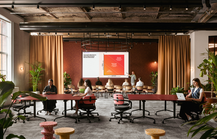
Buro Happold. Photography by Ben Tynegate
Similarly, the colour of our surroundings can influence our perception of temperature. Warm colours like red and orange can create a sensation of cosiness and safety, while cool colours like blue and green can evoke a sense of composure.
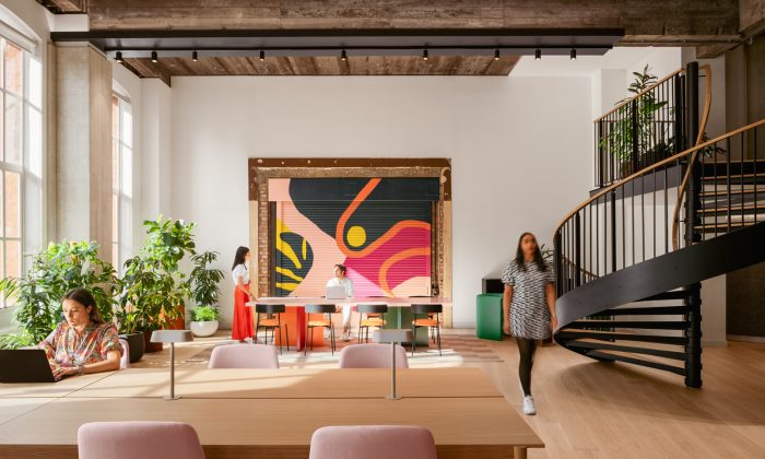
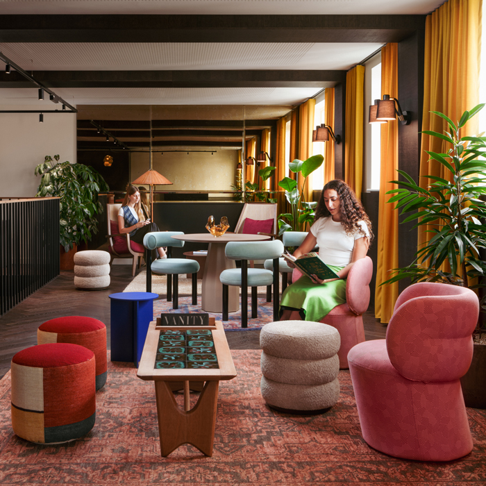
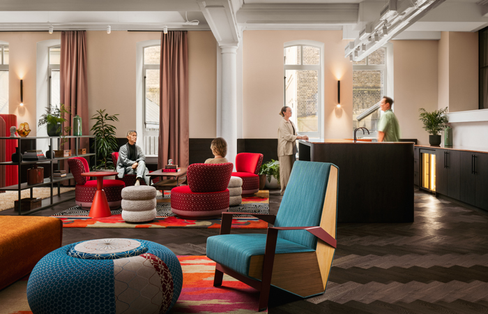
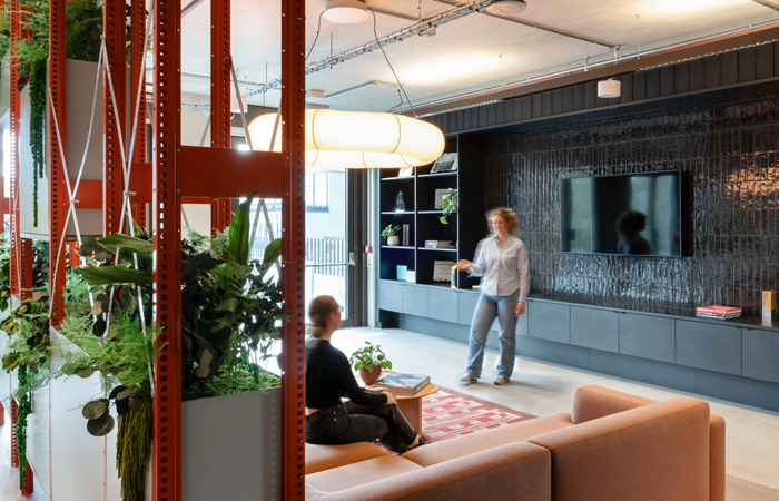
I recently worked on a beautiful scheme for PR Agency, Edelman, in West London, in which we inherited a stunning old warehouse building that was raw and industrial. Our approach was to create a timeless neutral base palette to really complement the architecture and celebrate the structure and historic character of the building. We then created a series of “villages” throughout the workspace, each taking on a personality of its own depending on the functional requirement needed by its users. We layered in bold colour and fabrics focusing on furniture and accessories, as well as varying levels of pattern and texture. The result is a rich, cohesive, and unique design focused on the experience we want people to have in the space. It is a highly curated interior and was carefully crafted more like a private members club than a corporate office.
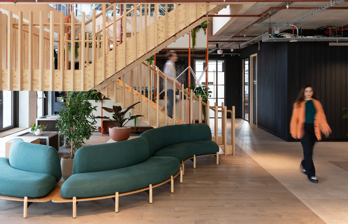
Buro Happold. Photography by Ben Tynegate
It is also essential to remember the principle of inclusivity. Designing for neurodiversity means acknowledging and accommodating the diverse needs and preferences of all individuals, regardless of their cognitive or sensory differences. It is NOT a one size fits all approach. As designers we have a responsibility to create sufficient variety in the interiors we design to accommodate all types of people and abilities. The fact is some people just like different things! Design will always be subjective regardless of how much consideration and purpose you give it.
For some, this might mean creating quiet zones with muted colours to minimise sensory overload. For others, it could involve incorporating elements of nature, such as biophilic design principles, which have been proven to reduce stress and improve cognitive function. I have friends who can’t bare an item of colour in their home because it ‘distracts them too much’. Whilst others I know can’t grasp why you would choose to make your house ‘look like a latte’.
Buro Happold. Photography by Ben Tynegate
A fun fact – did you know, every colour in the spectrum can be found in nature? Even those acid neons that I’ve seen designers wince at when stumbling across it in their RAL chart. For another project we recently completed in Shoreditch, we took a different approach to the palette. We created a darker ‘neutral’ base using deep indigo blues and teals, then layered on top warm hues of peach and red, pale greens from the base-build architecture, then shock accent yellow neon and dichroic effects in detail elements and graphic wayfinding. It resulted in an immersive and exciting environment for employees and their customers. Not a white wall in sight!
So why limit ourselves to a monochromatic ‘shades of beige’ existence I see so often in the mainstream (especially in resi design)? I’m not being literal when I say that – I feel it’s more of an attitude to design. Some of the most exciting design schemes are comprised offully neutral materials and colour choices, including some of my own projects. But they are done as a one-off and for a reason, not as a default approach to colour. Some argue that sophistication and elegance should be equated to neutral and safe schemes, which I have never resonated with. Personally, I believe in embracing the full spectrum of colour, but doing it in a way that is informed and structured and most importantly purposeful to each and every client.
By harnessing the power of colour, we can create spaces that not only look outstanding, but also nurture the happiness of all who inhabit them. Be bold not beige! (Or, at least, be a bit of both).