Brewing Trends: Oricha’s Bubble Tea Fusion Hits Birmingham with Phoenix Wharf, Echoing Global Craze
Hospitality and retail designers Phoenix Wharf have completed a first outlet for Oricha, a new bubble tea emporium, located on Birmingham’s Corporation Street. The concept is a fusion of ancient tea-drinking culture and a contemporary treatment, as well as melding East and West, taking inspiration from China, Japan, and specially Taiwan, as well as from British tea and coffee houses. This fusion reflects the background of the brand’s owners, one-time students-turned-entrepreneurs, who first met at Bristol University, before plotting their new venture. Mirroring the brand’s innovative approach, bubble tea itself is rapidly gaining global popularity, with the market forecast to grow by an impressive 19.1% between 2023-2028, signifying its rising appeal in the international beverage scene.
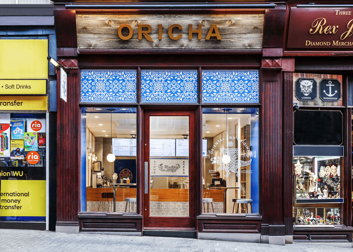
Oricha Birmingham by hospitality and retail designers Phoenix Wharf
The brand name, Oricha, is a fusion too, bringing together the words ‘Oriental’ and ‘Original’, with the word ‘cha’, Chinese for ‘tea’, a word first introduced to the English language as far back as the 1590s via the Portuguese, who traded in Macao and picked up the Cantonese pronunciation. When Phoenix Wharf came on board, Oricha’s brand identity was already in hand, having been created by a Taiwanese branding agency.
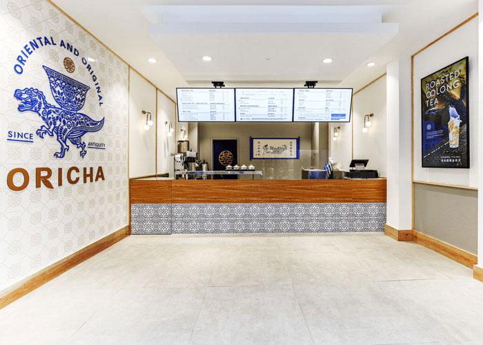
Oricha interior designed by Phoenix Wharf
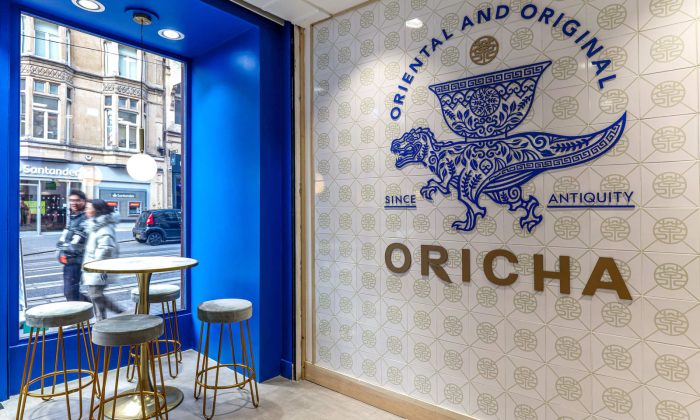
The Oricha logo features a tea leaf integrated into the letter ‘R’, whilst the brand icon is a T Rex dinosaur, a fun take on the Chinese dragon, hinting at the meeting of old traditions and a contemporary sensibility. The T Rex bears a large, traditional tea bowl on its back, representing the Eastern tradition of offering hospitality, and is decorated in a bespoke pattern inspired by stems and leaves. The Oricha crest above it represents the seal of quality and encompasses the Chinese character for ‘tea’ in a circle. The brand strapline – ‘Oriental and Original, since antiquity’ surrounds this family of icons. The identity’s colourway of rich blue, white, gold and grey also formed part of the brief for the new environment.
‘The site itself was a double retail unit and former jewellery store’ Chris Gwyther, Creative Director of Phoenix Wharf, explained. ‘We were briefed to work with the new branding and the idea of an Asian-Western fusion, referencing the eclectic cafes of the 30s/40s Shanghai Bund era and incorporating elements of traditional Chinese design, such as the use of tiles and timber battens. British coffee and tea houses were a further part of the mix, alongside more modern elements such as a concrete floor and contemporary lighting.’
Oricha boasts a vibrant blue painted interior shopfront
The 55.9 sq m space is made up of 16.9 sq m front of house and 18.6 sq m behind the counter. The deep counter is sited almost halfway back, so that customers don’t have to queue in the street when the weather is inclement. The counter front is clad in timber-effect laminate, set over custom-made steel units, and featuring brass detailing with a tiled lower section, using a porcelain tile that replicates the pattern used for the identity.
A row of three digital menu screens sits above the counter. The back wall of the space features is a manuscript scroll – another nod to authenticity and ancient traditions – featuring a fun illustration of a dinosaur chasing a bubble. A large, gold Oricha crest features on the back-of-house door, which is painted blue.
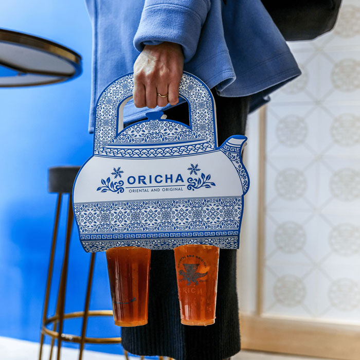
Innovative takeaway holder
Flooring throughout is large concrete tiles. The left-side wall of the interior features the Oricha branding at large scale, including a fret-cut T Rex, backed by tiles featuring the Oricha crest in pale gold, with the wall framed in pale timber. The right-side wall features promotional posters set against white, with a grey-painted lower wall section, as well as a floor-to-ceiling joinery unit. This displays set dressing ephemera, such as the brand’s unique teapot-shaped carry-out holders, alongside traditional glass jars of tea to underline the promise of high-quality ingredients.
‘Our clients are tea leaf experts and very particular about the sourcing of their tea product’, Chris Gwyther explained, ‘using only high-quality, Taiwanese, rice-roasted oolong tea.’
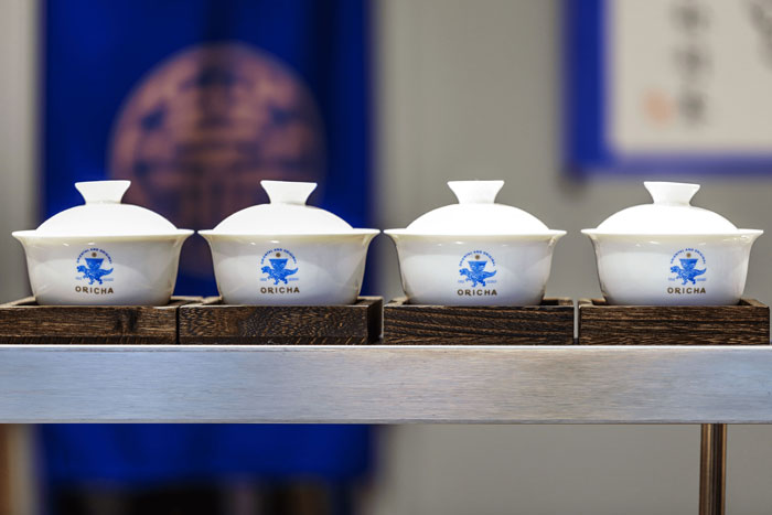
Phoenix Wharf designed the branding, as shown on the branded bowls
Just inside the store’s front window are two high tables with velvet-upholstered bar stools on a brass-coloured base. Two pendant lights over the tables are the Chubes ceiling pendant from Lights and Lamps, whilst wall lights throughout are the Brass drop curve wall light from houseof. The inner shopfront area is painted royal blue to match the brand blue, whilst the external shopfront is in dark stained wood with three panels of the brand pattern above the glazing, reversed here as white out of blue. The Oricha name in gold on the fascia is backed by deliberately-faded timber panels to suggest age and authenticity, with a protruding ‘bus stop’ sign also featuring the full brand dinosaur-and-tea icon. The brand icon appears once more in larger scale on the glazing as a manifestation.
‘Oricha immediately stands out from its more brightly-coloured competitors with its subtle and under-stated references to the traditional and the modern’, Chris Gwyther commented. ‘We’re sure it will trade well and look forward to working with its owners on future iterations in different British cities!’
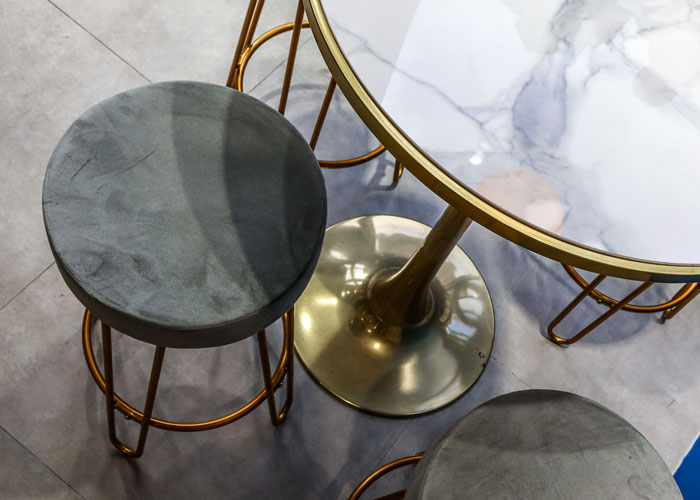
Seating and table area
‘It was great to work with the Phoenix Wharf team – they are very efficient and professional’ Jaspar Lo of Oricha said, adding that ‘Many customers told us that they like our shop’s design, which should be a great thank you to the team. We wish them all the best!


