Case Study: Vintry & Mercer with Dexter Moren Associates
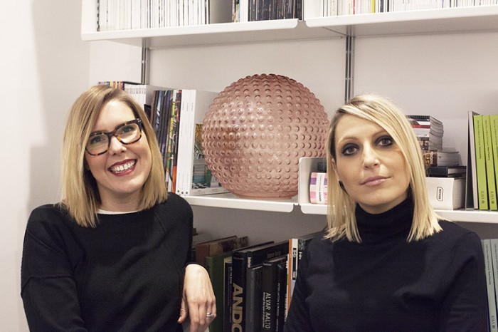
We caught up with Lindsey Bean-Pearce and Giada Gemignani of Dexter Moren Associates to chat about their latest hospitality project Vintry & Mercer which is due to open this summer. Going through their inspiration and approach to the design.
How did DMA get involved?
Following the success of the multi-award-winning Ampersand Hotel in South Kensington, and in competition against three other leading practices, Dexter Moren Associates (DMA) were re-appointed by the client Anton Fedun to realise Vintry & Mercer, a new destination hotel situated between the architectural triumph of St Paul’s Cathedral and the modern optimism of The Shard.
“An instant feeling of warmth, comfort and luxury and the expectation that they are about to experience something very special”
what was the over-riding inspiration for the hotel?
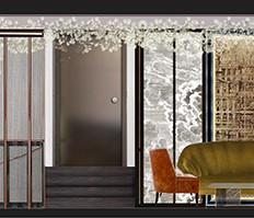
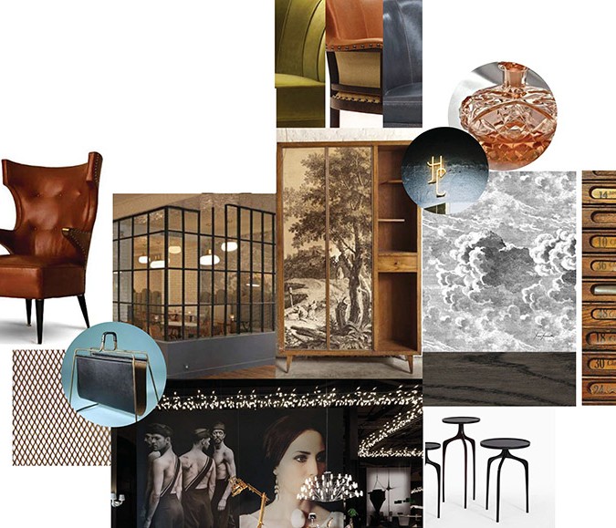
We drew upon our fundamental understanding of the varied and individualistic nature of London’s districts to create bespoke design features that engage guests with the story of the hotel’s creation, neighbourhood and the history of Garlick Hill Hythe and its medieval trade guilds: the vintners, mercers and merchant tailors.
Three types of bars: inspiration & design
The Mercer Rooftop Bar
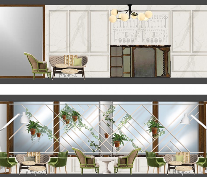
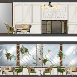
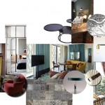
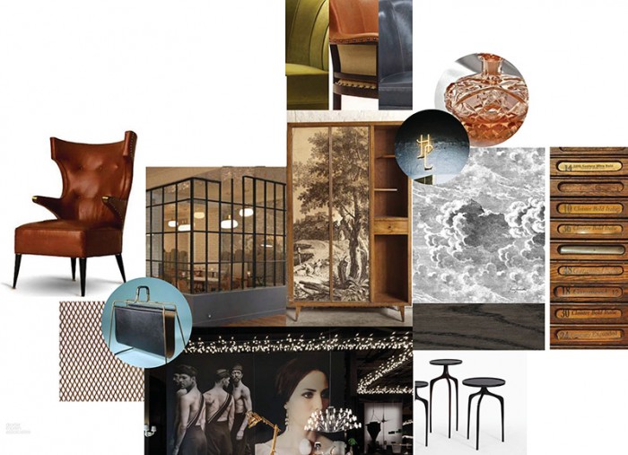
For the Mercer rooftop bar, Anton wanted the design to convey the comfort and grandeur of a traditional countryside orangery. For us, this translated to using a palette of weathered timbers and muted sage green and grey in the upholstery. Richness is introduced by the use of brass detailing, with honeycomb patterned tiles on the walls and Versailles parquet timber flooring. The glazed roof allows for views of St. Paul’s Cathedral, and natural light is maximised by the mirrored panelled ceiling over the bar.
The transparency of the clear glazed balustrades intentionally allows the layered planting of the small trees and hedges to become the main focus, creating privacy and shelter. This mixture of green planting and weathered terrace furniture further cements the old world charm of an English garden that we were looking for.
The Vintry Kitchen
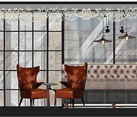
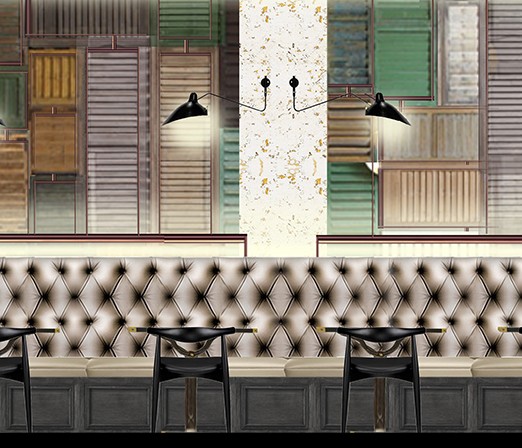
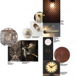
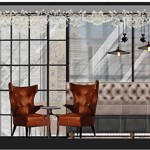
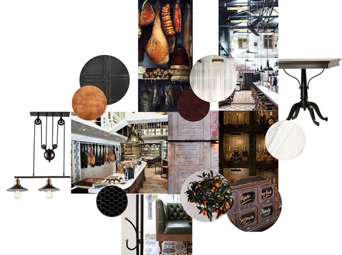
Located at the ground floor level, the Vintry Kitchen celebrates the vintner’s guild of wine merchants. It offers a relaxed easy style of dining, with textured cork effect walls, feature penny tile mosaics, and high button backed banquettes in buff leather placed alongside marble topped tables on a herringbone tile floor. The clever combination of plantation shutters with angled mirrors is used to throw natural illumination across the space from the roof light above. Ambient wall lights and pendants are carefully balanced to create a more intimate setting for evening guests. A communal table sits next to exposed oak barrels displaying the range of wines offered on the tasting menu.
DND Bar
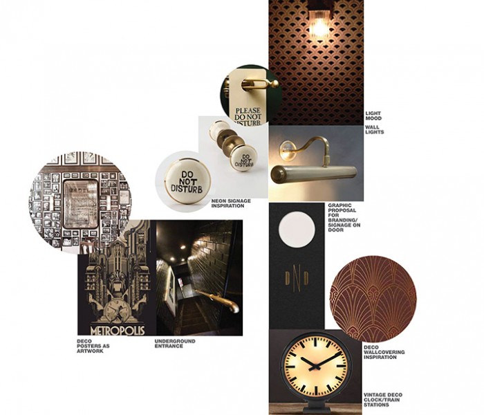
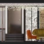
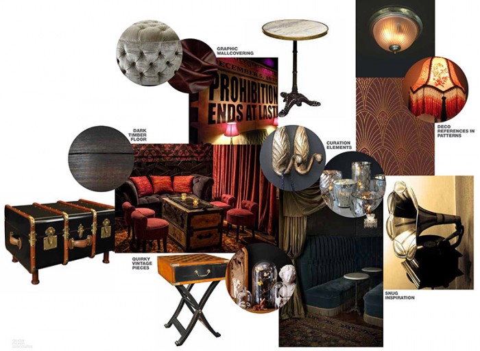
In contrast to both the Mercer Bar & Vintry Kitchen, the opulent basement speakeasy bar, Do Not Disturb, revels in its freedom from architectural intervention, and makes a feature of the lack of windows and roof lights. Instead we opted to accentuate the darkness. The DND bar is heavily influenced by the Art Deco period; ceilings are lined with decorative mouldings and trims are painted dark claret to tie in with the curved Deco-inspired lounge banquettes. Vintage lights and curiosities are wrapped in low-level lighting to set the mood.
What do you hope guests feel when they enter the hotel?
An instant feeling of warmth, comfort and luxury and the expectation that they are about to experience something very special. We wanted to capture the feeling of seeing a long lost friend, that sense of being ‘home’ and of well-being; the sensation that one has left the angst of everyday life behind and been transported to somewhere where one’s spirits are lifted by simply being in the space.
What was the hardest part of the project?
As with creating any new hotel, the hardest thing is always to balance the impact of beautiful design and the ability for that design to remain timeless. That is why it is so important to immerse the motif in the neighbourhood story, and thereby create a one-of-a-kind hotel unique to its location, that guests can understand and engage with. In this instance we believe we have created something truly special.
What was the best part of the project?
If we had to pick one part, and avoid the cliché of saying ‘all of it’ despite that fact, we’ll say the DND bar. We have always wanted to design a speakeasy bar; there is a natural pull of curiosity that gravitates anyone to these kinds of venue, and indeed Anton has a real love of speakeasy bars from his frequent visits to New York. We were very happy when he asked us to create one here, and it turned out to actually be the easiest and most fun part of the hotel to design precisely because from the off both Anton and ourselves had a mutual understanding of what we wanted to create.
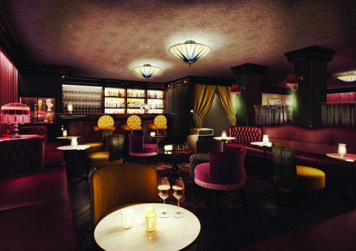
Add to this the fact that the space was an addition that came much later in the timeline of the project and was originally envisaged as something else entirely, so to see it finally realised is a real achievement.
Associate director Lindsey Bean-Pearce concludes:
“The hotel is a series of layers that unfold to tell the story. Much like the pages in a good novel that you always want to re-read, we aspire V&M to be the same, with guests wanting to revisit.”


