Conrad Algarve
How would you feel about working in Portugal four days a week for six months? Pretty good, right? So did designer, Kate Long of Rethink Interiors when she worked on the implementation of Sigma Seifert Interiors’ design of the hotel’s public areas, However, it wasn’t the sun or beaches she enjoyed. It was “living and breathing” the site of five-star Conrad Algarve luxury hotel project.
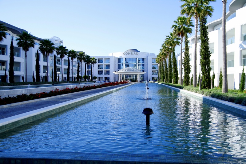
John Seifert’s (of Sigma Seifert) design of the Conrad Algarve was inspired by an 18th Century palace, with a grand entrance and driveway and metal gates. Two buildings flank the approach – and water features and lighting mark out the visitor’s arrival.
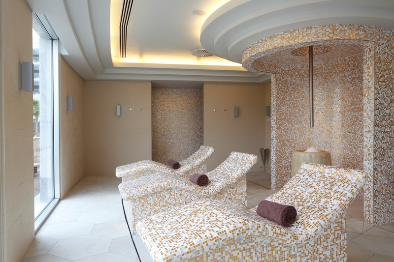
The Conrad Spa is almost a spa for people who don’t like spas – those more averse to lying in silence on a lounger, even between treatments.
“We wanted to challenge the idea of the traditional spa,” explains Long.
“Where you go in and find six loungers – a quiet zone – with people reading books. If you try to talk to a friend, even in a whisper, you feel you are disturbing people.” “In fact, when we talked to people, we discovered that they were really most stressed about not being able to use their phones!”
The more flexible approach is also underlined by the leather armchairs in the space – created by RHA, as was much of the furniture for the project. The armchairs recline slightly, and a corner sofa area is another welcoming de-stressing touch.
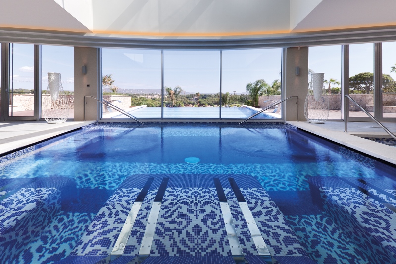
Tiled in a blue and white floral pattern, with a rich gold mosaic, the pool has its own tricks. It starts indoors, but quickly leads out, dropping off to the outstanding views.
Conrad was keen to make an impression on the spa, given the fact that this was the first treatment area ever run by the chain. They remained very involved throughout the project.
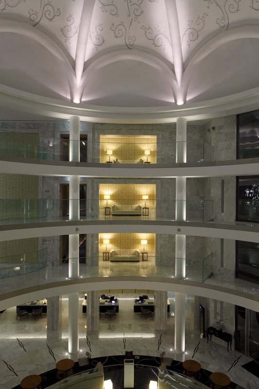
On looking up at the grand dome, which John Seifert made the centre piece of the hotel, guests see a trompe l’oeil floral relief, with full-height glazing to the rear and front; a focal point in the six-storey atrium void. Marble flooring further enhances the features.
This is light, but has strips radiating out from the single-storey staircase.
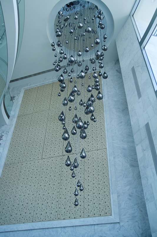
The chandeliers from Beau McClellan Design – at a 10.5m-drop – draw eyes looking up and down. They dramatically form the ceiling to the first floor, mirrored and reflecting the surroundings – full-height marble wall panelling for both visual and aural interest.
Interior Designers
Rethink Interiors Ltd – Interior design services to all areas.
Miguel Canico martins (MCM Design) and Sigma Architecture and Interiors – Standard guestroom concept
MCM Design – Suites, Speciality Restaurant, Spa (Rethink Interiors took over these areas upon departure of MCM Design)
Sigma Architecture and Interiors – Public Areas
Architects
Sigma Architecture and Interiors – COncept Architects
Palmer Grego Arquitectos (PGA) – Local Architects


