Covering all the angles: align creates new Tech Hub at Lexis Nexis
Workplace specialists align have completed a new central London office project – an elegant, contemporary and highly-functional workspace for the tech team of global legal services company Lexis Nexis.
Lexis Nexis, part of RELX plc, is a leading global provider of legal, regulatory and business information and analytics. The company helps lawyers win cases, manage their work more efficiently, serve their clients better and grow their practices, as well as assisting corporations in understanding markets, monitoring brands and competition and mitigating business risk.
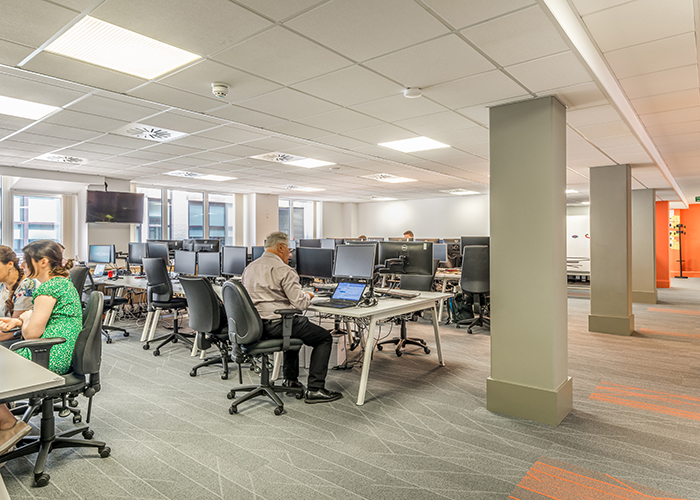
align had worked on a number of schemes for RELX plc companies, including the innovative scheme for Mendeley in the landmark AlphaBeta scheme in Finsbury Square, before being approached to re-design the 675 sq m second floor of the seven-storey Lexis Nexis Farringdon HQ (the company has two other UK offices). The scheme, housing up to 129 staff, including 6 senior managers, involved the relocation of the Tech Hub team, who had previously based out-of-house in a WeWork building in nearby Chancery Lane. The strategic re-integration move came together with a brief to preserve and evolve the team’s identity and culture, whilst at the same time ensuring the team was properly integrated into the overall Lexis Nexis work family.
Design Approach:
The project kicked off with a series of workshops led by align, aimed at drawing out the hopes and fears of key team members, in order to ensure the final brief answered not only functional needs, but the team’s more hidden emotional and aspirational aims. Concerns expressed at this early stage included worries about noise levels, about not having enough meeting or relaxation space and any loss of identity that moving might mean for the team. Key hopes, conversely, included the provision of better meeting spaces, a non-clinical design feel overall (though avoiding any try-hard elements, such as large inspo wall graphics!), great acoustic management, the provision of collaboration and break-out spaces, including a new ‘Inventing Room’ and the capacity both to integrate with and inspire the rest of the business.
The Inventing Room
The brief therefore evolved around a space plan that would enable staff to work in neighborhood-style groups in a number of open plan areas, with as many write-on walls as and stand-up areas possible, with clear sightlines throughout, including into meeting rooms to see if being used. Through the efficient use of space in the plan, not only stand-up areas, but an inventing room and a whole series of collaboration spaces were integrated, with maximum built-in flexibility and adaptability. Another aspect of the brief was the provision of a UX area, where staff could test out programmes, with those taking part able to be observed throughout from an adjacent meeting room.
‘As is the case with many tech teams’, align Director Nigel Tresise commented, ‘there was a requirement for fluidity and the ability for team members to be able to work in a variety of places, as well as at different heights. With space at a premium, the design of the multi-purpose break-out space was very much aimed at facilitating this.’
Design Walk-through:
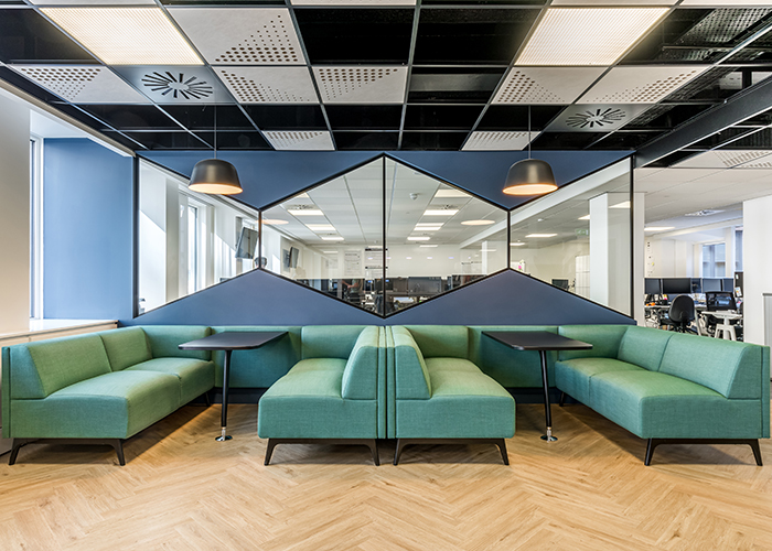
The new workspace is arranged into a north and south footplate on the second floor, located to either side of the building’s central circulation core. A central break-out space, promoting a sense of connection and togetherness, is situated in the south core immediately as people enter the space. This central area is both a collaboration space and a place for the team to relax and socialise and also provides visibility and connectivity between the two open plan areas situated to either end. The open-plan areas are delineated by two full-height partition walls, which feature an eye-catching design in the form of bespoke, angled glazed panels, arranged in triangular shapes.
‘The triangular vistas maintain a sense of connection across the floor and the use of such dynamic shapes also reflects the energy of the Tech Hub team’s work’, Nigel Tresise explained. ‘The glazing element was also important to maintain sightlines and ensure a sense of one-ness throughout the space’
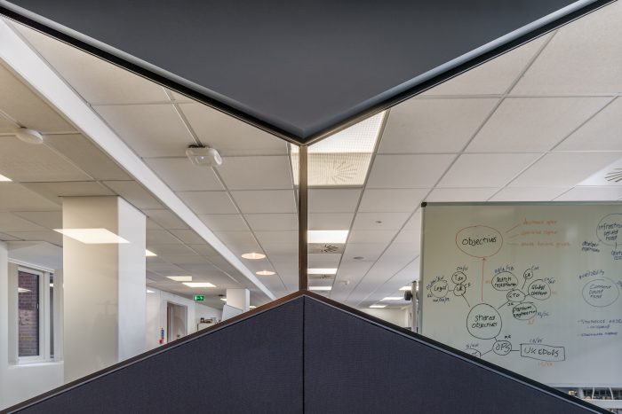
The windows allow people to see who’s at their desks at a glance
This visual element is further echoed throughout the scheme, with additional iterations including white chevron tiling in the kitchen-tea-point and chevron timber laminate flooring from Plus Four throughout the break-out.
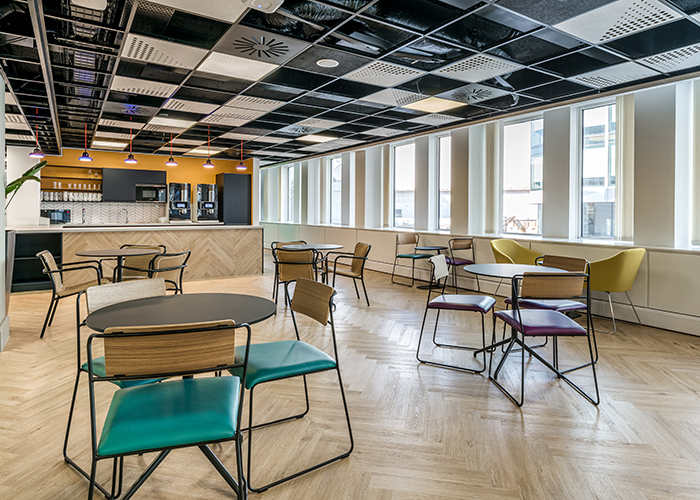
View towards teapoint
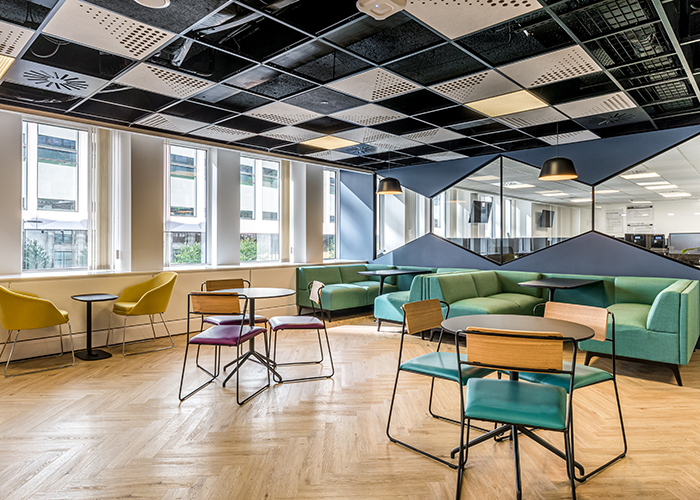
Furniture within the break-out space ranges from booth seating to mixed loose seating. Tryst booth seating (by Connection) is in a pale sea-green, whilst loose furniture in the break-out space is in wicker, along with shades of mustard, purple and grey. The loose furniture includes the Hug chair from Deadgood, the Transit Chair from Workstories and the Echo pouf from Muuto. For the project’s colour scheme, the client asked the design team to devise a family of colours that weren’t related to the company’s overall identity but which would create a new and strong identity specifically for the Tech Hub area and team. This new colour family also includes a deep navy-blue, used for the kitchen/tea-point joinery to the rear of the break-out space, as well as for the glass Bristol Light pendants from Deadgood which hang in a row of six over the kitchen worktop.

Surfaces include white chevron tiling and chevron laminate cladding to the kitchen front – also used for the collab area flooring
Behind the kitchen/teapoint are two phone booths for discreet calling, along with a team-leader touchdown area. The phone booths feature black, metal-frame doors with striking, long, vertical handles and a ribbed-glass-effect manifestation on the windows. The desks are lit by Tweeter Spotlights from Delta Lighting, as well as Tolomeo wall lights from Artemide, whilst the chairs are Fiber Sled Base chairs from Muuto in a dusty red. The booths are carpeted with Shaw Carpets to help with sound, with acoustic wall paneling in a Camira fabric. Shaw Carpets are used throughout the scheme in a grey pattern, with a secondary design used for some of each area as a unifying design element with a different highlight colour each time (either blue, green or coral). The touchdown area features the Air Table by Workstories with Sedus SE:Motion chairs. Sea-green has been chosen again for the tongue-and-groove-effect wall cladding to the rear of the touchdown space, with this cladding feature also used to frame the two phone booths.
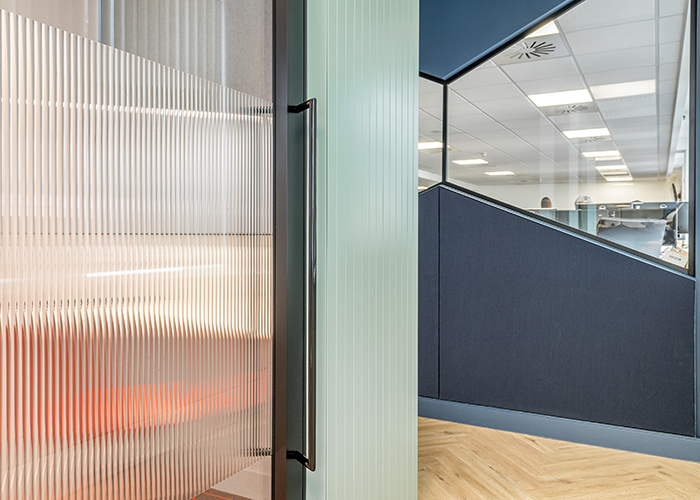
The booths feature ribbed glass-effect manifestation for privacy
Within the break-out spaces, the ceiling has been sprayed out in black in order to increase a feeling of height, whilst new perforated acoustic tiles have also been added at regular intervals to help absorb noise. One of the two partition walls to the break-out also features an additional layer of acoustic fabric by Kvadrat (whilst the furniture selected near the opposite wall providing the same function). The outer wall of the space includes timber casing to conceal electric cables, white-painted in the central area, alongside the break-out space.
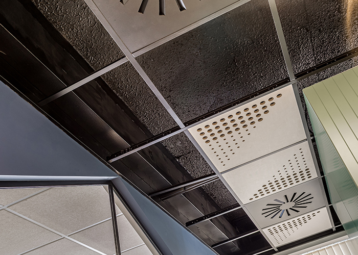
The main ceiling was sprayed back with the perforated tiles placed in a seemingly-random arrangement for visual interest
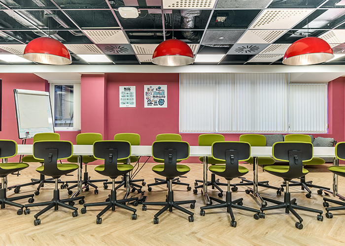
Beyond the partition screens at either end of the south space are the two open-plan work wings, whilst opposite the breakout area is a further enclosed large-scale meeting room – the ‘Inventing Room’. The Inventing Room features Vitra chairs, an outsize table, Rookie chairs from Vitra, Yak chairs from Frovi and large, industrial-style metal lamps from Deadgood, as well as two Can sofas from Hay along its back wall.
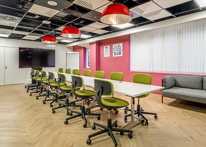
Can sofas from Hay sit along the room’s back wall
On the north side of the circulation core is a further open-plan workspace, with wallpaper on the immediate inner wall by Tektura and a coral-painted back wall to draw the eye through.
‘The possibility for feature wall coverings was limited to a degree’, explained Nigel Tresise, ‘as the brief asked to maximise working wall space, in the form of write-on-walls or white walls to house post-it notes for work-in-progress. We actively sought therefore to add colour and pattern via furniture, fabrics and, where possible, on walls.’
As well as open-plan desking, this space also features four smaller delineated areas. Two of these are semi-discreet, stand-up work areas, demarcated by floor-to-ceiling drapes, and containing high Relic tables from Frovi and Fiber stools from Muuto, with Ambit Rail Pendant lights, also from Muuto, overhead. The other two linked areas are the UX Lab and an Observation Room with a two-way mirror for testing out new tech solutions.
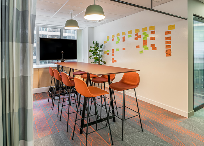
The two stand-up rooms are semi-discreet, demarcated by floor-to-ceiling drapes
‘align’s research processes were extremely thorough and ensured we articulated both obvious and less obvious thoughts and preferences about how we like and need to work’, Natalie Sender, Portfolio Delivery Director for LexisNexis commented. ‘The final designs are not only striking and stylish, but also work really well for our teams, specifically the kitchen area at the front of the floor, which has proved a great place for socials and meetings. The team is now properly integrated but has also retained its own identity – the perfect balance!’
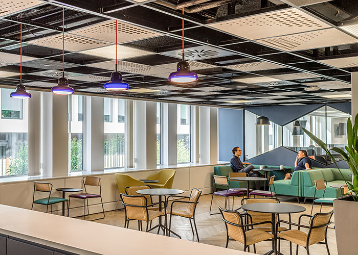
View back over collaboration lounge from teapoint
