Designer Q&A: Jon Brøcker, C.F. Møller Design
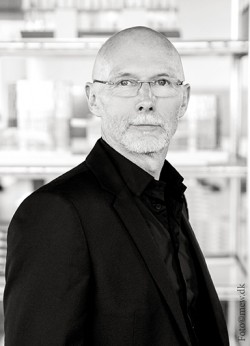
Sharing his product design expertise, Jon Brøcker, Head of C.F. Møller Design tells us about his collaboration with Modulex on VIA Architectural Signage.
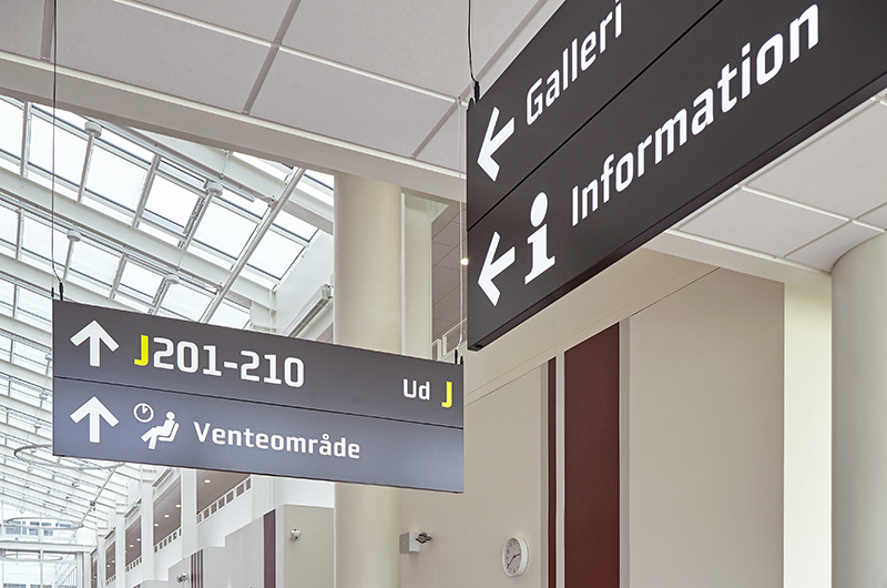
A project that launched in 2017, was a wayfinding solution for Aarhus University Hospital (AUH), Denmark. We wanted to find out more about this project and how C.F. Møller got involved with Modulex…
How did the C.F. MØLLER / Modulex collaboration come about?
Cooperating with skilful manufacturers on designing and developing products for our built environments and life within them, is what C.F. Møller Design primarily does. We know Modulex as a strong brand. Working with them on the VIA series was an opportunity we welcomed and a reference, we take pride in.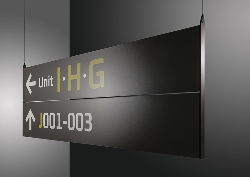 What was the thinking behind VIA?
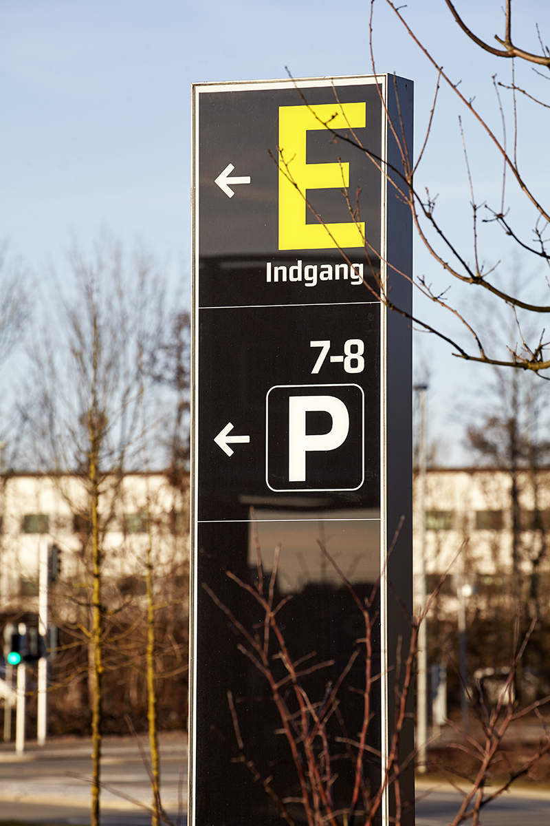
Part of our assignment for the planning and designing of the Aarhus University Hospital (AUH) was to work out the wayfinding strategy to move visitors, staff and patients easily around the extensive site. The final strategy constituted the basis for the design and use of signs whilst pinpointing a number of supportive architectural and technical elements that contributed to navigation. Based on learnings from the strategy work we defined and specified the types of signs, we would need, developed the syntax (order and interrelationship of the signs) and designed a full program of exterior and interior signage as the basis for an offering. Modulex was appointed winner of the tender, and together we developed the VIA program based on our design concept.
How did the industrialisation of the product have an impact on the design?
Unlike building and handicraft, industrial design (besides functionality, communication, ergonomics, economics and so on) also includes considerations on how to make the most of materials, how to optimize production, packing, transport, mounting, maintenance and so forth. These things don’t matter for the one-off product, but is crucial, when it comes to industrial design. Imagine mounting 500 signs with a laborious and poorly performed mounting solution! You have to consider all touchpoints of your design from production to recycling.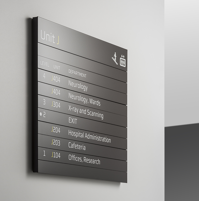 Did Danish design influence the VIA product range and how do you see this style of design?
That is a question, which cannot be answered in a few words, as it comprises the transformation from traditional to modern society over a number of decades, from the 1930’s onwards. The development of Danish furniture design, which was promoted and became the story of the welfare society has become synonymous with people’s perception of Danish design, however, I believe it is far more complex than that.
Danish design, as I consider it, is a certain design approach based on simplicity, functionality, quality and good craftsmanship. These are virtues we still aim at in every assignment together with longevity and clever solutions, that can pass the test of time. In the VIA line with its many items it finds expression in the consistent use of geometry, dimensions, materials, surfaces, colours, graphics and refined mounting solutions.
 As a designer, what materials do you consider to be most effective for signage products in both design and functional terms?
I have no pre-conceived preferences or favourites. Identification of the right materials and method of processing is rather the result of the design process including considerations on the use of the products and the dialogue with the manufacturer. There’s a big difference between materials and construction of signs for outdoor use in a public environment somewhere close to the sea compared with signs for indoor use in a semi private environment. The VIA range must deal with both extremes and subsequently we carefully selected a number of different materials.
There has been a seismic technological revolution over the past years – how do you see that impacting wayfinding around architectural buildings which C.F. MØLLER are working on?
Wayfinding in general and particularly in hospitals is a very complex exercise, that has to make use of all accessible means of tools. The buildings design itself and the shaping of the landscape are the basics in all wayfinding and important flows can be emphasized by the design of entrances, receptions and the use of colours, materials, graphics, art, landscape design, indoor plants and so on.
On top of this comes traditionally signage of many kinds, in both analogue and digital nature, with an increase in the use of the latter in all situations where information can change on a daily / weekly basis. Additionally a new layer of IT-based and some times interactive solutions has popped up within the last years, helping people to reach their destination safely and in time; and finding their way back. I expect that our builders are like most builders and will listen to our recommendations on what elements to use in a particular space in order to make the most efficient wayfinding strategy.
