Ekho Studio creates contemporary workspace within Grade II Victoria Mill
On Macclesfield’s Silk Road, in the heart of an area where regeneration has seen many of the town’s former textile mills repurposed as contemporary workspaces, designers Ekho Studio have created a brand new, future-facing iteration of the four-floor, Grade II-listed Victoria Mill for healthcare clients Inizio Medical.
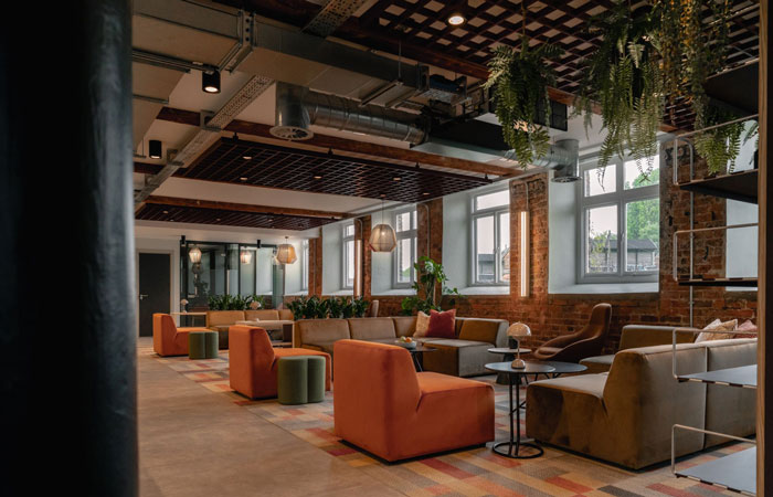
The Existing Interior
The new scheme, set within an early nineteenth-century, Grade-II listed building, looked to strip out the existing fit-out and completely refurbish the interior – already converted to offices by a previous tenant – for the needs of both a new client and a new era of working practices.
‘From the outside, Victoria Mill had very much retained its historic and high-impact presence’ Ekho Studio Founding Partner Rachel Withey explained, ‘but there was an immediate disconnect as soon as you went inside. The interior had been completely boxed over and made into a fairly generic white-box space, which in truth could have been located in any type of building. There was no relationship at all. We immediately felt that was a great shame and that the concealed steel columns and over-painted brickwork should be restored, revealed and celebrated.’
Grade II-listed Victoria Mill’s Reception area for healthcare clients Inizio Medical
Victoria Mill is prominently located on the town’s main arterial route and was originally used as a silk spinning textile mill, giving rise to core elements of the new design concept. The project sought to combine two workspaces previously occupied by Inizio Medical – the current one at Victoria Mill and also another Macclesfield location, Peakside House – into a single location for a new 50% occupier scenario, taking into account both hybrid and agile working preferences. The new project was also to be a ‘beacon of change’ for post-pandemic staff.
The given interior was indeed already an office space, but featured an enclosed reception area that lacked primary natural light and which left the reception very separated from both visitors and the wider team. A front-of-house waiting area was under-utilised and low in impact. There was also no clear brand journey; a lack of variety in seating settings and various completely under-used areas, including a wing of meeting rooms of various sizes along one corridor. Primary daylight was not filtering into the corridors and a low, underslung ceiling with dark and dated finishes throughout wasn’t helping the overall impression.
The Brief
The client brief that the space offered plenty of opportunity to create a more collaborative and flexible ‘hub’ space on the ground floor area, which could then act as the ‘beacon of change’ for the whole building, helping bring people back together after the pandemic and giving them a new flexible, collaborative and social space alongside more traditional desking areas on the upper floors.
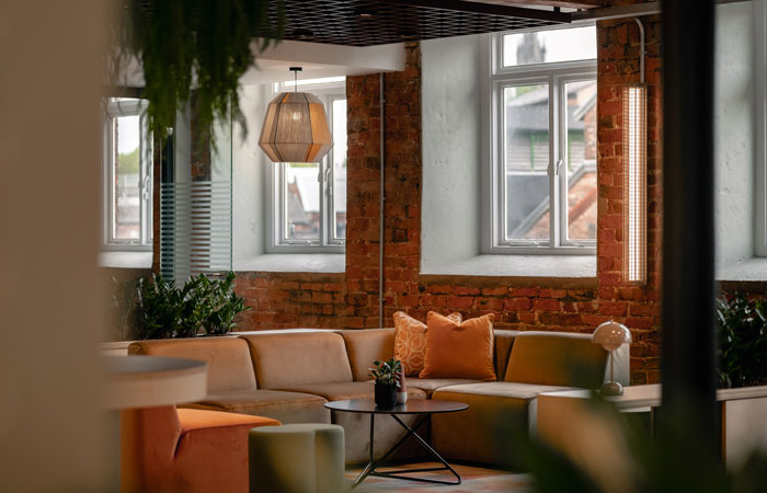
The Mills rich red brickwork is now fully exposed
The brief asked for the new design scheme to provide:
- spaces for social and informal connections, creating a sense of family and community, with a hospitality feel high on the priority list
- enhanced possibilities for impromptu collaboration and communication
- a new accent on biophilic features
- a way of making Inizio Medical’s company culture more visible
- an inclusive link between staff at home and in the office, which would encourage users to come in and use the office
- smaller desk profiles of 1200/1400mm for a better use of space on the upper floors
- reasons for people to move round the whole office to connect, including a flexible/social/meeting hub facility on the ground floor
- a welcoming and open entrance space
The Design Approach
Throughout the project, Ekho Studio sought to draw upon the building’s industrial history and incorporate links to this through materiality and form. Macclesfield and the surrounding area are visually full of layered textures, dramatic forms and close links to the river, which flows directly past the Mill. All these elements were used to influence the scheme’s material palette and design decisions.
The proposed designs looked to reveal the beautiful rich red brick of the mill and to expose the original ceilings and structural columns to add character and bring a sense of volume back into the spaces. The warmth of the brick would then be enhanced by the choice of new finishes throughout, from textured upholstery to wall and floor finishes. The design also sought to take influences from the textile industry by introducing products such as lighting pendants and furniture details with a direct nod to the weaving process.
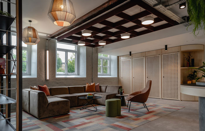
The space is collaborative and flexible
The colour palette demonstrated an emphasis on the rich earthy brick. By using this base to build our material palette, the design team created a bold and vibrant space which complemented the building’s heritage whilst rejuvenating and breathing new life into the Mill.
‘For the colour scheme’, Ellie McCrum, Interior Designer at Ekho Studio, explained, ‘as the red brick was a given for retained exposure, we began with that. This was not a client who wanted an over-literal 3D implementation of their branding colours in any case, which meant we were free to find the best colourways to work with the red of the brick.’
The Space Plan
Whilst the main focus of the project was the ground floor reception, social and meeting areas, the existing office floors above were newly also re-planned to show the number of desks that could fitted in, whilst also seeking to create more interest to the floorplate. Cellular managerial offices were removed to create more space for all to move around freely. The plan included proposals to limit storage and filing on the work floors and to reduce the loose paper footprint, whilst re-purposing offices as meeting areas to enhance differing work settings and agile working opportunities and adding new teapoint/breakout sections.
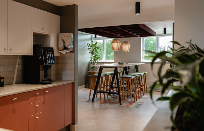
View from kitchen to communal work or meeting station
The scheme consists of five floors, from lower ground to third, with both working space and amenity areas on the ground floor, now re-named ‘The Hub’. The basement, ground, first and second floors are around 625sq m each and all used as general workspaces, whilst the third floor has a reduced floorplate of 340sq m, bringing the whole interior to a total of 2,840sq m.
The Hub
The Hub – the main new ground floor area – is a multi-functional space, providing areas for all the team to gather informally for social and Town Hall events – as well as for meeting and individual working as required. It also offers a multi-faith room, which can additionally be used for wellbeing activities, as well as First Aid. Flexible, reconfigurable furniture arrangements were key to this multi-purpose approach.
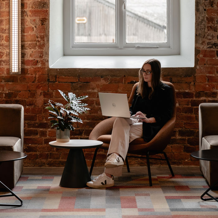
The Hub allows for social interaction as well as individual working
Other settings, for example, included a welcoming new reception area with visitor seating; a directly-adjoining business lounge followed by open seating areas for informal meetings; new phone booths; work stations for individual use; a social hub and ‘Town Hall’ space with a central island with an AV screen, with the island also able to be used as a servery for entertaining; a kitchenette and back of house storage space and toilets.
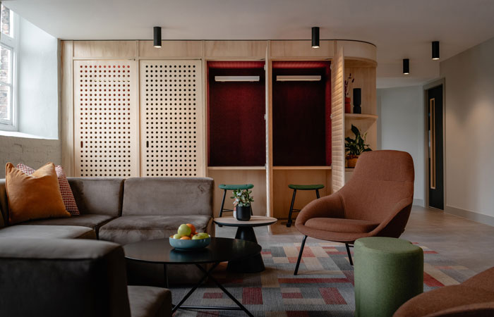
Phone booths
Materiality
The design approach looked back in time to the Mill’s original history and took on board historical imagery, including, for example, the production of silk buttons. The celebration of the building envelope’s historical materiality meant the revealing of exposed brick, which had previously been hidden and overclad and of ceilings with timber beams, which had also been overclad previously, ensuring the new feeling of height and spaciousness was really impactful.
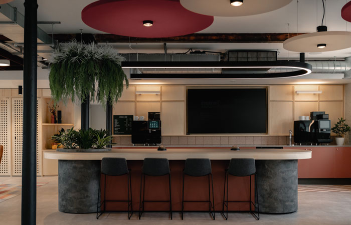
Camira Lucia lights over the kitchen island on the ground floor
A cluster of circular Camira Lucia lights create an eye-catching feature in the social hub / Town Hall areas, as do the woven-texture wool and metal pendant lights – the Hay bon bon shade – which reference the Mill’s former textile heritage, in the business lounge area. Can-style lights are inset into the new bespoke, plywood-finish ceiling grids over the business lounge area, with three large-scale grids set in a row between the newly-exposed original beams. Acoustic rafts and acoustic-backed woven metal sections from SAS International and Autex are also set into the new grid ceiling. Planting has been incorporated into the entirety of the scheme, but particularly features on the ground floor, including some ceiling-suspended planting. Former boxed-in windows on this level have been squared-out with greatly-improved natural light ingress.
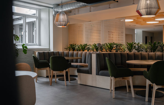
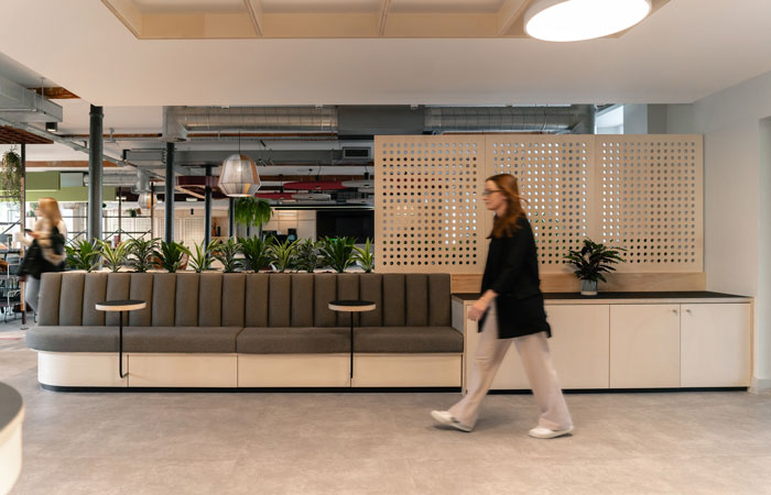
Ground floor banquette seating in front of floor to ceiling screening
The scheme’s furniture also has an industrial aspect to its aesthetic and has been mainly manufactured in the UK, to ensure both a heritage nod to British manufacture and reduced air miles to site. Floor-to-ceiling wall screens serve to divide the open space and feature geometric, circular indents on some of the panels in an abstracted reference to silk buttons. The Hub’s phone booths feature perforated plywood doors and acoustically-wrapped interiors, with all four walls of the ground floor Hub also treated with acoustic felt to offset the volume and height of the space.
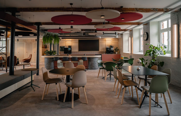
Social seating in the Hub
The flooring on the ground floor is a concrete-effect LVT from Amtico, with striking feature carpeting in the business lounge from Milliken, tying in directly with the furniture colours. A flooring apron around the teapoints is the Polygon Key Mini LVT from Amtico’s Designer’s Choice range, whilst the columns are now exposed original steel beams with attractive detail features at the tops. Wooden ceiling beams have been newly sanded and treated. Tiling across the rear wall has a weave effect, based on a textile-stitching concept. Acoustic pendants in the space are of different sizes. Plywood screens on the ground floor are semi open with a solid section at the bottom with the wood kept unstained – with the same material use on the upper floor teapoints – to look as natural as possible. Ekho Studio also installed new wayfinding on each floor opposite the lift doors using large-scale numbers.
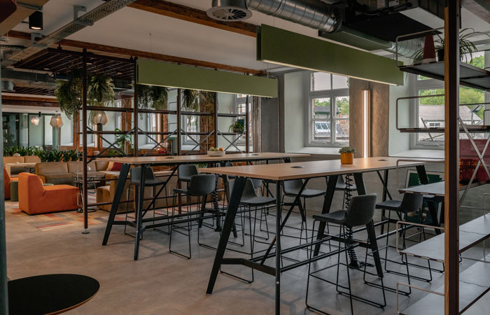
The variety of settings in the Hub includes high bench work stations
On the upper floor new teapoints, an acoustic felt grid is set above them to dampen noise and a new inset carpet has been installed beneath the new tables, with a woven pattern LVT all around.
Penny Forbes, Business Services Manager, Inizio Medical, commented:
‘The design has allowed us to reimagine how we use the office space. With our long-standing approach to flexible and hybrid working, Ekho Studio carefully listened to the needs of our employees and created a transformative design which has resulted in a highly-collaborative and engaging working environment; allowing each employee to fully embrace their individual working style and schedule. We have received fantastic feedback from employees and visitors to the building – all are blown away by how open, welcoming, comfortable, yet functional the office space is. The design itself has truly allowed us to reimagine how we work and collaborate in an environment where we can all realise our true potential.’
Project Credits
Photography: Stevie Campbell
Workspace Design: Ekho Studio
Contractor: SpaceScape
Project Manager: BWP Consultants
Furniture Supplier: WeSpace
Lighting: Hay, Camira, P&A, Astro, &Tradition
Acoustic Grids: SAS International, Autex
Flooring: Amtico, Milliken
