Ekho Studio melds Holbeck’s raw, industrial past with Temple’s new digital future at Globe Point, Leeds for client CEG
Interior designers Ekho Studio have completed the 300 sq m ground floor amenity design that sets the tone at newly-completed Globe Point, the first of the CEG Group’s developments to be completed within the regenerated Temple district in Holbeck, Leeds. The 37,800 sq ft, seven-storey, BREEAM Excellent and WiredScore Platinum office development – by architects Feilden Clegg Bradley Studios – is the first new-build office property to be delivered in Leeds this year and has been designed to provide next generation workspace for over 400 people in a striking flat iron design building with spectacular views across the city from its roof terrace gardens.

Globe Point in the Temple district in Holbeck, Leeds
Antonia Martin-Wright, Head of Investment at CEG, commented: “Globe Point has been designed to deliver the highest quality workspace in a great location close to the station. It is the first of our developments to complete in the Temple district, and a first for Leeds this year. It is set to create a buzz in Temple and, as the numbers of people living and working in the area continues to grow, this will help to support the fantastic bars, restaurants and other amenities, including our events space partnership with Chow Down.”
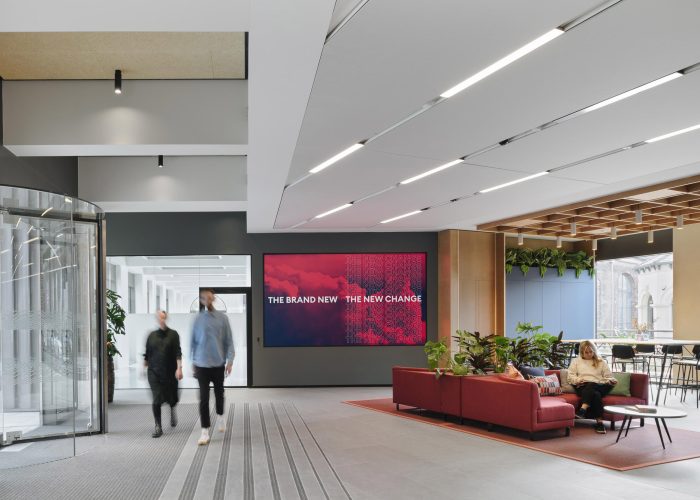
The brief for the ground floor amenity space was to create a warm welcome and sense of arrival
Sarah Dodsworth, Founding Partner of Ekho Studio added: “Globe Point is an interesting and unique project that will both fit with and elevate the surrounding area. It’s a special scheme, and one we’re really proud to be associated with. The ground floor amenity area has been designed as a community space, reflecting the diversity and energy synonymous with this vibrant city neighbourhood.”
Design Brief
The brief from CEG to Ekho Studio was to create a warm welcome and sense of arrival within a professional, interesting and fluid space that was both aspirational and affordable and had the capacity to hold events, as well as encompassing a really good café offer. The ground floor amenities needed to build on the unique architectural identity of Globe Point and to generate a sense of place. The aspiration for Globe Point was to be a magnet for pioneers and creatives, whose drive and innovation would continue to spark the city’s growth. The aesthetic intent and overall ambience needed to speak the language of the wider Holbeck area, which is currently full of creative, independent companies but has little in the way of public amenities or specific environments that could nurture casual business encounters.
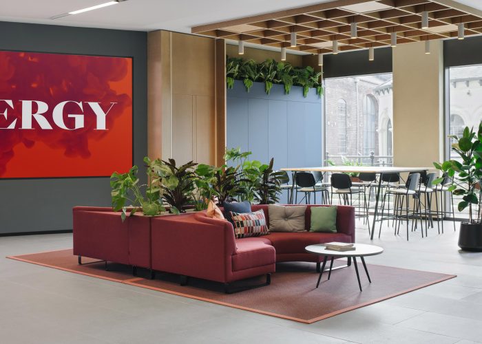
Visitors are greeted by a video wall and waiting lounge area with a high-table collaboration space beyond
“CEG specifically did not want us to create a flash, shiny, traditionally-corporate building arrival space” Sarah Dodsworth added. “The building arrival space had to be more nuanced, therefore, through clever arrangements and augmenting layers of interest. We sought to work respectfully with the beautiful brick crafted building, whilst creating something that was softer and more tactile and also telling a sustainable story by prioritising natural, renewable, low impact, reclaimed or high-recycled-content materials.”
Design Approach
The building’s architecture is celebrated and referenced through the ground floor’s ceiling forms and the bespoke, crafted joinery details that tie in with the wider building design. The architectural scallop form and detailing, featured on the façade and throughout the upper floor lift lobbies, is further integrated into bespoke joinery elements embracing the host point and café servery. A sense of attainable aspiration has been created through a select choice of considered quality, sustainable and innovative materials, cutting edge technology and bespoke artworks, with the aesthetic response building on the wider project influences, ensuring the ground floor space had meaning and was rooted in context.
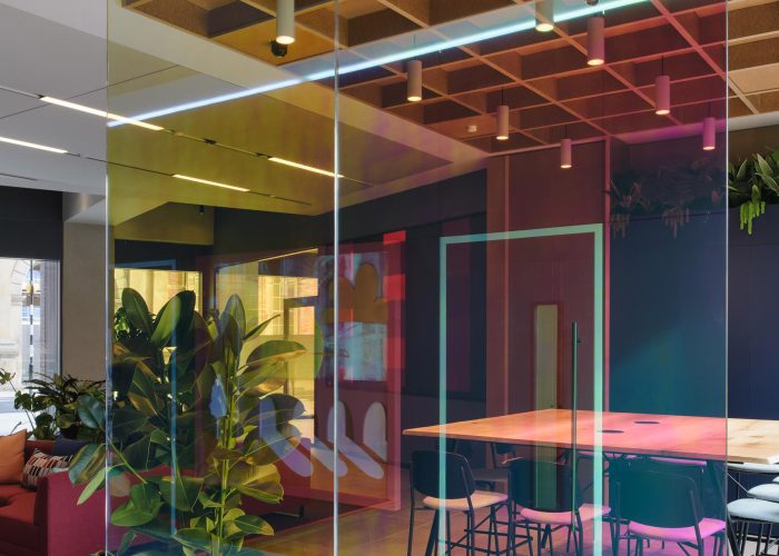
A strikingly effective diachroic film has been applied to the glazed feature screen
“For the ground floor amenity design” Sarah Dodsworth added, “we wanted to embrace and celebrate the dichotomy between the grainy, hard-industrial heritage of Holbeck and its progressive, digital future. The final scheme tells this story in a fusion of two kinds of materiality – the rustic and highly-sustainable, together with super-smooth and more obviously ‘designed’ elements, allowing the two strands to come together in a subtle, seamless and occasionally abstract way to celebrate people, craft, sustainability and technology.”
Design Walk-through
The design aesthetic and language transition and flex to respond to the various functions within the ground floor space, so that all areas work seamlessly, from the arrival space and host point to a meeting and co-working space, a café and a gathering and events space, all exuding an inviting atmosphere and a typically-Yorkshire sense of welcome.
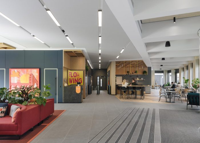
The scheme features a mix of natural and highly-tactile choices such as cork, timbers and textured clay wall renders
The ground floor spaces feel instantly comfortable and accessible to all through careful material choices, soft lighting and abundant planting. A mix of natural and highly tactile choices such as cork, timbers and textured clay wall renders are contrasted with the statement monolithic black cafe servery bar with pendant lighting above, allowing the transition from day to evening use. The scheme’s bespoke artwork pieces by artist Melody Sutherland further reflect and celebrate the grainy architectural richness of the area, referencing local landmarks synonymous with the post-industrial landscape of Leeds.
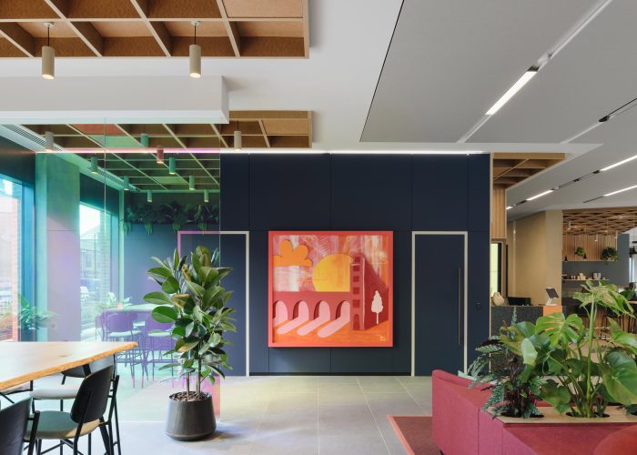
The scheme features three bespoke artworks by Melody Sutherland, celebraing the grainy architectural richness of the area
On entry, visitors are met by a discreetly-integrated host desk point and a huge-scale multi-screen video wall directly to the left, which creates opportunities for events and social gatherings. To the rear and away from public access is the scheme’s first tenant space – a 200 sq m workspace. Ahead of the arrival point lies a soft seating area for waiting visitors, plus a high-table collaboration space for ad-hoc meetings.
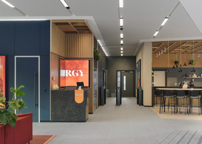
A discreetly-integrated host desk point is directly ahead on entry
The café space is the ground floor’s real focal point and brings people together within the space, offering a perfect opportunity to dwell. The large servery counter and bulkhead feature can be easily seen from the street outside, as this is a space as much for the wider Leeds community to embrace, as much as for users of the building, and is now open to the general public. The angularity of the building footprint influenced the monolithic form of the café’s servery counter, which sits adjacent to a purpose-built commercial grade kitchen. The food offer includes delicious homemade pasta and baked goods, with an additional beer and wine offering, further underpinning ambitions for this to become a neighbourhood evening and weekend venue.
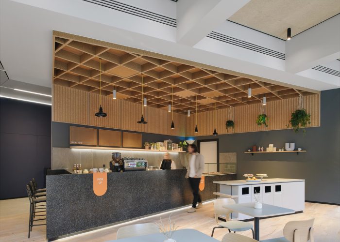
The focal point cafe, with Durat counters and feature bulkhead ceiling
The light-touch approach to the creation of ‘zones’ in the amenity space establishes a visual language with just enough variety; it was important that the fluidity and flexibility of the overall space wasn’t broken up by too much disparity, so that there is also a unity to the design. The visitor’s eye is immediately taken by the scheme’s stand-out joinery interventions, which include timber bulkheads drawing attention towards the servery, plus the host desk and co-working area. The application of cost-effective and sustainable fabrication materials formed in a simple square frame format delivers a unique design language here and the designers worked hard to integrate these more basic materials, including chipboard – a paperboard product made entirely from both pre-consumer and post-consumer recycled fiber – and cork, an inherently sustainable resource, which is both renewable and biodegradable.
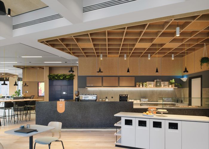
The cafe’s food offer includes delicious home-made pasta and baked goods, as well as a beer and wine offering
“Every design decision was interrogated through the process of crafting these bespoke installations” Sarah Dodsworth explained, “to address the ever-present functional requirements of this kind of commercial, communal space – including fire ratings, accessibility to ceiling voids and acoustic requirements, for example – in a considered and crafted way.”
The ’rustic’ and ‘high tech’ materiality blend can then be seen through the addition of strikingly slick acoustic ceiling panels from Kvadrat’s Soft Cell range, and the dark blue matte wall linings utilising the Fenix range by Arpa – both materials with EPD accreditation. The expressed coffered soffits in the café space are lined with Woodwool – a rigid board made of strands of straw, with great acoustic properties – whilst the internal perimeter walls feature a subtly beautiful and warm toned clay render from Clayworks, whose plasters are unique blends of unfired clays mixed with minerals and pigments to provide healthy, breathable finishes for internal walls and ceilings. Manufactured in Cornwall from abundant raw materials, these are amongst the most sustainable and healthy wall finishes available – recyclable, compostable, re-useable, and containing absolutely no toxic ingredients or VOCs.
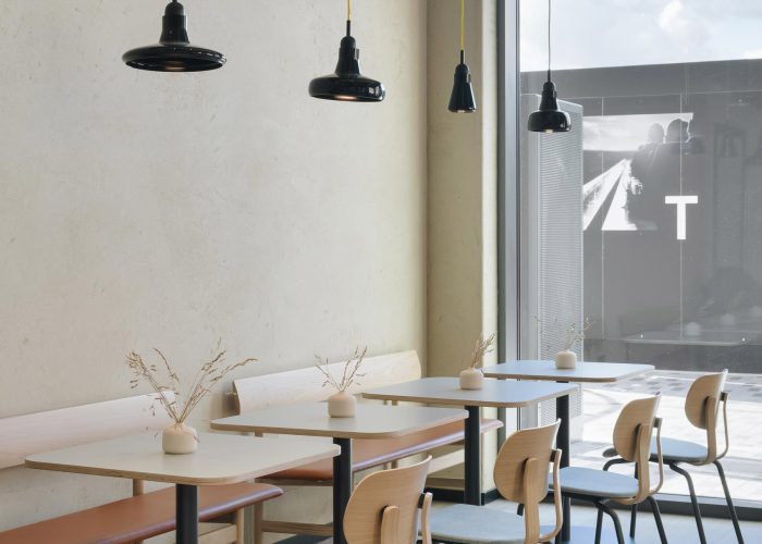
The cafe is easily visible to passers-by and is open to public use
The host point and café servery counters are formed of a solid surface material called Durat, made with recycled post-industrial plastics, including 30% recycled Acrylic and shimmering flecks of natural mineral pigments, with the café flooring a rustic, graded, engineered timber. Another element of the brief was to furnish the scheme with as many UK-manufactured products as possible, to celebrate British furniture design and manufacturing and minimising delivery distances and lead times. These include sofas from MARK in Cornwall; loose furniture from VG&P (Very Good & Proper) in Walthamstow and upholstery fabrics from Camira, based in Yorkshire and Bute. One rare exception is fabrics by Danish textile company Kvadrat, chosen for their high-performance quality and sustainable attributes.

The cafe counter sits adjacent to a purpose-built, commercial grade kitchen
Ekho Studio also developed the building’s signage and wayfinding elements, which saw the designers expressing their creativity through the application of playful materials and colours, including a strikingly effective diachroic film which is applied to a glazed feature screen and changes according to the rhythm of the natural light pouring in through the windows, with powder-coated metals and perforated peg board details throughout.
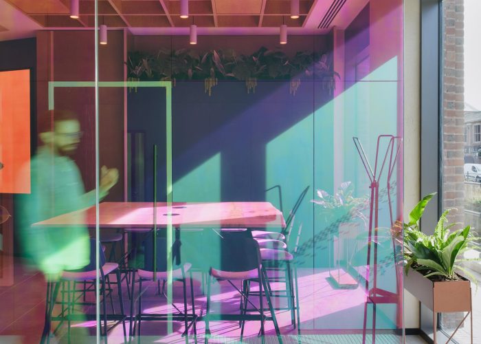
The colour of the screen changes according to the natural light that hits it throughout the day
“Our overall approach was one of considered contrast” Ekho Studio Interior Designer Kath Brookes commented. “The colour story and materiality really embody the story of the space in many ways. The scheme’s planting, for example, is housed in various styles of pots made from reclaimed whisky barrels, recycled metal pots and upcycled plastic bottles, which are subtle, but unique, whilst the scheme’s three bespoke artworks by Leeds artist Melody Sutherland are informed by the Temple area’s intriguing textures, with a layered treatment, set into 70-mm-deep timber frame boxes. The vivid colourways of the artworks – one in a pink and two predominantly blue and orange – were developed in tangent with the TEMPLE brand identity, created by Thompson Brand Partnership.”
The lighting in the scheme features semi-recessed spots from Artemide; recessed lights from Parc Industries in the ceiling’s NODE system which slots effortlessly between the Kvadrat Soft Cell panels, and which allows the building’s services to be designed holistically, with the additions of LED lighting strips and hand-blown Brokis pendant lights from the Shadow collection to define zones and add depth.
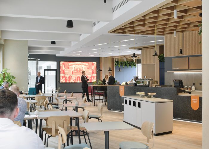
View back from the cafe towards the main entrance
Photographer: Tom Bird
