Elegant Clutter discuss the Bar & Restaurant Sector
Elegant Clutter fuses craft, design and technology to offer the broadest and most integrated artwork service in hospitality. A creative led approach is backed up by the ability to manufacture and install all artwork and mirror content, from high volume guest room projects to bespoke public area sculptures and original art. We spoke with Director Harry Pass about his team’s expertise in the bar and restaurant sector.
Use our hashtag to find more articles – #BarandRestaurant
What experience does Elegant Clutter have of working on artwork for bar or restaurant interiors?
Elegant Clutter started out by styling pubs with bric-a-brac and antiques. From 1990 onwards, most of the pub groups we supplied made a shift towards dining, eventually turning most pub groups into restaurant groups. These customers wanted to deliver a consistent experience within each brand, and we started to develop bespoke collections of art and accessories for the likes of Harvester, Bella Italia and All Bar One. These would be tested in a few sites before being rolled out nationally, sometimes leading to 8 independent teams installing every day. We took a very creative approach, treating everything as a piece of art, allowing us to grow our remit into signage, wallcoverings, lighting and furniture. The visual expression of brand personality became our business, otherwise known as Story Telling.
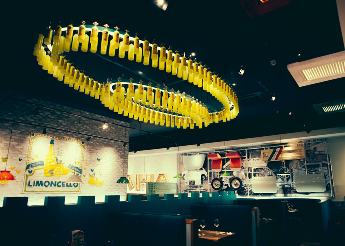
A mixed media approach on view at Bella Italia, Dudley. Interior Design by Keane, Image Credit: Elegant Clutter.
Meanwhile we had also launched into the Hospitality sector and became approved suppliers to large groups like Hilton, Accor and IHG. Our bespoke approach fitted well with the evolution from bars and restaurants being included merely as a necessary brand standard, to more significant investments in the F&B offer to make it something destination in its own right and a profit centre for the hotel.
Our more recent experience now also includes Art Consultancy work. This has allowed us to collaborate on international award winning projects such as Fritz Felix Restaurant of Brenners Park Hotel in Baden Baden, designed by Robert Angell Design International.
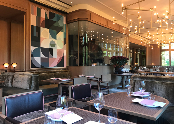
Original paintings at Fritz Felix Restaurant, Brenners Park Hotel & Spa, Baden Baden. Interior Design by Robert Angell Design International.
How can art impact on the success of a bar or restaurant?
Art can have a very positive impact on the success of a bar or restaurant. In a pure business sense, it can be a key marketing asset.
Often being the most unique element in an interior scheme, in simplest terms it can be the thing that people remember most about a space and can give a restaurant or bar it’s tone of voice. The right art can subtly enforce brand values through the clever use of colours in the pieces and/or choice of subject matter without it feeling forced or corporate.
It can make a space more photogenic which encourages people to share images on their social media. User generated content is becoming a key marketing strategy for most forward-thinking businesses and art can help drive this. The rise in recent years of the ‘Instagram wall’ is a great example of this tendency and is becoming commonplace in an art brief for bars and restaurants.
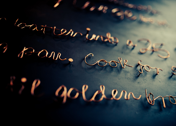
Pancake recipe replicated as an art installation at M Gallery, Cheltenham. Interior Design by Trevillion Interiors, Image Credit: Elegant Clutter
How can artwork be utilised to create a specific atmosphere in a bar or restaurant?
As the one element that serves no function beyond aesthetic, the role of art in a bar or restaurant is to bring emotion, give a space life and speaks of its story.
Art can be elegant, sophisticated and sit comfortably within a space as the finishing touch or perhaps be the crowning glory or focal point that elevates an environment. It can equally be a rebellious juxtaposition to the interior scheme that demands attention and provokes reactions.
What ever direction it takes, it is hugely influential in shaping the ambience and the conversation.
What are your key design considerations when creating artwork for bar or restaurant interior schemes?
Who, where, what, when and how much?
The target clientele has significant influence on what will be the most appropriate style of art and so is the central consideration when creating artwork for a bar or restaurant. We get to know the audience we are trying to connect with and the emotional response we want to achieve.
One of the other key design considerations is how the client will experience it – will the piece be front and centre the moment you walk in or is it tucked away to be discovered as a hidden gem when you visit the restrooms? How will multiple pieces flow through the restaurant or bar? In many ways, art can be a visual signpost that helps explain or define the function of a space – another way to connect the guest with the environment.
Practical considerations such as lighting and how it changes from day to night of course have a part to play. We work very closely with interior designers understanding colour schemes, materials and surfaces – sometimes subtly referencing the scheme in the art. But rest assured, whether it compliments, or clashes will be deliberate.
Art has limitless possibilities so understanding the scope gives the project its outline. We see budgets not as constraints but as frameworks that give structure and direction. A good art consultant will give careful consideration to budget allocation within a scheme, looking at this as a whole and getting the balance right determining which areas will have hero pieces and those that do a more supporting job.
Could you talk us through 3 examples of bars and restaurants you have created artwork for?
The Bistro at Hotel du Vin Brighton is a beautifully ornate room with antique fireplaces at either end which would typically be finished off with grand mirrors. Shelley Rainer of Suited ID asked us to develop something more unusual and treat these locations as gallery walls for modern art but with a quirky reference to the seaside location, which was the story we were asked to tell.
We developed a pair of artworks which feature illuminated high res photography of alluring figures swimming underwater. The frames were made with the top section missing, helping to create the surreal illusion of water inside a framed picture.
The artwork is designed to be edgy enough to be noticed and perhaps to raise a wry smile but not to distract from the luxurious finishes and classical atmosphere in the space.
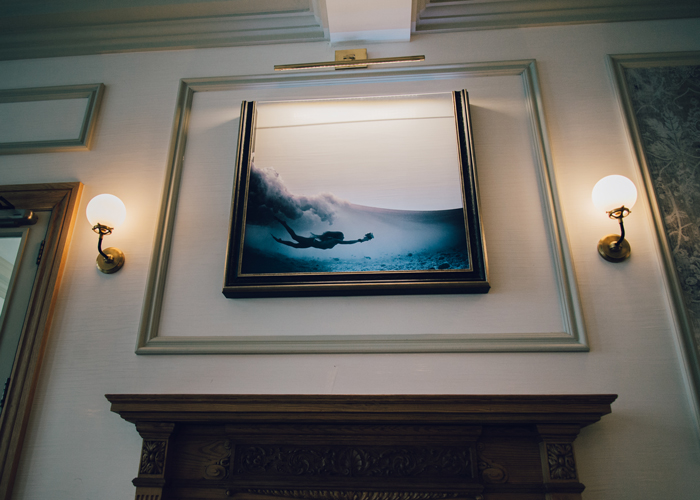
Making guests look twice at Hotel Du Vin Brighton. Interior by Suited ID, Image Credit: Elegant Clutter
The 25 Hours Hotel in Düsseldorf presented many opportunities to develop playful artwork concepts in conjunction with the Interior Designer Stylt Trampoli. Their creative vision was for a hotel with a French ‘mother’ and German ‘father’ and the restaurant space was briefed to show off the daring, artistic and creative joie de vivre of the French side of this partnership. It is not often that we are asked to paint oversized life drawing studies of nudes along all main walls of a 16th floor restaurant!
One of our in-house artists was a natural fit for the brief and following several rounds of sampling at scale, we went to site to paint the final layout directly to the wall. The wall covering surface was like artists canvas which was lovely to work on top of but did not leave any margin for error. This
was an unusual brief but one that we loved working on and has influenced our opinion on the scaling of artwork to create something that can be both a feature and a texture.
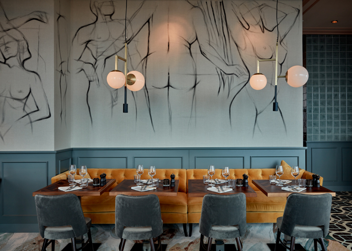
Hand-painted wall mural by Karolina Skowronska, 25 Hour Hotel, Düsseldorf. Interior Design and Image Credit: Stylt Trampoli.
Every Hard Rock Hotel around the globe has a unique Sessions restaurant and each one is designed to appeal to the local market as a destination restaurant as well as the space where hotel guests dine for breakfast. Interior Designer Lázaro Rosa-Violán created an upscale space for Budapest with a range of influences, most notably the local hand made ceramic tiles found on rooftops in the city.
This project required the services of Art Story, our in-house artwork consultancy and the whole collection was developed from a blank canvas. We worked with the brand, interior designer and local investor to create a layered artwork scheme that aims to capture the essence of the brand – where the guest is the Rock Star. The artwork scheme balances between two elements; firstly a series of iconic album covers that are layered with contemporary graphic illustration printed on the glazing and secondly, a “Look-at-me” neon artwork of a Tiger that is positioned above the DJ booth.
There are some wonderful examples of authentic neon signage in Budapest and we decided we would also work with the real thing as opposed to LED technologies. The tiger is caged behind a steel mesh and features the lyric ‘Love will tear us apart again’ by Joy Division.
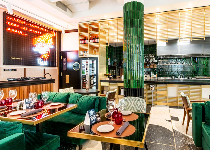
Sessions Restaurant, Hard Rock Hotel Budapest, Interior by Lázaro Rosa-Violán, Image Credit: Hirling Bálint – We Love Budapest
Contact Elegant Clutter through BCFA Product Finder
The BCFA Product Finder is a unique search engine created especially for interior designers to source contract furnishing companies. Utilising this platform will support your findings for upcoming projects, with over 200 members profiles showcasing the latest product launches, new materials available, industry news, and design trends.


Comments