Five Key Approaches to Wellbeing in Commercial Interior Design
Should every project look and feel fantastic? Of course – but long before we get to that Instagrammable moment, designers need to be thinking of wellbeing and incorporating wellbeing strategies into their process.

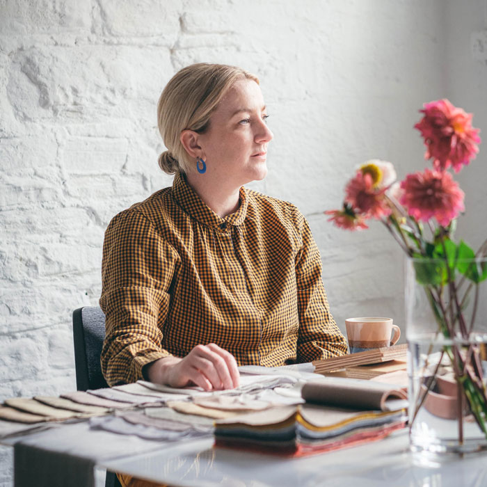
Rachel Withey, Founding Partner, Ekho Studio
Here’s our approach:
1 Creating Connection
Right at the beginning of any project, we consider the social aspects of any space, regardless of whether end-users are there for work, hospitality or residential amenity purposes (in a student or private residential scheme, for example). Wellbeing is partly about feelings of inclusion and human warmth, so we need to ensure space-plans and circulation allow for people to congregate, cluster, bump into others or purposefully collaborate.
2 Remember the Introverts!
When clients talk about spaces to be used for events, I always ask what those spaces will be used for at other times. Spaces that are too clunkily devoted to events such ‘pizza and beer evenings’, or anything too forced, are really playing to the extroverts and not taking wellbeing seriously enough. People with heightened sensitivities of any kind may well want to meet and collaborate, but not in an unnatural way, so ensuring these spaces are attractive for less self-conscious use is important too.
3 Seeing, Breathing, Hearing
Avoiding the stress that comes with low levels of daylight, poor air quality or terrible acoustics is incredibly important for user wellbeing, so these are hugely important elements to consider early on. Feeling as if you’re in a goldfish bowl and too visible to all, with no ability to create intimacy, or else sitting down for a coffee but being unable to hear whoever’s talking to you properly are surprisingly common occurrences. As a designer, you’re certainly looking to create a sense of welcome and intimacy within a space but without closing it off completely. This can be a very fine balance.
4 Colour and Wellbeing
A real cliché in designing for wellbeing is that colour palettes should be exclusively devoted to creating a feeling of calm. ‘Calm’ is absolutely not the be-all and end-all of wellbeing. Colours that energise can be just as important to make users feel good. You need areas that do both these things so that users can find the place that feels right for them in that moment. Where the floorplate doesn’t allow for such flexibility, you need to design settings that can flex instead, especially through lighting, using different settings to allow light to interplay with colour at different times of the day, for example.
5 Ergonomics and Texture
Everything that needs to exist in order to de-stress a user should be considered in an interiors scheme, from chairs that support your spine to tactile textures that comfort and welcome you or light you can both work or bathe in. All these elements should form part of a scheme by any designer worth their salt, without the user needing to know or understand the selection processes behind them. All the user needs to do is to use and feel the result of these processes. The best wellbeing elements are always instinctive.
By Rachel Withey, Founding Partner, Ekho Studio


