Five Workspace Design Show Highlights
Yesterday we spent the day at Workspace Design Show at Business Design Centre, Islington, an event which aims to bring together the UK’s workplace interiors community to explore the experience of tomorrow’s workspaces.
We thoroughly enjoyed meeting suppliers, building relationships with existing contacts and discovering new conversations and products. We’ve brought together our top 5 highlights:
1: Empathetic Workplace Design
We joined the audience for the last seminar of the event, a conversation between Steve Brewer and Mbali Chaise, led by Vanessa Champion. The trio discussed how empathetic workplace design can promote positive employee wellbeing.
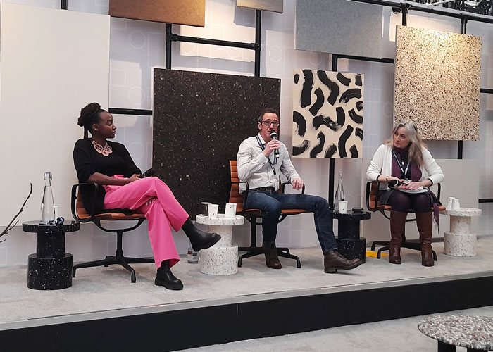
We took plenty of notes but in brief here are our key take aways for designers:
1. Take time to know and understand the individual users of the workspace. This is at the core of crafting successfully empathetic workspaces and positive employee wellbeing.
2. Choice and ‘tailorism’ is what users are looking for, they crave control over the spaces they are using. A true diversity of spaces enables users to select working environments which are best for them at any given time.
3. Consider the impact of each environment on neighbouring users. Cohesively zone spaces, with grey areas to allow for flexibility, this ensures that a user’s impact on their colleagues has been taken into consideration.
4. For ‘choice’ to succeed there must be a culture of trust, enabling users to utilise spaces without fear of judgement especially in relation to perceived lack of productivity.
The conversation also considered the designing with the senses in mind and biophilia within workplace design.
2: Attention to Detail
There has been much discussion on how to design a workspace which enables all employees to thrive and how the inclusion of a variety of spaces can facilitate this. Free standing workspaces, as well as work pods, have been launched by leading brands for several years and are components designers can integrate within their schemes in order to deliver productive and happy workplaces.
Mute showcased a preview of OmniRoom, a freestanding workspace system where every element has been considered. What sets this system apart from the competition, attention to detail!
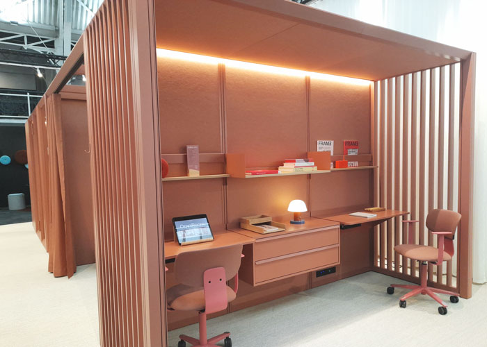
In order to facilitate an ever changing and mobile workplace OmniRoom is fully reconfigurable without the use of a single tool or instruction manual. Each meter or half meter unit is digitally ventilated, can include lighting and can be fitted out with a full accessories package. Accessories are space-saving, positioned on a subtle grid frame and easily moved or adjusted.
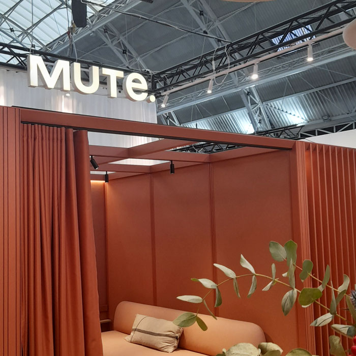
Mute extended their exquisite attention to detail to include not only their sustainable material selection but also to perfect their colour matching. All elements can be colour matched, including materials provided by external suppliers such as Gabrielle for textiles, but also for free standing furniture suppliers who are able to exactly match the colour for their pieces.
3: Sustainable Space
Design Insider Ambassador M Moser created a haven away from the exhibition bustle in the form of a bar and lounge; the bar an area of excitement and flux and the lounge offering a space for rest and recharge.
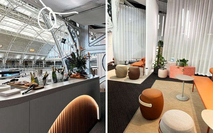
The lounge offered particularly inviting pockets of space, cloaked in sheer curtains, ideal for a calm moment to gather our thoughts.
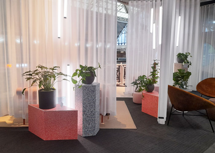
M Moser’s brief was to design a sustainable space with the concept of reducing environmental impact through repurposing, recycling and reusing material. To bring their vision to life, the design team collaborated with some of their partners, including:
Edward Williams built the statement bar using leftover materials from other projects. The design team visited its workshop to determine which materials best suited the theme. The bar front also featured spare fabric tubes from Camira.
Silent Gliss provided a fabric made from pre-consumer waste, to create partioning throughout the space.
Flokk loaned their furniture for the lounge side. Each piece crafted sustainably with its own unique identity and story.
Bolon loaned sustainably crafted rugs for the lounge area.
Current Affairs (CA) supplied the lighting, which included a feature light above the bar. CA will repurpose the lights for future client projects.
Finally, Planteria provided planting to decorate the space and repurpose it for future projects.
The bar design reinforces M Moser’s climate mission to build to net zero. By working with their partners and peers to design and build responsibly and to help reduce waste.
4: Sustainable Approach & Colour Perfection
Woven Image’s stand delivered colour palette perfection, drawing together every tone from the sectors most current colour scheme. The brand are colour specialists and showcased their selection with the newly launched acoustic 3D Fuji tiles which can be used as ceiling or suspended tiles including the option of integrated lighting.
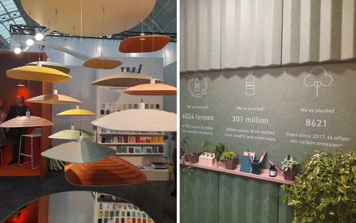
Fuji is the latest product which demonstrates Woven Image’s commitment to addressing their environmental legacy.
‘Since our inception and well before it became a global necessity, sustainable design and manufacturing has been part of our DNA. It’s who we are, not simply what we do.’
Woven Image pioneered the production of high-performance acoustic finishes and textiles using recycled materials, predominately post-consumer PET plastic, making a direct contribution towards achieving a circular economy. With 275 million tonnes of plastic waste generated globally each year, Woven Image is proving that PET waste can be successfully upcycled into a value-added resource that meets growing market demand for acoustic finishes.
5: Mobile Screening
Stansons have taken their screening expertise, their in-depth understanding of dividing spaces and how these zoned spaces can best serve their users, to launch a beautifully resolved mobile wooden screen which incorporates storage, media and planting.
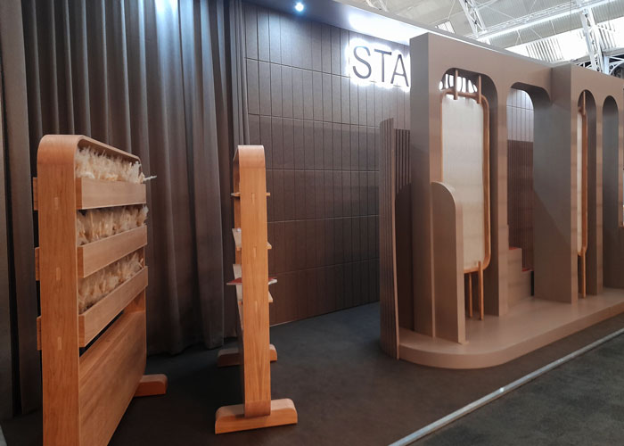
We would be thrilled to hear about your event highlights, please leave a comment below, and if we missed you product launch pop in a link for us all to learn more.



Comments
‘Choice and ‘tailorism’ is what users are looking for, they crave control over the spaces they are using’
Absolutely, we’re finding demand for mobile solutions that empower teams to shape their own spaces are what our customers are looking for. In case you missed us at the show – we design and make ThinkingWall, a range of mobile walls with whiteboard,acoustic, digital connectivity and storage.