


Illuminating Design: Nordlux’s Lone Pedersen on the Power of Colour in Lighting
As part of Design Insider’s colour campaign, we had the pleasure of speaking with Lone Pedersen, Product Manager for Design For The People and Nordlux Decorative. Nordlux, known for its mission to enhance quality of life through innovative lighting design, collaborates with leading contemporary designers to create functional, timeless lighting solutions.
In this interview, Lone shares insights into her role, Nordlux’s design philosophy, and how colour influences their approach to lighting. From the inspiration drawn from the Northern Lights to the impact of light quality on mood and atmosphere, Lone discusses the evolving role of colour in lighting design and what the future holds.

To begin, could you please introduce yourself and provide us with a brief overview of your role as a lighting designer at Nordlux? Additionally, could you share some insights into the Nordlux brand and its approach to lighting design?
My name is Lone Pedersen and I’m the Product Manager for Design For The People and Nordlux Decorative. I’m responsible for the design process from A-Z – among other things making briefs for our designers, seeking new design inspiration, product development, supplier contact and many other cutting surfaces.
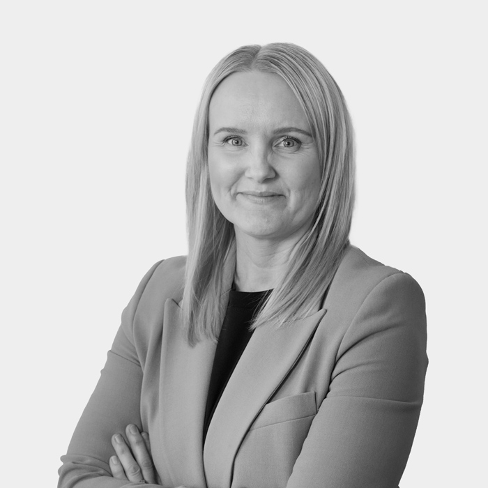
Lone Pedersen, Product Manager for Design For The People and Nordlux Decorative
At Nordlux our vision is “Lifting people’s quality of life with light” and our mission is to “create products you want to bring home”. This describes the way we approach lighting design. Together with contemporary Danish designers we strive, collection by collection, to create the best design and most functional light, with new perspectives on the Danish design tradition. We aim to create timeless lighting that people will value more and more as time goes by. We want our designs to be the fruits of innovative thinking that enhance our lives and the spaces surrounding us.
Given Nordlux’s Danish background and proximity to the Northern Lights, could you share whether this natural phenomenon has inspired your work with coloured lighting? Do you see any parallels between natural coloured light displays and your design approach?
In Denmark, and Scandinavia in general, we have always been fascinated by light because we have so many dark months of the year. For us light equals “hygge” which is word that describes a cozy, contented mood evoked by comfort and conviviality.
Just like the natural Northern Lights I would say I am directly inspiration by natures beauty when developing our products not only by the colours but also the materials shapes and the experience light can have on a space.
When we talk about light quality, how important is colour to achieving the desired effect? Could you elaborate on how different colours of light impact the overall experience of a space?
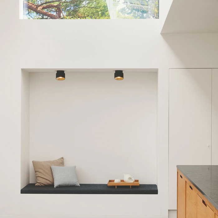
Light quality and especially colour (Kelvin temperature – “K”) is a very important factor in every room/space. The wrong light can have a huge impact on how we perceive the room and how we feel being in the room.
1000K like light from a candle
2700-3000K warm white light
6000-7000K resembles daylight
10.000K Clear blue sky
Having a cool bright light can make a room feel more open/ bigger whereas warmer dimmer light creates a sense of intimacy and enclosure. Its also important to match the right colour light to other features within the room, having a wrong colour light can obscure how we see other colours such as soft furnishing and chosen wall colours meaning over all it will have a huge effect on the final desired look.
Coloured light can significantly alter the atmosphere and mood of a room. How do you approach the use of coloured lighting to create specific moods or atmospheres in both commercial settings? (please give 3 specific examples)
Light affects how our brain works and if we feel fresh and ready or tired and relaxed. Light temperature can also influence our Circadian rhythms and exposing the eyes to blue light during the sensitive periods can suppress melatonin and shift our circadian rhythms. Having a cooler and close to daylight setting in a work environment is perfect, it will boost our mood, keep us alert and clear minded.
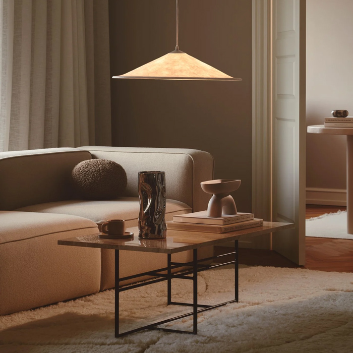
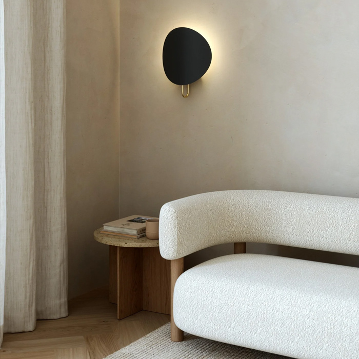
In other situations, the cool blue-ish light would create a completely wrong experience. For example, wanting to relax in a hotel room or enjoying a drink at a bar. If the light is bright, and a cold kelvin temperature this would not feel comfortable and would have an opposing effect on the desired atmosphere. For this a warmer Kelvin temperature with a dimming function would be more suitable as our photoreceptors minimally respond to yellow and orange light which will not disturb our melatonin levels and keep us feeling relaxed.
Morning: Soft light for waking up – 2000K-2700K
During the day: Light for working and undergoing functional tasks – 3000K – 4000K
Evening: Cozy and more relaxed – 2000K-2700K and maybe also dimmed light.
The casing materials used in lighting fixtures often have their own colour and finish, which can influence the light output. How do you select colours and materials for lighting casings to complement or enhance the light quality?
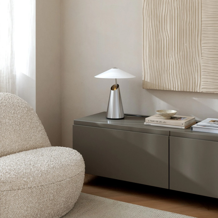
Personally, I really like working with opal glass. I can’t think of a material that gives a better light diffusion and glare free effect with a beautiful smooth colour. I also really like Fabric shades in a natural tone to soften the light output.
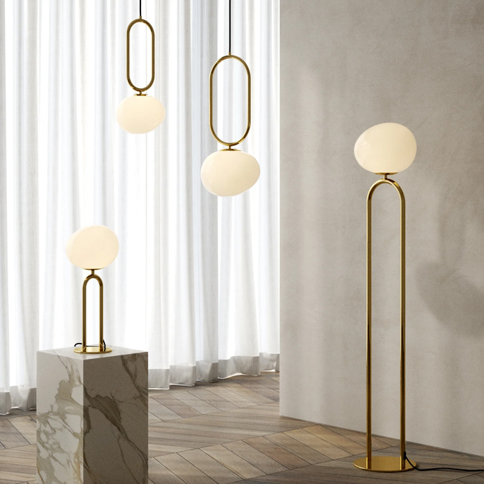
We also do a lot of designs in metal, and we always think about the reflection of the light and that is why we always paint the inside colour of the shades white as this will keep the coloured light most exact and true to form with our distracting the design on the exterior of the shade.
What are some of the current trends in lighting design concerning colour? Are there any particular colours or colour combinations that are becoming increasingly popular in modern lighting design?
I have found matt warm earthy neutral colours are remining a constant and a staple in Danish design however we are now elevating this by mixing materials textures and tones together.
More recent trends I have also seen are the pops of dynamic bold colours such as rich reds and cobalt blues. We are also seeing the cooler metals such as steel and chrome making a come back after brass was a popular option for so long.
From your perspective, what role does colour play in the future of lighting design? Do you foresee any innovations or shifts in how colour will be used to enhance lighting in the coming years?
I think the possibilities for colour in lighting are endless. Lighting isn’t just a functional element to me; it is a design staple and can be an art piece in itself, and as colour trends develop lighting will always adapt weather it’s in a biophilic inspired workspace or a maximalist coffee shop. We can also see the constant development in technology now which has made lighting much more personal for the consumers desires in creating the perfect impact on a space.
Unfortunately, most people still don’t know the importance of light and how it can affect us. I hope in time we can help with the enlightenment on that topic.
Find Nordlux on Supplier Finder
Supplier Finder is the UK’s only search platform for accredited suppliers of commercial interior furnishings.
At Supplier Finder, our mission is simple: to help you find the perfect commercial furnishing suppliers for your interior schemes and projects. We understand the importance of having confidence in the suppliers you specify and the products that bring your designs to life. That’s why each supplier featured on our platform is accredited through Commercial Interiors UK’s rigorous membership application process. This ensures that you engage with only the best in the industry!