Natasha Marshall on the Power of Colour in Interior Design
In our summer celebration of colour, Design Insider is thrilled to feature Natasha Marshall, a very well respected London-based designer and artist known for her expertise in colour, texture, and pattern. With a career spanning over 30 years, Natasha’s journey from running her own interiors brand to becoming a sought-after specialist in residential and hospitality projects is inspiring.
In our conversation, we explore the pivotal role colour plays in Natasha’s design philosophy, learn how she transforms spaces with tailored colour palettes, and uncover her unique approach to guiding clients who may initially resist the use of colour in their interiors.

Natasha Marshall, Designer & Artist
Could you please introduce yourself and share a bit about your background in design and art, particularly your experience as a London-based designer and artist known for your use of colour, texture, and pattern?
Hi I am Natasha Marshall and I am a colour and textiles specialist. I am a trained Textile Designer with a BA Honours Degree in Printed and Knitted Textiles from Glasgow School of Art. I ran my own interiors textile and wallpaper brand and ghost-design studio for over 20 years, before specialising in colour and textiles for interiors in 2018. I moved back to London from Glasgow in 2020. I work with clients on residential and hotel projects, with my focus on the use of colour, pattern, textures and textiles being used on the projects. My work is usually involves collaborating with the project architects and client.
What inspired you to pursue a career in design, and how did your journey begin, especially considering your experience as a ‘ghost designer’ for leading fabric and wallpaper brands?
I have since a very young age been fascinated by architecture and design. In London I grew up seeing Robin Webster building their family home, before they moved back to Scotland. I then went onto study in Glasgow and loved the city, so made it my home after art school.
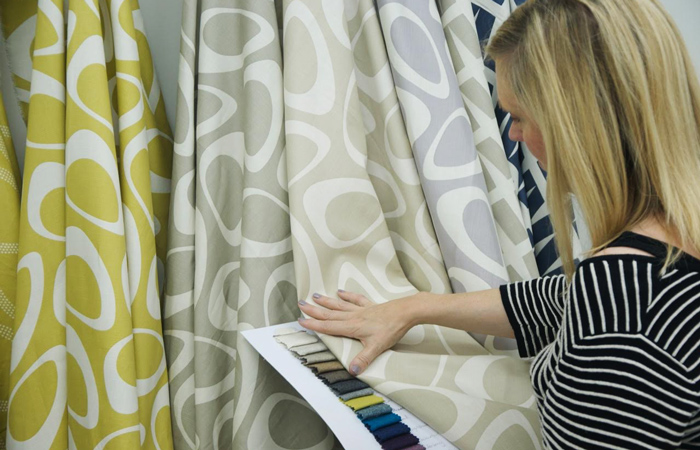
Printing Plectrum Design
I hadn’t found a job in Glasgow so I set up on my own in 1997 a year after graduation with financial help from The Princes Trust, Craft Scotland and Glasgow City Council. Initially hand-printing orders before moving to bulk production with UK mills which we stocked and sold worldwide. Due to the success of our own products we were contacted by brands and mills to be a Ghost Design studio. We worked with many of the worlds leading interior fabric and wallpaper brands.
How would you describe your design philosophy and approach to incorporating colour, texture, and pattern into your projects, given your ability to understand the effect of these elements on people?
I grew up loving houses that used pattern, colour, textiles and art. I remember my first bedroom I chose a print called Emma from Laura Ashley.
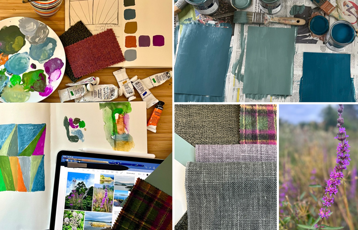
Capturing colour from nature
I like to use the surrounding landscape for my colour inspiration, so you bring the outside in. By interviewing clients I bring the right colour and patterns into the interiors, that they personally love, which really uplifts an interior and their well-being. Bringing fabric and texture into interiors brings a softness and individuality to the space and changes the acoustics.
Can you share a memorable project where the use of colour played a significant role in transforming the space, such as your award-winning studio and home projects in Glasgow?
My most memorable projects are developing my original studio and home in Glasgow from disused buildings. The interiors included lots of my printed patterned fabrics, block colour and lots of white. These were award winning projects. These were amazing architectural spaces to live and work in.
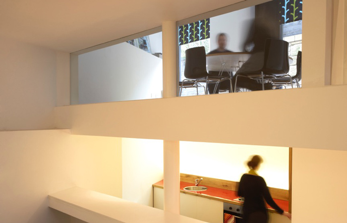
The Printworks Design Studio
Nowadays I often use more colour on the walls, but it is not about using strong colour. It is creating a colour palette that works for the space, links to the architectural details, so it flows from room to room.
How do you engage clients who initially think they don’t like or need colour in their spaces, and how do you help them discover the colours they love?
I explain that I need to get into their heads to understand what they love and don’t like. By asking questions this opens peoples thoughts up.
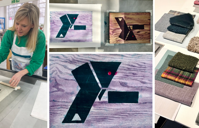
Mokulito printing using client colours
If it is a painting, piece of artwork or the surrounding landscape I then start to create a colour palette around this. I select fabric samples, I mono-print with the colours to explore the % mix of colour. Then often move on and Mokulito print with the architectural plans and colours so we start to have creative fun with pattern and colour.
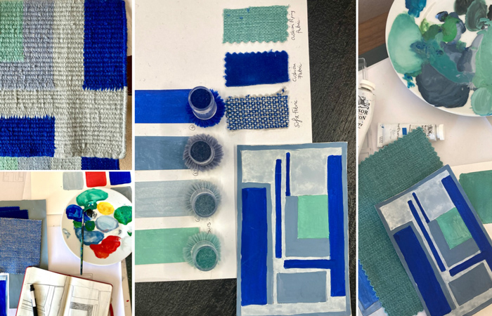
Designing bespoke patterns for clients
By seeing this visual journey, clients start to engage in what is needed on a Project, as colour doesn’t have to mean strong colour, it is about creating a palette that is right for them.
Could you explain the importance of sampling and testing colours, fabrics, and textures in the actual space, and how lighting affects colour perception, given your extensive knowledge of the qualities of fabric?
For wall colours they have to be painted on sheets with two coats to see the actual colour, not just chosen from shade cards.
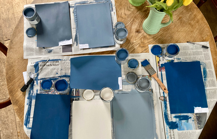
Choosing paint colours
I would then always say that they need to be viewed day and night in the actual space ideally, as colour can have a very different effect than you imagined. Fabrics are equally important as the textures and scale of patterns really depend on the overall space. Like with using colour, patterns do not need to feel overpowering. I feel a good use of pattern and colour should feel timeless and just enhance the architectural space.
What are some common challenges you face when working with colour and pattern, and how do you overcome them to ensure the final design is both uplifting and timeless?
The biggest challenge is clients not having a pre-conceived idea of what they they want.
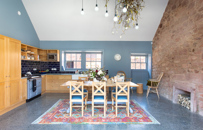
The kitchen at Papple Steading Hotel
By working with them I get into their heads and work out what they do want. You need to have a feel for the architectural space and naturally have an eye for what works. At Papple Steading a hotel project near Edinburgh I worked with the architect and client to inject the vision of colour and individuality the client really wanted for the property.
You need to be able to imagine yourself in the finished space, so the time spent in rooms for meetings or studying the architectural plans and models before the final decisions are made are always so useful to me.
In your experience, how does the right use of colour, texture, and pattern influence the mood and atmosphere of a space, and what impact does this have on the overall design?
Colour and pattern gives the project individuality.
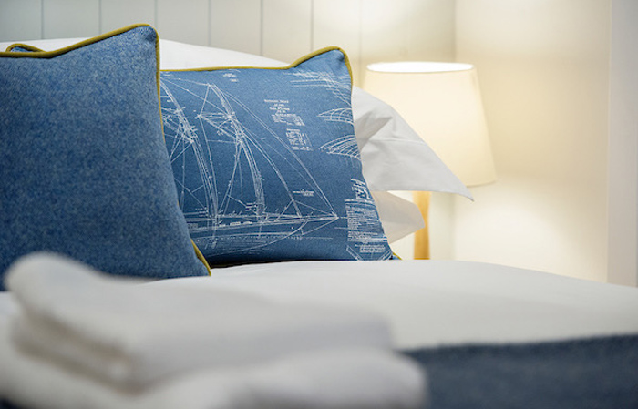
Salt Lodge Hotel, Troon
The Salt Lodge Hotel I worked on in Troon is a perfect way to see how the use of colour, texture and pattern create a luxurious relaxed nautical feel. By making the right choices you insure a seamless flow from room to room and link to the architecture and surrounding area.
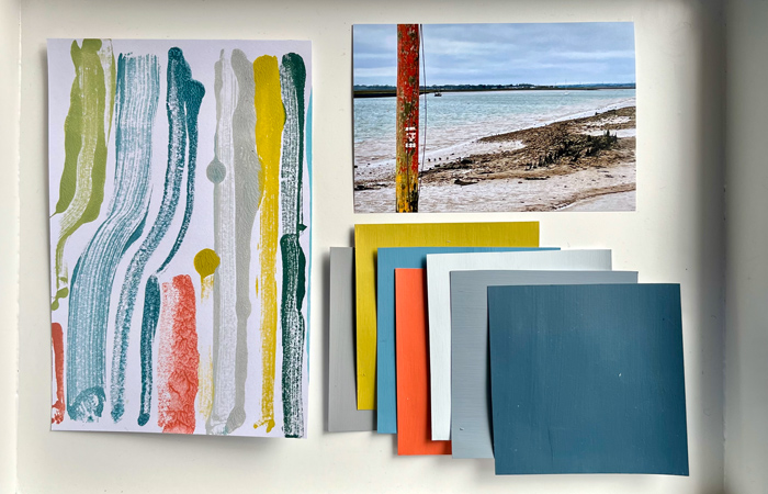
Creating a restaurant colour palette
Colour and pattern create uplifting spaces that inspire peoples lives and happiness. Many of my projects use colour from their surrounding area and I believe by consciously living with the seasons, colours in our interiors bring a deeper connection to natures rhythms.
Can you give an example of a project where you felt the use of colour and pattern was exceptionally successful and truly transformed the space?
One of the first projects when I moved to London I worked with a client who had a white architectural-award winning home that they did not love or even like.
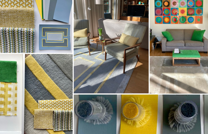
Colour, pattern and bespoke client work
By creating a colour palette, choosing key fabrics, patterns and making bespoke interior items the house was transformed into their home. By using the colours and textiles they loved, I created an interior space that they now enjoy. Once you get the basics right you can add in the artwork and key items they love to have around them, this then lets the client create a timeless personalised interior haven.
Looking ahead, how do you see the role of colour, texture, and pattern evolving in design, and what future trends do you anticipate will shape the industry?
Clients are starting to see the importance of colour and textiles for aesthetic and acoustic reasons. Looking ahead I see the Collaboration of individual specialists on projects becoming more common rather than all being employees of a single company. Individuality is key to the success of creating a beautiful home, restaurant or hotel and a vital part of this is which colours, textures and patterns to use, brought in by those specialists.
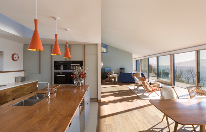
Choosing colours for interiors
The right look is created by the full design team and client collaboration from the start. People are now realising the importance of colour and how this is linked to their well-being, I see this trend continuing.
I am a trained textile designer, with 30 years in the industry and my usp is my use of colour and textile knowledge. I love empowering clients, changing their relationship to colour and choices of materials. At all stages asking the questions what they love and alongside considering our planet, linking the design process of what we use and where it is sourced, so full circle linking to their values. Through good design choices together we are creating a sustainable future.


