Nulty: Lighting Up 80 NEW BOND STREET!
Nulty’s lighting scheme for the newly refurbished 80 New Bond Street development focuses on a seamless blend of architecture and light.
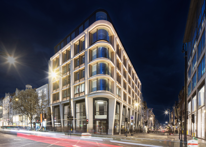
International lighting design consultancy Nulty has produced an elegant lighting scheme for 80 New Bond Street, a flagship dual-frontage development from global real estate firm Hines, situated moments away from London’s renowned Oxford Street retail district.
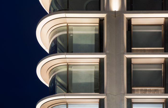
Nulty worked in close collaboration with design lead Orms to integrate light within the architecture to produce a seamless visual aesthetic. A focus on considered use of hierarchy and contrast activates the façade after dark and cements the building as a point of orientation for the area, while creative use of light within the interior adds depth and drama to ensure a lasting first impression.
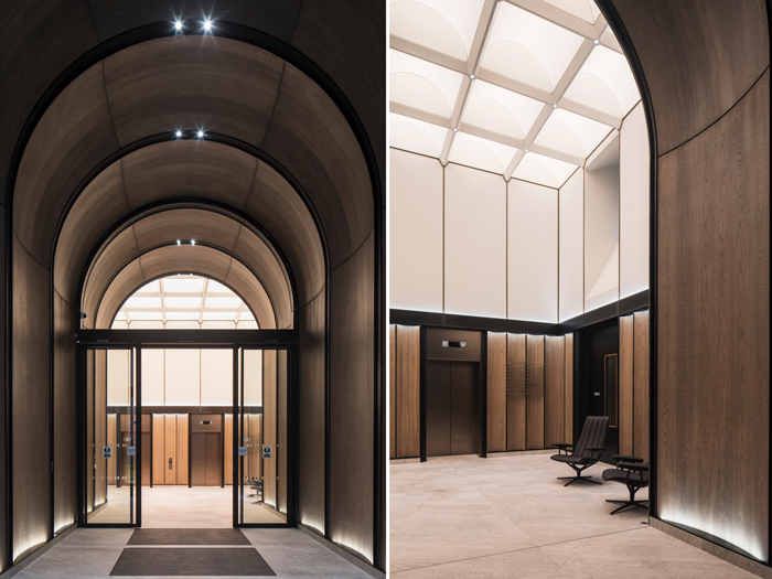
One of the standout features of the newly refurbished building is the entrance to The Burlian, 80 New Bond Street’s new high-end workplace proposition. An arched doorway of green stone frames the threshold and reveals a striking walkway lined with wood panels and bronze-finished archways.
Here, an emphasis on concealed lighting elevates the materiality whilst minimising visual impact. Discreet spotlights were embedded in the arches to form a soft layer of light overhead and supplemented by a wash of light along the oak panelling that complements the curvature of the wood and forms a run of warmth into the reception.
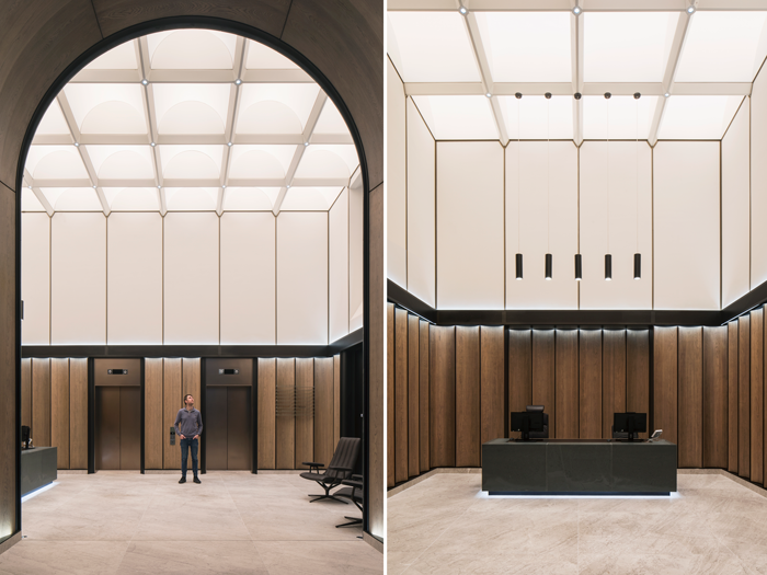
The simplicity of the double-height reception that follows allows the gaze to be drawn upwards to a spectacular backlit vaulted ceiling. Seamlessly engineered to ensure that the architecture and lighting design are in constant dialogue, the ceiling comprises 24 LED modules that work harmoniously as one single composition of light. The system features tuneable white light, which simulates daylight by transitioning through warm and cool colour temperatures throughout the day.
Whilst the structure of the ceiling is primarily rectilinear, the vaulted soffit is curved due to way that the backlit fabric is deftly tapered across each segment. This detail creates a deliberately nuanced quality of light that emulates the effect of daylight.
The juxtaposition of smooth and straight lines continues elsewhere in the reception, where indirect lighting frames an architectural wall detail and emphasises the contrasting wall surfaces on either side. A stone reception desk is the scheme’s only other focal point and is subtly accentuated by a gentle line of light beneath and a cluster of pendants above that direct functional illumination onto the workstation.
The overall lit effect of the façade elevates the prominence of the building after dark and draws out the architectural features that would otherwise disappear in the darkness. A combination of in-ground uplights and downlights enhance the lower proportion of the building, washing light onto the stone and directing the eye to the architectural columns. Further up, uplights illuminate the window reliefs to form a rhythmic play of light and highlight the fluted balconies to add further visual interest.
Lighting has been carefully integrated across the entire façade to prevent light spill beyond the architecture.
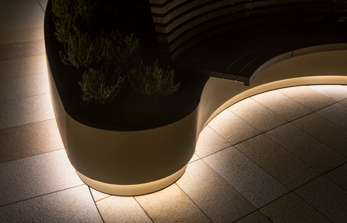
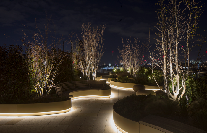
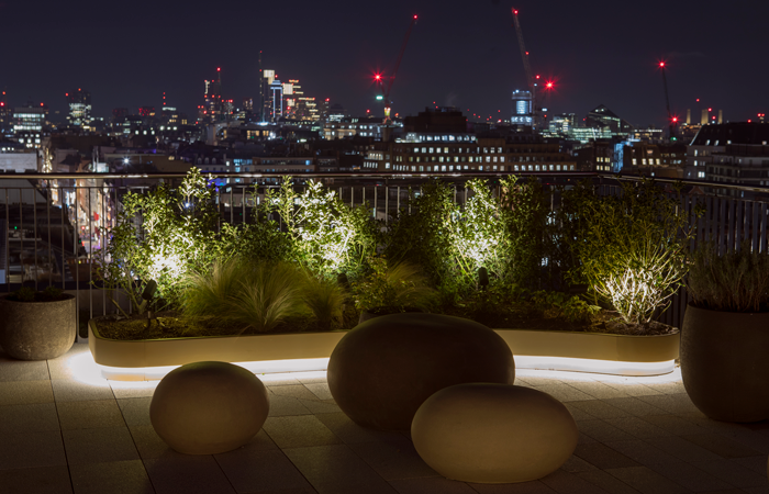
Upstairs on the communal roof terrace, light fixtures were installed below the balcony sightline to preserve the views across London. Low level spike lighting accents the miniature trees and greenery, and an integrated skirting detail frames the planting to emit a functional glow along the pathways.


