Personal Narratives in Design: An Inside Look at Wow!House 2024
Last week in Clerkenwell, the UK’s London hub for commercial interior furnishing suppliers, we listened to many conversations focused on the lines between commercial subsectors including hospitality, workplace, and residential becoming increasingly faded.
Design Centre Chelsea Harbour, renowned for housing the UK’s leading high-end furnishing suppliers, primarily serves professional designers and architects working on prestigious residential projects, as well as design enthusiasts seeking inspiration for their homes. With over 130 showrooms and more than 600 international brands, many of these suppliers also cater to the commercial sector, attracting a growing number of commercial interior designers.
Today, we see not only a crossover between commercial sectors but also a convergence of residential and commercial projects.
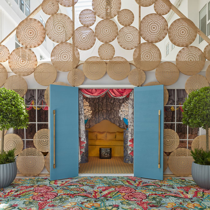
Mamou Mani facade. Photograph By James McDonald
Running from 4 June to 4 July 2024, the award-winning Wow!House is located within the Design Avenue at Design Centre Chelsea Harbour. This unique showhouse spans 500 sq m, featuring 19 full-size rooms and outdoor spaces. Each space is uniquely designed by world-class interior designers, collaborating with globally recognized brands and top-tier suppliers.
Claire German, CEO of Design Centre, Chelsea Harbour, says:
“Our goal is to pioneer a sense of wonder; to amaze and inspire by showing the world what extraordinary achievements can be made when our talented industry comes together in such an ambitious and exceptional way.”
Design Insider visited Wow!House to unearth design passion, inspiration, and concepts that seamlessly integrate into both residential and commercial settings. In this article we showcase the 6 rooms which caught our eye, for their interior decoration, but also because of the personal narratives imbued into the spaces by the designers.
Zoffany Entrance Hall by Benedict Foley:
Multidisciplinary creative Benedict Foley, celebrated for his work across interiors, design, and art, brings a narrative and emotive approach to his projects. For Zoffany’s entrance hall, Benedict drew inspiration from the 1963 film “The Leopard” by Luchino Visconti, specifically its grand ballroom scene. His design aims to capture the fluid volumes and elegant shapes that glide across the ballroom floor.
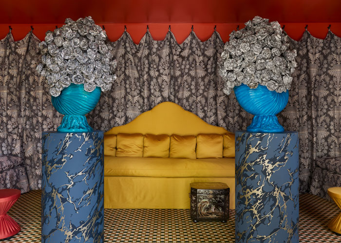
Zoffany Entrance Hall by Benedict Foley. Photograph by James McDonald
Emphasizing UK-produced textiles, Benedict underscores the importance of preserving heritage production skills to ensure the future of manufacturing. In collaboration with Peter Gomez, Zoffany’s Head of Design, he selected Suffolk Damask for the wall drapery and central upholstery. This 18th-century design was rediscovered beneath layers of wallcoverings at Temple Newsam in Leeds. The Long Gallery design has been revitalized in a wool and cotton fabric, as part of the SS24 launch for Suffolk Damasks & Stripes. This woven, multicoloured jacquard, inspired by tapestry techniques, blends natural yarns to create a contemporary yet historically rooted textile.
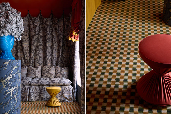
Following the Wow!House event, in an exciting partnership with the Queen Elizabeth Scholarship Trust (QEST), these fabrics will be repurposed and reinterpreted by a new generation of craftspeople. The textiles from the Zoffany WOW!house entrance hall will be unveiled in a fresh guise at the Second Life Exhibition this autumn.
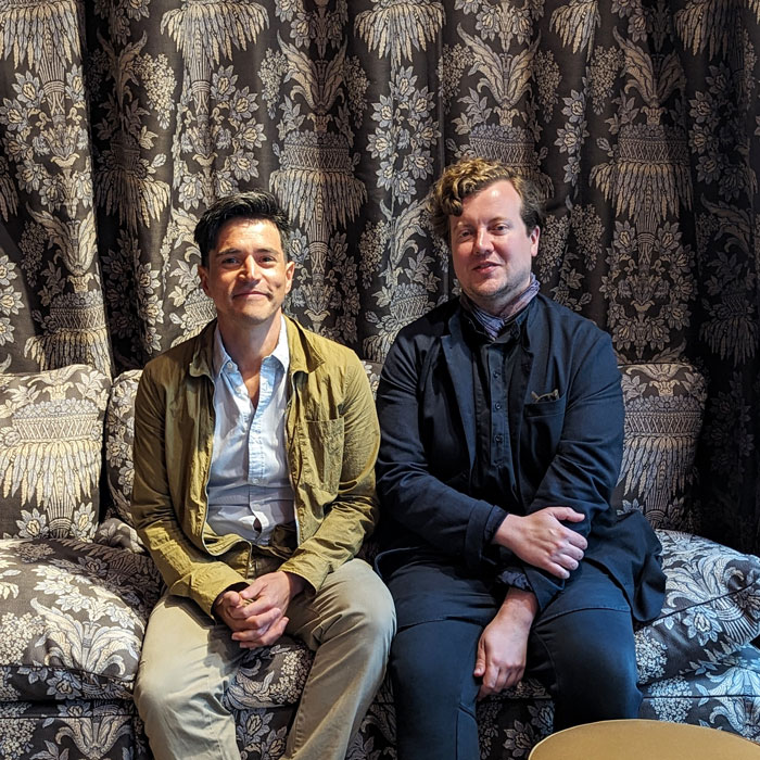
Peter Gomez, Head of Design at Zoffany with Benedict Foley
Benedict’s work not only tells the story of these UK-produced textiles but also sets the stage for their continued journey, blending past and future in a seamless narrative.
Watts 1874 Legend Room by Alidad:
Watts 1874, the iconic family-owned company, is celebrating its 150th anniversary with a stunning tribute by the world-renowned designer Alidad Mahloudji, known for his unparalleled eye for antiques and textiles.
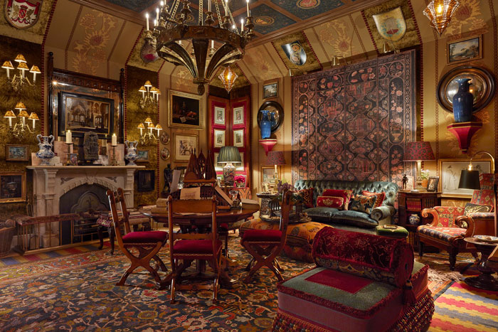
Watts 1874 Legend Room by Alidad. Photograph by James McDonald
Alidad’s meticulous research into the family history enabled him to design a space that represents Watts 1874’s rich legacy. His intention was to utilize as many fabrics as possible within this celebratory room, ensuring they all harmonize perfectly. By layering textiles, furniture, and intricate details, Alidad tells the story of Watts 1874’s past and present.
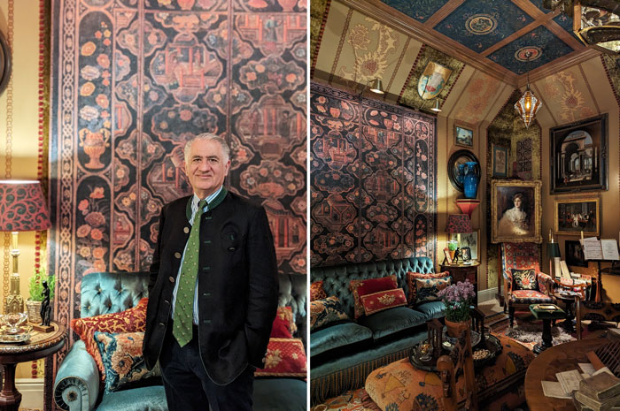
Alidad Mahloudji
Determined to create an exceptional space, Alidad raised the ceiling height, an architectural change vital for crafting a private haven for his proposed client, Sir Gilbert Scott—a space where he could eat, sleep, and live.
The design journey began with the selection of Malvern for the walling, a large-scale Renaissance design redrawn in 1889 by G.F. Bodley, pioneering architect and co-founder of Watts 1874. This design features stylized thistle flowers twining upwards. Additionally, a bespoke ceiling paper, inspired by a coffered ceiling at Eastnor Castle in Herefordshire, was created. This piece precedes a collaboration between Eastnor and Watts 1874 on a new collection, previewed on the panels behind the main sofa.
The Rug Company Dining Room by Ken Fulk:
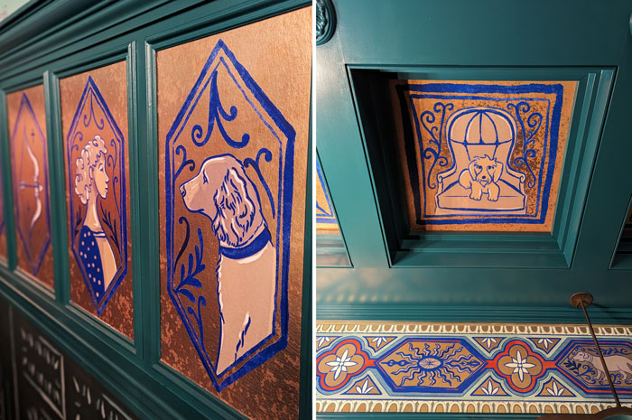
The rug “A Life Reflected” led the design for this space, weaving personal narratives through a design inspired by the storytelling traditions of Delft and Azulejo tilework, dating back to the 14th century. The motifs on these ‘tiles’ can be customized to reflect your own life, however, in this instance, they capture Ken’s life, depicted both in the rug and the hand-painted wall motifs, offering visitors an intimate glimpse into his world, including an introduction to his dog.

The Rug Company Dining Room by Ken Fulk. Photograph by James McDonald
Ken drew inspiration from his favourite dining room in London, the William Morris Green Dining Room at the Victoria and Albert Museum. This space influenced his use of ornamental mouldings and ceiling coffers, mirroring Morris’ iconic style, and inspired Ken to reinterpret his “Surrealist Garden” rug design, creating an engaging wallcovering with a picture-book quality.
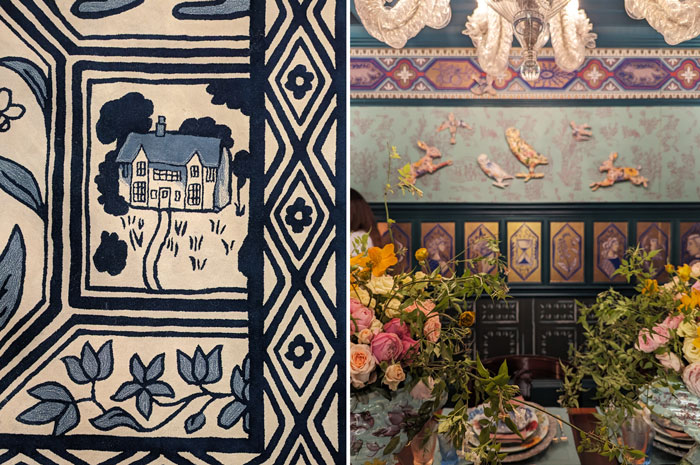
Experiencing this modern take on age-old techniques was a delight, especially as it allowed us to explore so many chapters of Ken’s personal story within the design.
Schumacher Courtyard Bedroom by Veere Grenney Associates:
Acclaimed British interior designer Veere Grenney, known for creating spaces that are equally serene and exciting, has expertly delivered just that in this space—a surprisingly wonderful sanctuary.
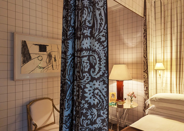
Veere said, ‘It will be a kind of self-portrait. I am designing this room for me.’
Inspired by a long-ago bedroom of his own, the room is fittingly adorned with Veere’s personal art collection, featuring works by post-war English artists Roger Hilton, William Scott, and Alan Davey.
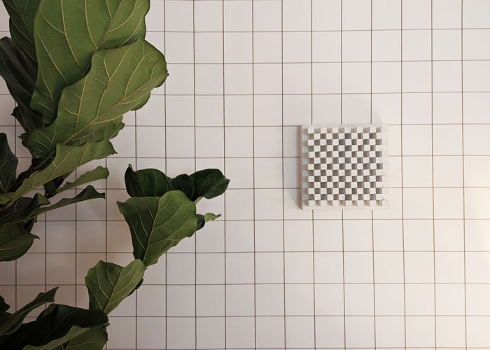
Veere has lined the walls with his new Woodmen check design, reminiscent of the Superstudio grid but softened by its larger scale and berber brown lines—a colour he favours for grounding a space. The four-poster bed is draped with swathes of Veere’s second new collection for Schumacher, Suffolk Damask.
In the literature, visitors are invited to “stay awhile and let it work its quiet magic.” Perfect!
Zimmer + Rohde Bedroo Suite by Tolu Adeko:
Tolu begins the description of his space with a story, sitting you on the Orient Expressing, travelling from Paril to Constantinople (now Istanbul). He elaborates that your sleeping quarters will blend the familiar comforts of home with tantalising echoes of far-flung adventures.
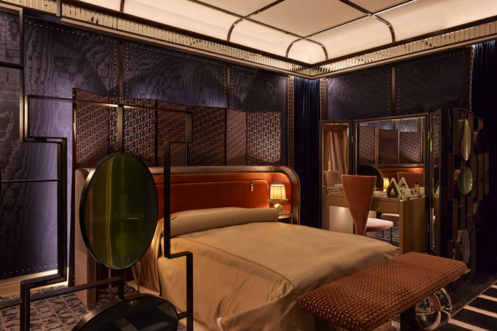
Zimmer + Rohde Bedroo Suite by Tolu Adeko. Photograph by James McDonald
Tolu Adeko leads his multi-disciplinary design studio Adeko & Co, a Nigerian-British designer is known for his holistic and narrative driven design, as well as his collaborations with artisans, craftspeople and makers. On this occasion his main collaborator is interior textile house Zimmer + Rohde, founded in 1899 and family run for 4 generations, the brand is known for using the very best materials and collaborating with the world’s finest weaving mills and printers, the ideal choice for the Orient Express!
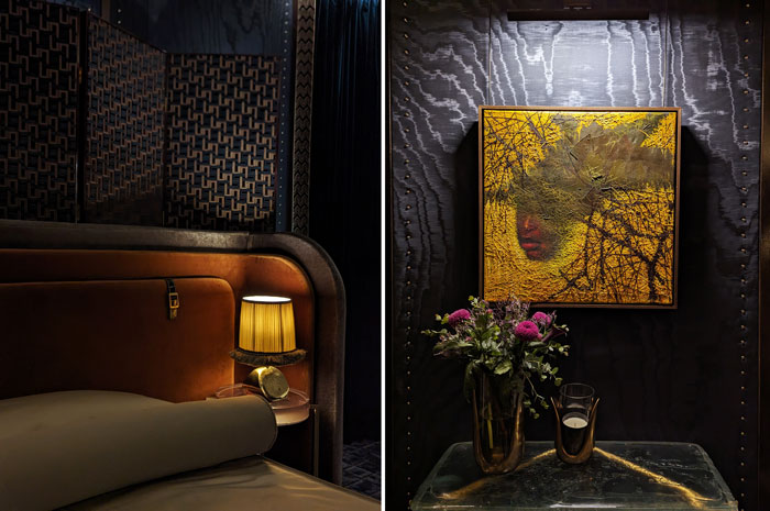
With Zimmer + Rohde’s 125 year archive at his disposal, Tolu’s starting point was the pioneering spirit of the companies founders, Ernst Rohde and Max Marx who were instrumental in exporting fabrics during the transition from art nouveau to art deco.
Chase Erwin Library by Andrea Benedettini:
Andrea Benedettini’s studio is built on individuality, personality, and identity. Andrea’s strong personal identity is reflected in every project. When work on Wow!House began, Andrea focused on creating a room that embodies excellent design and quality furniture, staying true to the studio’s ethos. Andrea aims to create beautiful interiors showcasing outstanding quality. In a female-dominated industry, it is crucial that the work is recognized for its unique style and character. The designs are distinct and identifiable as uniquely theirs.
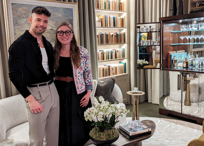
Andrea Benedettini with Design Insider Managing Editor, Alys Bryan
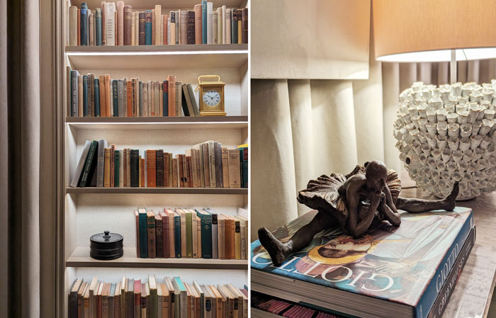
Working with Chase Erwin on Wow!House was special due to their aligned visions. Assigned the library room, Andrea embraced the challenge, integrating a ballet background into the design. Having trained in ballet since childhood and attended The English National Ballet School, the ballet influence is deeply personal.
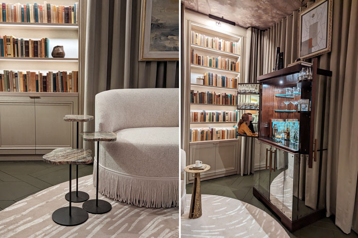
The design includes numerous nods to the theatre, creating an immersive experience. Elements suggest movement and reference ‘Swan Lake’ in the furniture and lighting. Suede curtains wrap the room, reminiscent of theatre drapery, with crystal chandeliers adding a contemporary twist. Stylized forest chorus wallpaper on the ceiling adds intrigue and theatricality.
Ultra Suede by Chase Erwin was used for its acoustic qualities and expansive colour palette. Suitable for drapery and upholstery, Ultra Suede is currently produced using 33% plant-based fibres, aligning with the designer’s sustainable values.
The Wow!House 2024 exhibition at Design Centre Chelsea Harbour has beautifully showcased how personal narratives can shape and enhance interior design. From Benedict Foley’s Zoffany Entrance Hall, inspired by cinematic elegance and historical textiles, to Alidad’s tribute to Watts 1874, celebrating a rich legacy through meticulous research and layered design elements, each room tells a unique story.
Each space in Wow!House not only dazzles with visual appeal but also deeply engages visitors with the personal stories and creative journeys of the designers, can this narrative approach be replicated in commercial spaces and to what benefit of the user of the space?


