Phoenix Wharf’s Vibrant Revamp: Transforming Covent Garden’s Old Chang Kee
Hospitality, retail and branding designers Phoenix Wharf have completed a clever and colourful refurbishment of hospitality outlet Old Chang Kee in Covent Garden. The Singaporean family-run operator opened its first two UK stores in Covent Garden’s New Row in 2018 and on Goodge Street, also in London, at the end of 2019. The client, UK franchisee Sandra Leong, commissioned Phoenix Wharf to redesign the Covent Garden site earlier this year to improve spatial issues and make the store more modern and memorable. The fast-turnaround project has seen most of the new interior and furniture pre-assembled off-site to minimise store closure times and to allow the venue both to close and re-open over the course of August, with minimal final refinements completed in September.
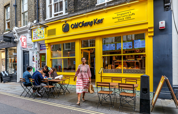
Old Chang Kee, Covent Garden
‘The Old Chang Kee food offer had been incredibly well-reviewed since the brand opened in the UK’, Phoenix Wharf Creative Director Emma Carter explained. ‘The logistics of the existing Covent Garden site, however, offered definite room for improvement, with the store’s small existing servery counter, for example, necessitating people having to queue outside and stand aside each time someone came out. The interior colours were rather muted and the menus not clearly visible until you were inside, making the offer challenging for anyone previously unfamiliar with it.’
Brand History
Old Chang Kee was originally established in Singapore in 1956 in the form of a humble stall, quickly becoming famous for its curry puffs – the Singaporean answer to the pasty, samosa or empanada. The stall attracted customers from far and wide, including many British people before the dissolution of the Crown colony in 1963. Expansion over the following decades saw the brand become a recognisable staple of Singaporean street life nationwide.
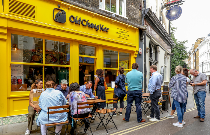
The revamp has proved instantly popular
The brand’s UK outposts feature a grab-and-go concept with the aim of making authentic Singaporean street food accessible to customers in London and the UK. Its signature curry puffs – hot, buttery pastry with a spiced filling – have been lauded by eminent food critics including Giles Coren, Fay Maschler and Marina O’Loughlin. Also available on the menu are other classic Singaporean favourites, such as Nasi Lemak (coconut rice) and Laksa (rice noodles in a coconut curry broth).
Design Approach
The Phoenix Wharf team looked to the history and traditions of the Singaporean Shophouse in their design approach, where street food was served from ground floor premises with living quarters situated above – a set-up very much mirrored by the Covent Garden location.
The brand was originally established in Singapore in 1956 as a humble street stall
The client brief was to create a more contemporary look for the outlet, moving away from the existing understated magnolia interior, decorated with lots of trinkets and wood, which had made the look and feel a little too obviously traditionally Singaporean. The Covent Garden location also has lots of local competition, with the road becoming a real foodie destination in recent years. The venue definitely needed to stand out more therefore, as well as to be easier for customers to access – and more efficient for the operator in terms of ordering and service fulfilment.
‘A clear balance needed to be struck between retaining Old Chang Kee’s brand essence and heritage and creating the desired more modern look and feel’ Emma Carter commented. ‘The bright yellow of the fascia is an established brand colour and had to stay, for example, although the tone needed to be punchier and make more of a statement, as the previous fascia had been too pale. We also introduced a blue secondary colour to the interior for the first time. This immediately adds a more contemporary note, as well as working well with the yellow. The blue has been used for the walls and features additionally in the menus and the counter-front tiling – as well as being extended to new, re-usable blue melamine crockery and chopsticks, which set off the food really well.’
The New Interior
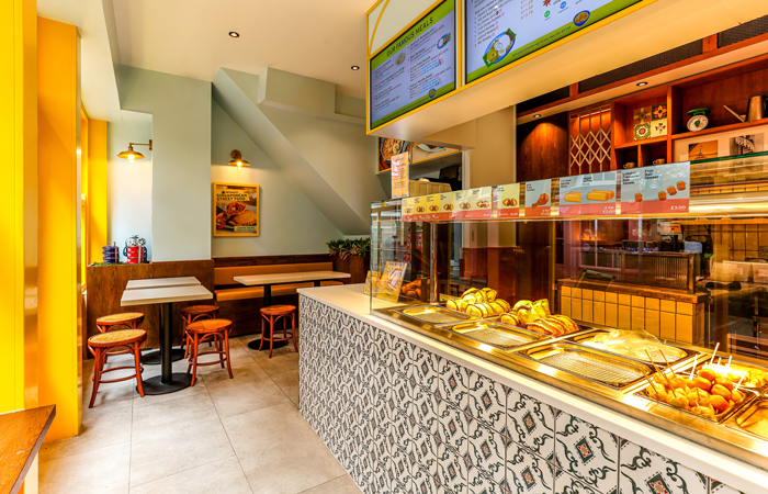
Although the offer is mostly takeaway, there was also some demand for eating in, so the new layout needed to incorporate seating to meet that mission, whilst not encouraging too much dwell time, as the offer is predominantly grab-and-go and there was no possibility of expansion of the very small space overall, which measures just 21.3 sqm in total. Window seating, plus two standalone tables for four were integrated, featuring loose wooden seating (re-using existing Singaporean stools), plus one new inset banquette in a teak veneer with a yellow seat pad. The banquette also has storage space incorporated beneath the seat. The new tables feature a laminate top in a rich oyster grey, which allows the food and coloured plates to stand out. Small inset planting adds a third colour into the scheme, as well as aiding acoustics and referencing the famously lush greenery of Singapore. External seating allows for another ten customers to eat in situ at any given time.
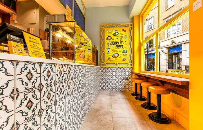
The new counter is directly opposite the entrance, with a solid surface top and front clad in Singaporean Dragonera tiles
The previous hot food counter, located to the right as customers entered, has been replaced with a new 1.6m-counter directly opposite the entrance, with inset food tray display spaces for the curry puffs, so that people can see as they order, with a till point directly adjoining. The new counter top is a solid surface material, whilst the counter front has been clad in eye-catching and typically Singaporean Dragonera tiles, with the tiling continuing and wrapping round the right hand wall of the space.
A new gantry pelmet in plasterboard with curved timber detailing has been designed to sit above the counter, with the easily-legible menu now visible on three 50” inset illuminated digital screens. This is located well above head height and is clearly visible from the exterior. This particular store also has a step up to the entry, giving the new menu a further height advantage. The curved gantry-top detail – a shape repeated on the back wall – is a nod to the menu’s central item – the curry puff.
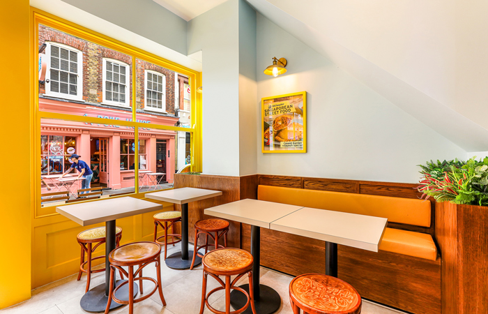
Interior seating includes window stools plus seating for 8 to one side
Storage was a big part of the new design story and the rear of the new menu and product signage – both on the rear wall and on the gantry – can be used to store items, taking takeaway packaging out of sight, for example, where it had previously been visible to customers. Behind the service counter is a new ground floor additional kitchen area (with the main food prep remaining on the lower-ground level) for sinks, hand-washing and further shelving. At the back of the public area is a condiment station with a tray drop and customer bin. A changeable poster space directly behind this also features as a concealed door to further hidden storage, making use of previously dead space above the stairs. A full-height fridge sits alongside this for customer drinks.
The rear wall of the space features new yellow tiling with a grey grout, wrapped around existing teak timber, which was too high quality to consider replacing. Further food story graphics are also integrated into this wall, along with the Old Chang Kee logo in black. A rear stair, which leads down to the lower ground kitchen area, has been discreetly sectioned off, as the occasional customer had been known to take the stair before, believing it to be a public access route.
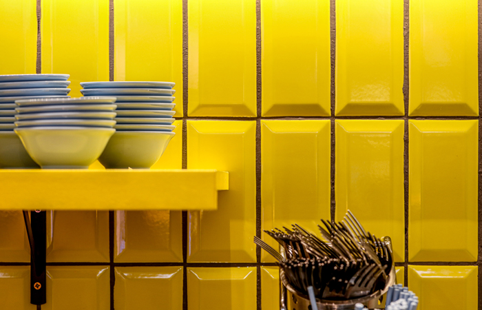
Rear wall yellow tiling
Phoenix Wharf also had a graphic remit as part of the refurbishment, redesigning the menu and creating a new poster in a yellow frame for the right-side wall. Newly re-commissioned brand photography – featuring the new melamine serving bowls and plates – works well with the upgraded interior and graphic treatment.
‘After five years of successful trading, our Covent Garden location was in need of a redesign – both to make our grab-and-go offer more appealing, as well as to make operations a little slicker’ client Sandra Leong commented, adding that ‘this was a challenge given the tiny footprint of the site, but Phoenix Wharf were able to take a difficult brief and run with it. The new layout and design certainly have more stopping power than before and our team appreciates a better laid-out store that is operationally easier to maintain. Singaporean food and its accompanying aesthetic is also not well understood in the UK, but Phoenix Wharf put in the effort to research and understand this. I’m excited to use our new-look store as a blueprint for future locations.
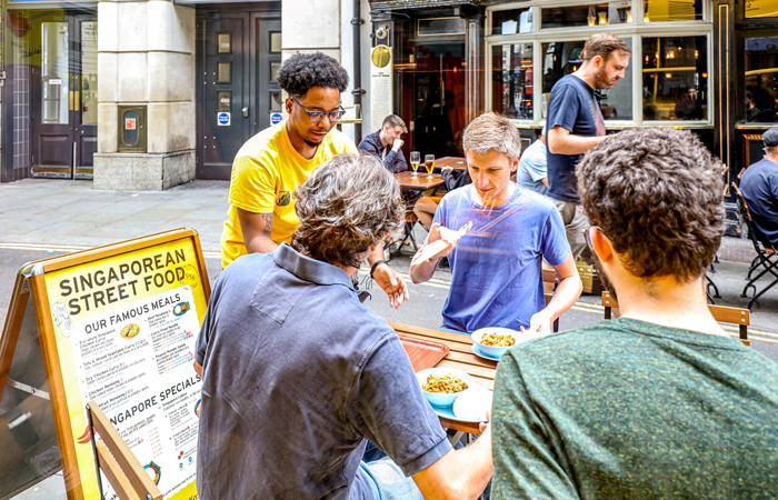
Customers can also sit outside, where there is room for 10 more covers


