Designer Q&A: Michael Marriott
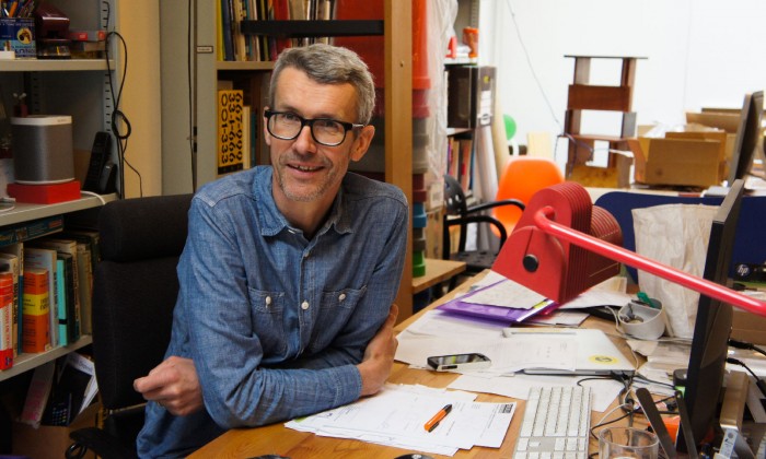
This week Design Insider had the privilege of interviewing Michael Marriott in his Hackney studio. Over an excellent fresh filter coffee and the last remnants of an Easter Egg Michael told us about his most recent work as well as his 20 year campaign for millimetres!
Can you begin by telling us a little about yourself?
I am a furniture designer, or something like that. My training is in furniture.
I often find it difficult to explain to people what I do, people have an idea of what furniture design is and they think of something specific like Philippe Starck, but I am also slightly odd in that I do 30% furniture design, 30% exhibition design and then probably 10% interior design and 10% product design. The rest of my projects are either a combination of those or something a bit on the periphery of those and not quite as easily titled.
There is also another part of my practice which is important; perhaps 20% (those percentages go out of the window a bit) is about providing content, or concept, or something specific to a space in a gallery or museum.
Could you tell us more about your 2016 project at National Trust 2 Willow Road, Ernö Goldfinger’s Modernist family home, which was part of the London Design Festival?
I am a big fan of Goldfinger and the house, it was his house that has been preserved beautifully, an amazing and historically important house!
The National Trust wanted to do an event during London Design Festival to alert people to the fact that they have this incredible piece of 20th Century Modernist architecture in their portfolio. The National Trust knew that I had done a show about the house previously with an artist and they approached me. I made a big shift from the first gallery show because this was at Goldfinger’s house in a very busy environment, the polar opposite to the white gallery. I didn’t want to add anything to the space itself; it was an off site trade fair and so it was be treated as a trade fair and I did a product launch. It was more interesting because it was unexpected to have a product launch on a trade fair stand in Goldfinger’s house!
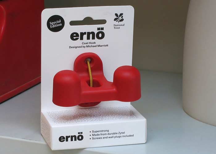
I launched Erno coat hooks, named after Erno Goldfinger. The whole project was a combination of product design, organising and managing the production, and exhibition design. It was a lovely project to do!
I made a limited edition of Erno in a red which was chosen from the house, the colour in the house was very specific because Goldfinger used colour very beautifully, and I chose the particular red which he had used for accents in the stairwell. The limited edition of 222 was gifted to the National Trust to provide money which could go back into the house.
Last month you collaborated with graphic artist, print-maker and designer Anthony Burrill at Clerkenwell London as part of Clerkwenwell Design Week, could you tell me more about your project?
Anthony Burrill was asked to be part of Clerkenwell London’s Design Undefined series of events. Anthony asked if I fancied doing it together, which is how we have ended up working together in the past. We viewed the space together and started to consider how to make the room feel as though it had purpose beyond just a showcase for Anthony’s work.
Photograph Dunja-Opalko
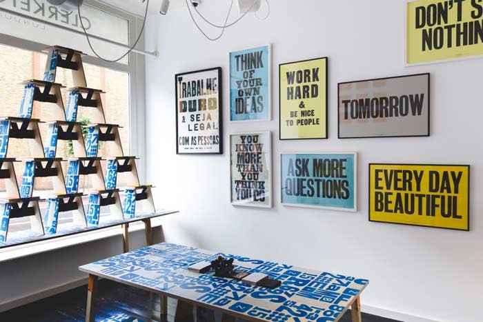
We made one wall a gallery wall of Anthony’s prints; hung like the Royal Academy Summer Show.
It was a given that Anthony would showcase his new book which was on sale at Clerkenwell London, so we wanted to give the book a place and a reason for being there. I designed and built a display trolley for the books, and a reading shelf. We made a run of low stool/side tables and Anthony designed artwork which was screen printed onto the birch plywood. The scale of the stool was relative to the size of the book which sat on the seat under an elastic webbing. We then made everything out of birch plywood including the trolley and the shelf, this unified the surface treatment throughout the space.
We included the Erno coat hooks in the space, and above them we had 9 clocks which used Anthony’s stencil typefaces. Along with the clocks, the metal shelf brackets and leg brackets were all laser cut steel and powder coated in the same shade of orange to match Anthony’s book. We created a good pallet of colours and materials, a simplicity which created continuity and gave the room an identity!
Did we hear that you have a new webshop?
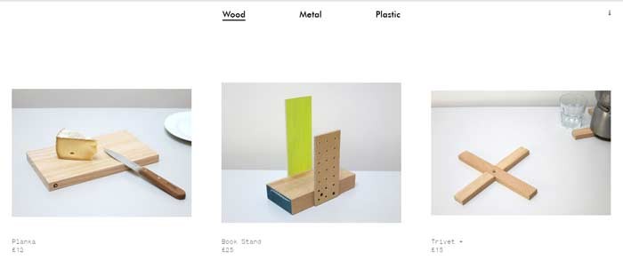
Yes, the shop is www.woodmetalplastic.com
When I first left college I made and sold batches of my designs. Over the years I have worked on projects which have led to small products, the first might have been my silver wing nut necklace which was for a pop up design market and we launched the webshop on the same day we launched the Erno coat hook.
More recently an ash off-cut which was grabbed from the workshop and used as an impromptu cheese board, led to another product. The proportion was perfect, so we slightly adjusted the dimensions and we used a Robertson Screw to brand the side of the board, so we made some and put them onto Wood Metal Plastic. Robertson Screws is my campaign in waiting!
Millimetre Mandate – A Modern Mobilisation by Michael Marriott
Millimetres are the perfect measuring unit for man and machine. Our mission is to make millimetres mandatory. In education, in the minds of the masses and in the mainstream media. We believe that it is time to cancel the use of centimetres. They are capricious, casual and can cause confusion. Join us in a meaningful mobilisation. Be mindful, be meticulous; Measure in Millimetres. #Millimetreswork
Contact Michael Marriott.


