Q&A with Kit Miles
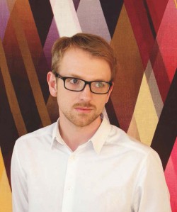 After graduating in 2011, Kit’s been rapidly accumulating awards for his work, and is considered a rising star in British design. So far he’s collaborated with Vitra, Conran & Partners, Heals and Hyatt, and has his own range of fabrics, wallpapers, cushions and furniture.
We interviewed Kit, to find out a bit more about his designs and what inspires him….
You’ve been named one of the top 30 under 30 by Forbes for 2016. The awards keep coming.
Yes! And now Homes and Gardens have put me forward for New Designer of the Year. What with that and new contract and hotel projects coming through, 2016’s already shaping up to be a big year. I think our reputation is growing and I believe it links back to our attitude towards design, and in particular our hand-draughtsmanship. We use hand drawings to distil and communicate ideas…or as I frequently say “take what’s in our imagination and create new unique realities; create new other-worldly scenarios”. My aim is to always change print design somehow. That keeps me motivated and inspired, and that’s what keeps my studio distinctively different from the rest.
“take what’s in our imagination and create new unique realities; create new other-worldly scenarios”.
A little bird tells us that back in your student days you were an intern at Timorous Beasties. How did that experience influence you and your own designs?
I did a 6 week internship there. What struck me was that their fabrics always had a power and energy to them. Paul and Ali were very generous with their advice, and I thank them for that. I lived in Glasgow alone in an almost-abandoned mansion in the west end for my time there. It was a unique experience. This was in the middle of my 2 year MA at the Royal College of Art – so having finished my first year, I had a lot of information to process, and being in Glasgow in a new environment, I was forced to put my brain on ice and think about things from a different perspective. Since those days, I’ve developed strengths, sensibilities and aesthetic values and formed my own creative style.
Then in stark contrast I travelled to Morocco with a friend from the RCA. We drew for 3 weeks non-stop, and the culture there and resulting ideas formed the basis of the final year for my MA and the future…
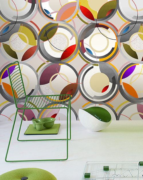
We see a lot of colour in your designs. Tell us more?
Colour is one of the most powerful tools I can use in telling a story through design. It’s the glue that holds a story together as it unfolds in our imagination. It’s such a potent but fleeting force and in my work, I choose colours carefully to help evoke each theme; the effect can be lyrical, aspirational or even threatening. I never feel restrained. It’s always mesmerising, and I find it totally intoxicating.
“Colour is one of the most powerful tools I can use in telling a story through design”
You often mention the influence of history in your design. Which era has the most appeal for you?
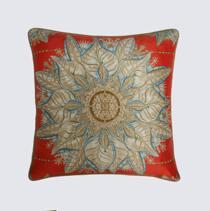
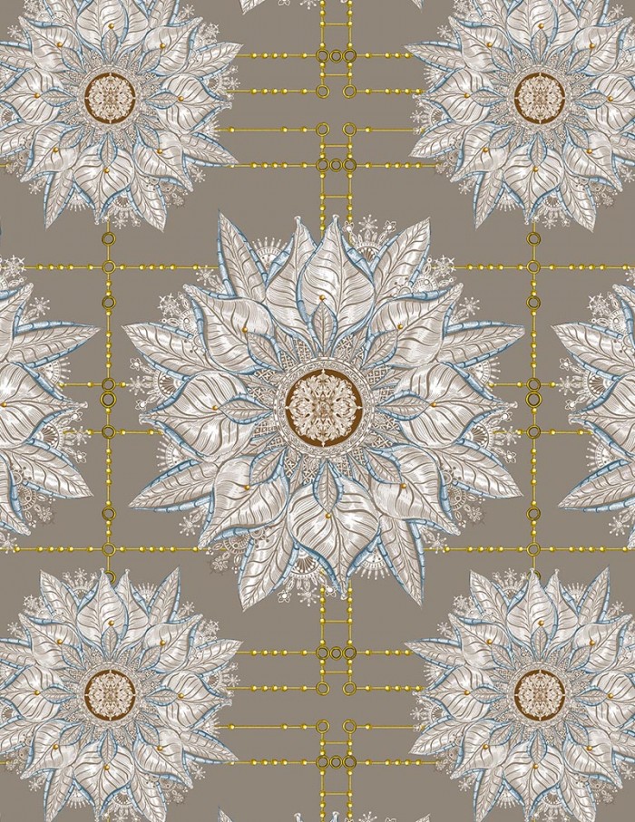
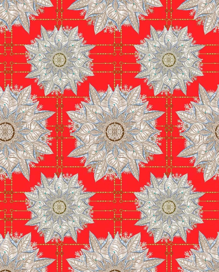
I was going to tell you about a design in the collection I have in Liberty. It’s called Byzantine. The strength of the Byzantine empire itself; the architecture of the churches; the religious influence….It’s all just staggering. There’s a very recognisable tile motif in Byzantine art, and in my view it’s got a really strong graphic language. There’s this intricate rose-like shape bursting out from the centre of the motif – it’s like an eye staring at you. Indicentally Byzantine is actually one of the only designs in my whole collection that’s completely symmetrical. There’s so much symmetry in historical design – there’s a mathematical balance and harmony…. and I supposed our innate animal response to symmetry is that it’s pleasing and evokes a sense of trust. It’s ingrained into our DNA. It certainly makes designing wallpaper fun!. Asymmetry of course has its own opportunities and is something I regularly like to exploit.
So…the benefit of linking my collection closely with historical as well as contemporary – even futuristic – references… is that I’m free to open up wormholes into other dimensions. But I don’t like to be boxed in when I’m creating. So I’m not a Bauhaus designer or a botanical designer.. I can stretch and move wherever I want to without anyone telling me otherwise. In my studio I’ve created and nurtured this culture too; it’s investigative, curious, open minded and healthy.
When you started out at the Royal College of Art..what was your master plan?
We’re still closely connected and they have been very supportive of me since I left. I’ve just entered work into the now Famous RCA Secret exhibition, go check it out! The Royal instilled in me a belief that I could change the world if I put my mind to it.. I never had a master plan but I always had very clear visions of a kind of printed universe, a nebula of ideas conspiring in my head. The RCA really deconstructed my ideas and forced me to re-configure. Believe me, once you’ve been through an RCA education, you won’t come out soft.. It gave me the strength to now take no for an answer.
What advice would you give to design students?
Turn off your iPhone and go see some art. Communicate! Don’t be afraid to get things wrong, be idealistic, listen to advice, dream big, never stop, dance hard! Most importantly, ask yourself, who are you? What are you going to bring to the table?
“Turn off your iPhone and go see some art. Communicate!”
Wallpaper or fabric? Which comes first?
Wallpaper. Designing something cinematic has always appealed to me: I love that it’s confrontational and you can play with visual tricks on a flat surface, breaking space up with scale, colour and repeat. It can fill the viewer with a sense of awe don’t you think?
But textile is where I learned about attention to detail and being careful. I spent nearly 5 years training on the print table learning how to apply pattern to fabric using traditional print methods like screen print, hand dyeing and so on. I also believe that there’ll be many new types of material that fall in between wallpaper and fabric … like graphene. With that I’ll be able to design moving walls and patterns and colour can be applied through light emitting cells! It’s all very interesting to see how these are-they / aren’t -they textiles are also used in architecture and technology – even space. Back here in Wapping meanwhile we’re involved in an exciting new project where we’re creating a silk coated wallpaper !
Your studio’s based in Wapping, London – what’s the appeal?
There’s a lot going on right outside my studio. Every week there’s a different photo shoot or some event down the road. I think it’s a dynamic pocket in town.
If you could start over, what would you change?
I wouldn’t change anything. That’s not to say I haven’t ever failed.. I am sure I will continue to do so in some capacity. Failure is seen as something bad but actually it’s valuable. In the creative process that’s where the innovation starts.
What has been your favourite project to date?
Michaelis Boyd invited me to wallpaper the entrance hall of the Groucho Club this year which was fantastic! We are also working on some very interesting commercial projects in China as a result. My favourite project is designing my collections of wallpaper and textile collections and collaborations with the likes of Osborne and Little and Tektura.
There’s a lot of talk about trends out there. What are your predictions for 2016?
I’m not a trend focused design studio and I think that serves us very well. For me it’s always been about capturing the essence of something like architecture, or music or theatre. I want to try and recreate that feeling you get when you walk into a cathedral, or what’s left with you after seeing an amazing sequence in a film. I want my natural curiosity to be visible in each design I create. I want people to re-look at familiar patterns and objects and explore and experience what I’m seeing. I don’t think trends in the traditional sense have a future. Maybe the world needs a new kind of new punk movement.
See Tektura’s Kit Miles Collection
