Retail Futures
Since it’s meteoric rise during the 20th Century, retail has always been an ever-changing and continually evolving beast. Brands have come and gone, each searching for the best ways to get their products in front of prospective customers; each ultimately looking to sell as much to them as possible. The consumer landscape has always been broad but the proliferation of the internet has led to layers of nuance to any target market that a brand might chase. Whilst this may have been counterbalanced by the reach with which the internet allows, the introduction of e-commerce has affected bricks-and-mortar stores across the globe. And then of course there was a global pandemic. So what does the future of retail hold; how are brands responding now?
![]()
When Legal & General, the owners of the Beacon Shopping Centre in Eastbourne, were considering how to redesign the interior of the traditional white plasterboard and glass windowed space, they knew they wanted to make a grand statement. The job was awarded to Aberrant Architecture, a practice that has made a name from creating vibrant and memorable environments such as Landscape for Play and Rosemary Works School, and the results on the south coast are most definitely visually arresting. Colour plays a huge role in the transformation, with large swathes of block colour dominating the eyeline and overhead areas, whilst also allowing for zoning of the vast space. In addition to these bold selections, there are also a number of 3-D interventions with a set of interconnected installations that are actually inspired by the history of the area itself.
![]()
Drawing upon the origins of the town, which once consisted of 4 separate hamlets, the designers chose to introduce 4 distinct areas; each with their own unique character and set of fully interactive structures, including slides, peepholes and swings. The shifts in height, scale and orientation are deliberate and with inclusivity in mind; allowing a range of people to get involved. But one of the most distinctive design elements of each of the hamlets comes in the form of animal characters, which were inspired by those depicted in George Orwell’s novel Animal Farm. There is local significance here once again; Orwell was a student in the town, and these reimagined 3-D forms extend one of the core components of the overall design – play. There are numerous cues to play across the centre, not least hopscotch and other floor based games laid out in colourful vinyl, and it’s the ramping up of these fun elements that Denz Ibrahim, Head of Retail and Futuring for Legal & General Investment Management, sees as an essential ingredient in the Beacon’s success:
“Changes in consumer needs mean that the retail sector in the UK has seen a shift in recent years. Covid has exacerbated those challenges that the industry already faced. Customers now want much more from their local shopping centres, beyond just shopping. They want places full of energy and now, more than ever, want better services, more memorable experiences and a wider variety of offers. They want a space curated for them and their community.”
![]()
By saturating the retail space with colour and these playful installations the owners and design team hope to have ensured long-term future-proofing strategies and they seem sure to capture the imagination of even the most resistant of shoppers. Utilising these bold and visually impactful tactics for in-store design, which are akin to that of set design in many ways, are undoubtedly part of a trend that comes and goes in retail design. But projects like the Beacon Shopping Centre as well as numerous recently completed larger than life interiors in China such as Shenzhen Neobio Family Park are certainly indicators that things have indeed ramped up a notch. And of course, there are always new product trends; new must-have things that surprise the market and quickly create their own sense of aesthetic due to their sheer proliferation across sections of contemporary culture – bubble tea anyone?
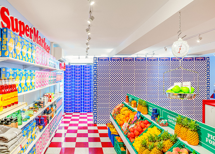
One such market taking America by storm following its legalisation across many states is cannabis. It’s hard to know for certain how long-term the trend might last, but for now, store design is perhaps more a chance for weed suppliers to catch the wave, and people’s attention, in drawing them into their shops for the first time. And with a bit of design magic, maybe those visits can help lead to repeat trips (excuse the pun) and customer retention. That’s something that Superette has certainly considered when designing their recent weed emporiums in Toronto. Like Beacon Shopping Centre, Sip ‘N’ Smoke and SuperMarket are a blast of colour and designed with visually arresting features and a playful feel that creates an immediate and unforgettable brand identity.
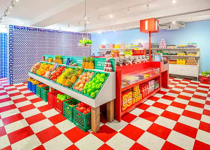
SuperMarket in particular embodies nostalgic and therefore rather familiar retail design style, and in many ways defies our expectations of just what a weed shop might look or feel like as an experience. In essence, the experience is very similar to that of a visit to a traditional grocery store, only this one has had the visual volume turned right up; not to mention the fact that the products are cannabis-based.
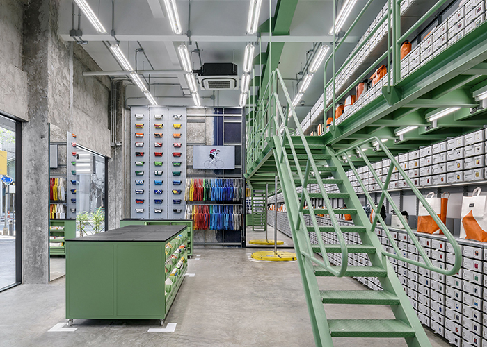
Freitag has been producing bags from recycled truck tarp since 1993 when brothers Markus and Daniel Freitag took some waste material to task on a standard household sewing machine. Fast forward nearly 30 years and the brand is a household name and the bags are instantly recognisable whilst being synonymous with durability and sustainability. But recent store designs have turned the make-and-supply tradition on its head, instead inviting customers to participate in the production of their purchases themselves. The interactive nature of the set-up is a draw for those who seek personalisation of their apparel, whilst also elevating the retail experience through unique and memorable involvement that goes beyond the regular browse-and-purchase format.
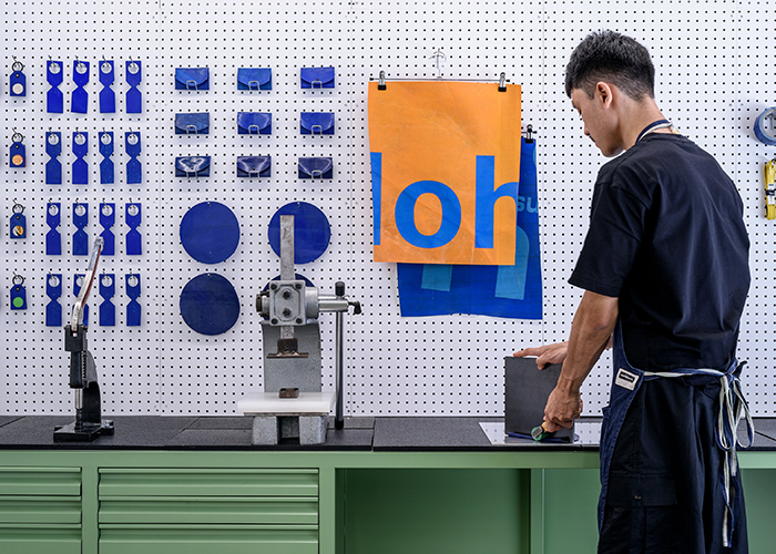
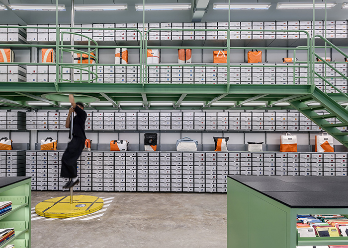
The Bangkok store, located in the Silom region, was created in collaboration with Supermachine Studio and makes use of upcycled elements that are laid out in a tidy factory warehouse style. The Sweat-Yourself-Shop shelving extends from floor to ceiling, and includes tarp material at various stages of completion and an integrated mezzanine from which visitors are invited to look out over the entire collection of one-off items on display, as well as offering the option of a slide down the fireman’s pole to exit.
In many ways, allowing customers to get involved in the making process of a product is another invitation to play. It creates a greater sense of freedom and selectivity than standard off-the-shelf products, and that in turn fosters a deeper connection to the final piece. This level of authenticity is only possible because the making process has been revealed to the user, rather than hidden from view; these bags aren’t arriving at one’s door or sitting on a shop’s shelf without any sense of where the materials that make them came from or who might have been involved in the process of producing them. That’s something that the team at natural skin care and wild fragrance company Haeckels have taken into every facet of the design of their new store in a disused casino in Margate. The south eastern coastal town had a rich tradition of utilising the healing properties of the sea, something the Victorians in particular recognised with the introduction of a grand, now closed, Seabathing Hospital located directly upon the town’s seafront.
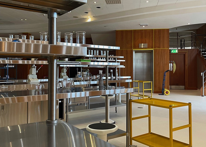
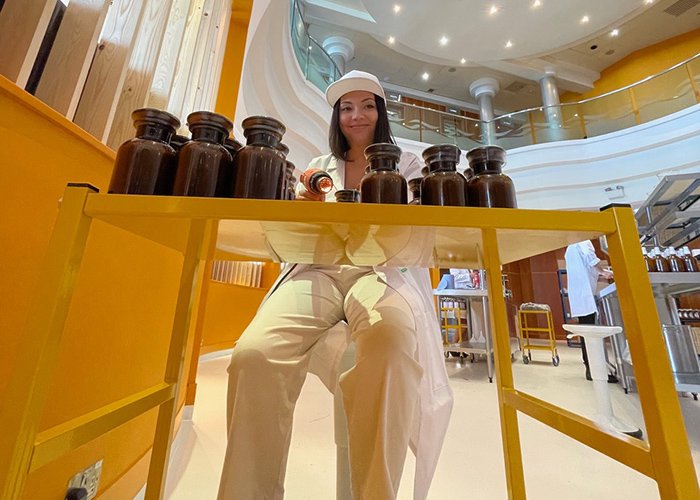
Back in 2012, founder Dom Bridge began to wonder once again whether there might be more to the often seaweed strewn beaches than meets the eye. He began concocting skin care products and smells in a pan on his stove that were derived from the abundant green sea-plant, and a decade down the line, Haeckels Margate-made products can be found in stores spanning every corner of the globe. Whilst compact, the original Margate store boasts a truly unique interior style that is reminiscent of the set of the film The Martian, but the contrastingly vast ex-casino and now Making Space represents an entirely new form of retail environment. For where there were once fruit machines and blackjack tables in the central atrium of the building, there are now stainless steel industrial kitchen units and racked shelving full of the types of dark brown glass jars you’d associate with a Victorian apothecary. And at each station you’ll find a member of the team, busily mixing the natural substances from those jars to create an array of sumptuously smelly products. All right there, in plain sight, for everyone to see. There is no secrecy here; what goes into these skincare products is to be celebrated and admired, not withheld from the customer’s view. A sense of trust and authenticity prevails from this openness and once again, a greater connection to the product and brand is achieved.
But of course, in the fast-paced modern we live in, in-store experiences aren’t the only thing to consider when it comes to retail. In a world where convenience is powered by technology, retail brands must also take into account how efficient a store can be, especially for the increasing number of people who are particularly time-poor in their day-to-day lives. Not to mention the ongoing effects that the pandemic has had upon the collective drive to get out and visit retail spaces. A steadily progressing section of the industry is self-service and interior architecture firm Fyra and branding agency Motley were keen to explore this route for Finnish postal service Posti when designing Box.
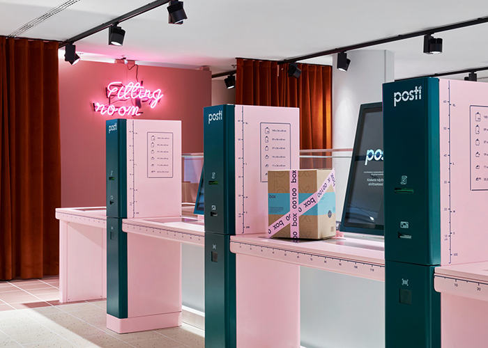
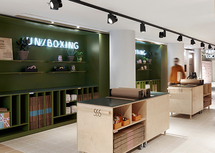
The brief was to create a self-service store for online customers that went beyond the already-industry-standard of a row of lockers. But fitting in some 600 lockers as well as fitting rooms in a central Helsinki store is no mean feat, particularly when you consider that the brief also sought a visually arresting aesthetic and feel. So, whilst the lockers are present within the design, they create a backdrop in which block colours help to intuitively guide users around the space, be they there for a quick grab-and-go or a more involved trying on of their product choices. And the design of the space also makes returning items a slick and again, intuitive process, whilst there is also an emphasis placed on the reuse of the packaging materials themselves.
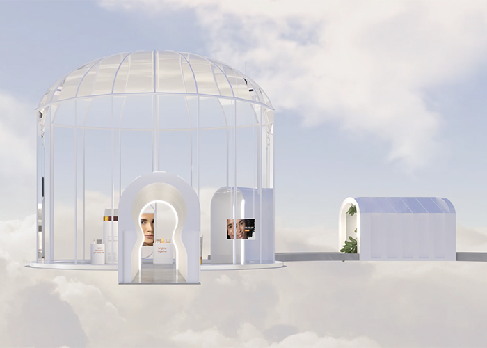
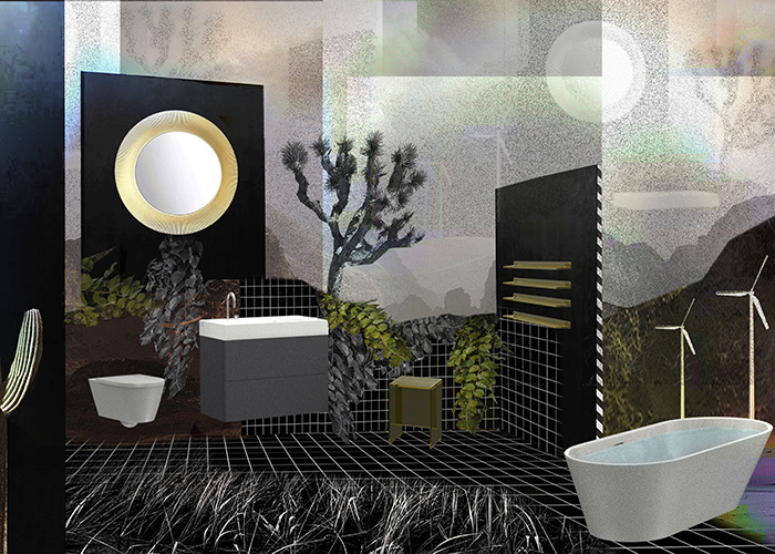
But physical spaces really need not be a consideration at all for retail brands; something that the pandemic may have inadvertently sped up as a result of enforced shut-outs of customers during various lockdowns. Online platforms such as Zoom and Clubhouse may be amongst the greatest success stories of technology keeping us connected during that time, but it also offered brands the chance to push VR upon a captive audience, and the medium progressed enormously and a rise in popularity followed. Brands such as bathroom supplier LAUFEN, who may have never believed VR a viable means to showcase their products, leapt upon the opportunity and employed the services of skilled and highly creative artists to interpret their products into immersive spaces unlike anything we’ve ever seen before. The dreamlike virtual environments captivate the imagination but still act as a form of backdrop, with the Kartell range of sanitaryware elevated to a near-fantasy level of wonderment and awe.
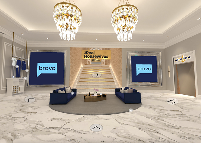
Whilst it’s yet to be seen whether LAUFEN will continue with these digital design tactics, there are companies who have turned their attention entirely to the medium as a means to design for retail. At a time when the Metaverse is expanding and evolving Obsess really does take virtual reality e-commerce platforms to a new level. High end brands, particularly those in fashion, such as Ralph Lauren and Fendi have already jumped on board and now have Obsess designed spaces that anyone with a connection to the internet can visit, explore and buy from; almost as if IRL. Entirely online virtual environments come with the bonus to brands that they do not require real estate and all the associated costs, and the distinct freedom of shopping from one’s sofa (or wherever) for the customer. All the while, allowing for a strong brand identity that goes beyond mere aesthetic and includes experiential interaction, albeit through a screen or headset.
We may not live in a time where everyone has the means or desire to shop in immersive digital realities, but there is no denying that this format is on the rise and improving in quality at a rate we were yet to see before the pandemic. Whilst these virtual worlds continue to grow and evolve, retail brands may still need to consider designing “big” when it come to IRL experiences; and it’s in that word “experience” that they may turn their attention, because aesthetics and product placement alone may not be quite enough for an audience that’s growing in terms of expectation but dwindling when it comes to attention span.
