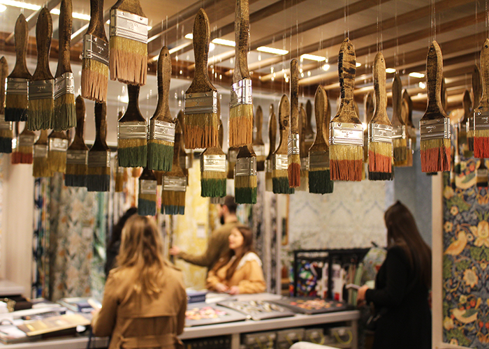
Review: London Design Week
The Chelsea Design Centre was buzzing with life last week, providing in-house brands with their first big event of the year from 13th – 18th March 2022. Walking into London Design Week, we were welcomed by an eye-catching installation, bursting with colour, immediately setting a cheerful tone. Paint was provided by Andrew Martin and Sanderson, while the spheres themselves have been repurposed from past installations, with any new additions made from recycled materials.
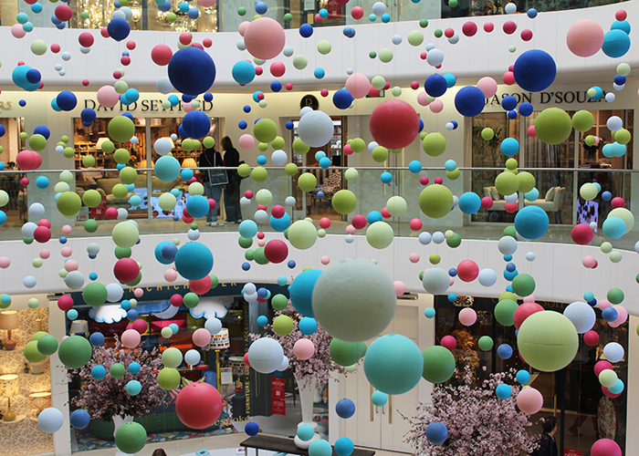
Although not as busy as previous days, there was an excited energy that encouraged us to voyage through showrooms and really connect with the theme of the show, which looked at the season of rebirth and new beginnings. With over 100 events on the programme and some exclusive SS22 launches showcasing fresh palettes and patterns, we were spoilt for choice on a rainy Wednesday and took no hesitation in diving into the tactility and discovery of this event.
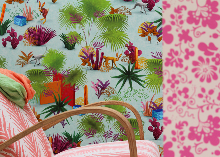
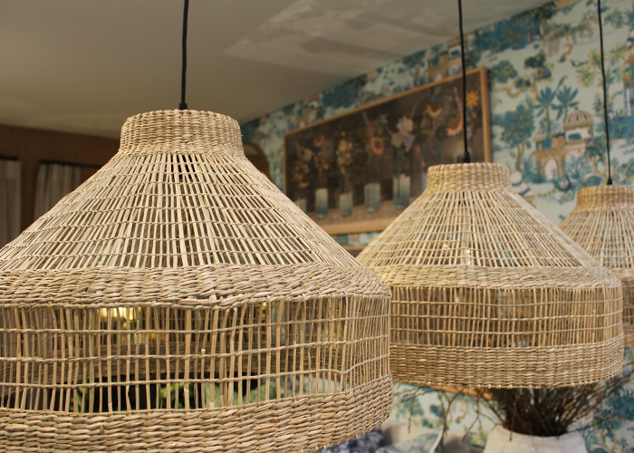
In line with the new season, bright colours and hues of green we’re splashed throughout the Chelsea Design Centre, bringing a sense of light to the gloomy day. An earthy feel was created through a combination of colours and textures inspired by nature. The use of rattan furniture and wicker accessories proved a hot trend at the show, shining light on the intricate hand-woven techniques, reconnecting with ancient furniture making methods. This paired with muted colours and floral patterns forms a rustic authenticity, re-emphasising a connection with nature. This trend was perfectly demonstrated by these wicker lampshades from Robert Langford, contrasting the explosive floral patterns.
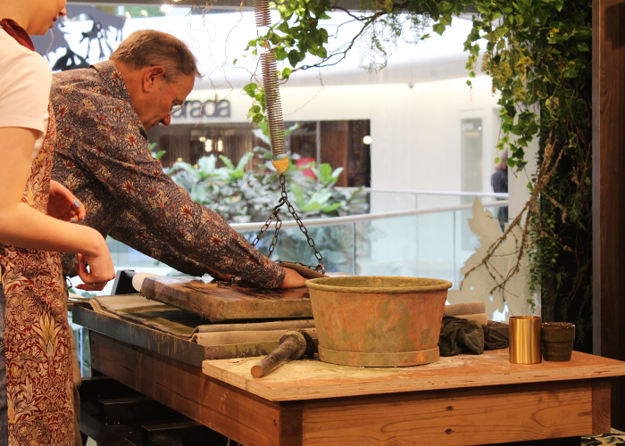
Sanderson Design Group captured spring in their showroom with the launch of their new collection ‘Water Garden’. The room was lively with a creative moodboard workshop and botanical block printers, looking at ancient yet ageless manufacturing processes.
The connection between colour and light was reinforced throughout the exhibition, with brands paying attention to the way in which colour only exists with light, reflecting the balance of nature. Lincrusta invited visitors into their showroom to boast beautiful new colours for their unique collection of embossed wallcoverings.
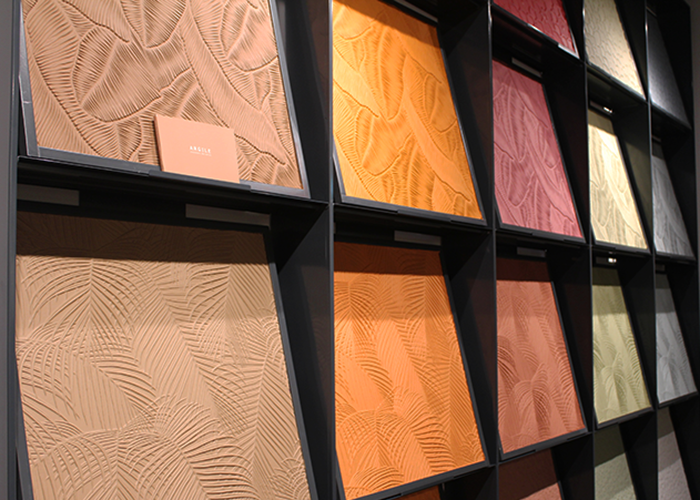
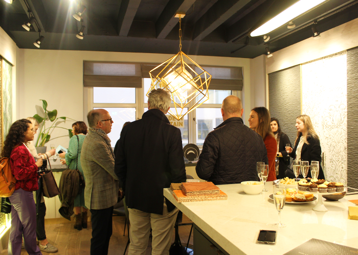
In a collaboration with Argile, Lincrusta also hosted an Access All Areas discussion, where we discovered how both brands work with organic renewable materials to create timeless products and a unique ambience.
With a nod to historical manufacturing processes, tied in with the renewable energy of spring, we saw a range of antique inspired collections. From vintage prints to classic colours, GP & J Baker’s new ‘Ashmore’ collection presented a timeless palette of soft modern shades of parchment, blush and sage, to a rich emerald and denim.
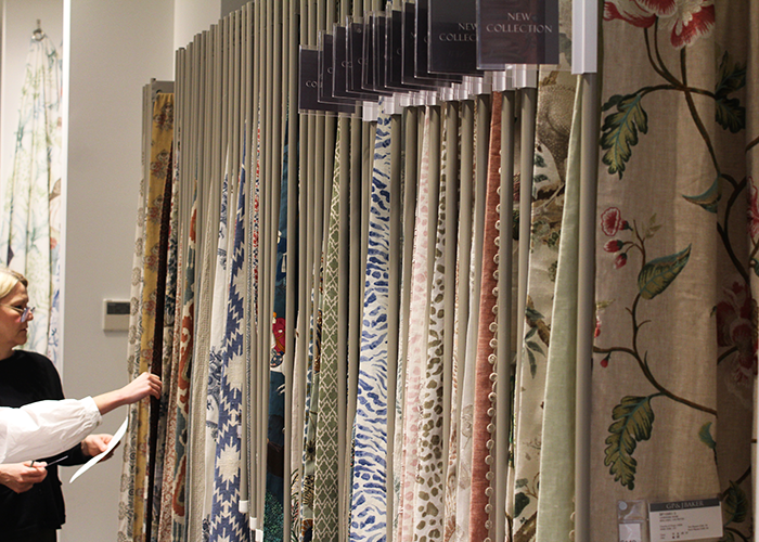
Lelivre radiates elegance, and their new collection, ‘Resonance’, reimagines their avant-garde motifs and tradf. Combining stripes, animal print and a trio of iconic textile patterns to flirt and blend with art, this creation gives spirit and rhythm to interior fabrics and spaces.
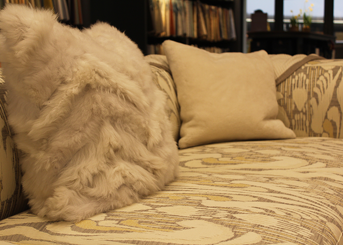
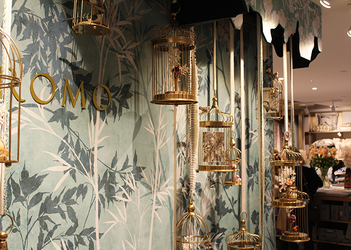
We caught a sneak preview of Romo’s upcoming collection, Pulma, narrating a blissful fairy tale that ushers in the wonder of nature and all it has to offer. Featuring intricate prints and embroideries, traditional details have been reimagined for the 21st century, as swirling florals and graceful birds transfix the eye and envelop the senses in a magical surrounding. Keep an eye out for this release at the beginning of April…
Zimmer + Rohde also delved into an experimental use of colour with their collections Kusbit and Grand Leaves, both bursting with colour and creativity. In line with the theme of the exhibition, Zimmer + Rohde hosted a panel discussion on ‘Creating Biophilic Narratives with Fabrics’, highlighting that the ‘modern day consumer and client are demanding that nature is incorporated into the spaces they are living in more and more – simply because it makes them feel good to be linked to the outdoors.’ We also spotted these new collections within the Inspiration Gallery, conceived by creative director Arabella McNie, which featured a series of pieces expressing the mood of the new season.
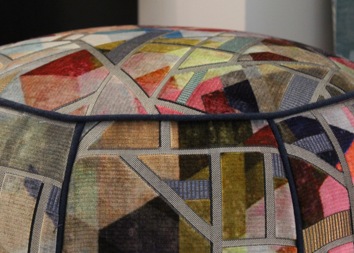
Three narrative threads tied the installation together: ‘New Shoots’, which explores design with a connection to nature, including fresh florals and botanical prints; ‘Sorbet’, which features an upbeat palette of pistachio, raspberry, peach and citron alongside a sense of playfulness and storytelling; and ‘Sonia’, named after Sonia Delaunay, channelling many of the Parisian avant-garde artist’s recurring motifs, from concentric circles, fractured squares and rhythmic compositions to abstraction and joyous colour.
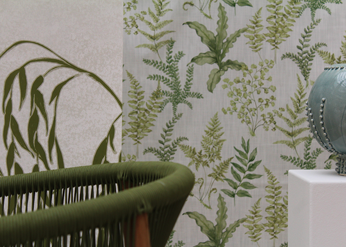
As the industry is emerging from the restrictions of the pandemic, there was a real sense of rebirth and new beginnings. The energy was uplifting and despite the somewhat unpredictable British weather, we left London Design Week with a real spring in our step and plenty of inspiration to guide us into the spring season.
