74 designs amenity spaces for Grainger at The Headline
74 is delighted to announce the completion of its amenity space designs at The Headline for client Grainger plc. The new BTR (build-to-rent) residential development is located in Leeds on the former site of the Yorkshire Post offices and printing works and forms part of the city’s new Wellington Place urban quarter.
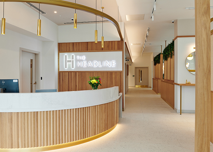
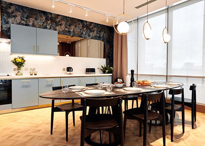
The new-build, 18-storey building, with extensive frontage looking directly out over the River Aire, features a stepped design from the 13th to the 17th floor, with parking at below-ground level. The 242-home scheme has been designed by architects The Harris Partnership, with 74’s remit covering the interior design of the 595 sq m ground floor residents’ amenity space – where social areas are combined with a reception area, residents lounge, co-working space, a fitness-on-demand wellness studio and a gym – as well as a 155 sq m ‘Sky Lounge’ on the building’s 11th floor, with private dining room and additional external terrace space.
Brief and Approach
“We were looking to create a stand-out design for the amenity spaces” Bianca Yousef, Associate at 74 commented, “that would be notably different from the harder-edged, more corporate feel of the interiors of many of the surrounding buildings. The idea for The Headline was for a soft, elegant and sophisticated series of spaces where residents could work, rest and play, with ideas and inspiration for the design concept taken from the site’s former life as the headquarters of the Yorkshire Post newspaper.”
Katherine Stephens, Grainger’s Development Manager for The Headline said “We are really pleased with the finished amenity spaces at The Headline. 74 have done an excellent job in answering to our brief, bringing creativity and great attention to detail and in doing so, creating spaces that we feel confident our residents will love.”
Design Treatment
The design treatment for the two amenity spaces was aimed at enabling residents to relax immediately on entering the building and to feel at home. Light, soft tones – a mix of neutrals with feature soft blues and greens for the ground floor and the addition of a strong orange/rust colour in the Sky Lounge – combine to create a striking and fresh palette, with refined and minimal contemporary detailing throughout, as well as strong statement furniture and dramatic feature lighting.
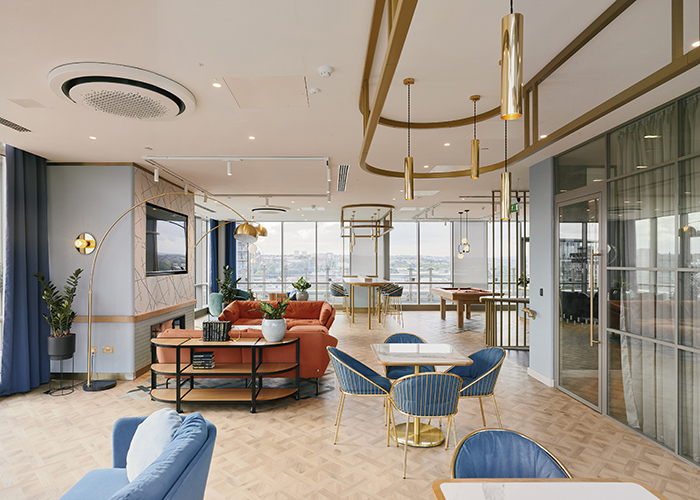
Bringing the outside in via greenery and natural materials to prioritise resident wellbeing was also an imperative, as were the quality cues provided by the scheme’s materials, which include solid surface finishes, such as beautiful porcelain floor tiles and natural light oak. Brass is used throughout in the scheme’s furniture, lighting and design detailing, with the gold finishes to the scheme’s metalwork creating a welcoming sense of warmth. Fit-out contractor Gariff Construction Ltd, who have previously worked with Grainger, created the scheme’s stand-out bespoke joinery.
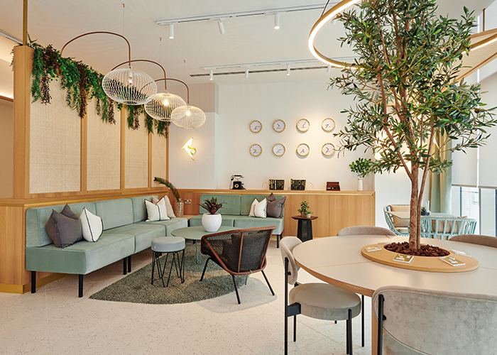
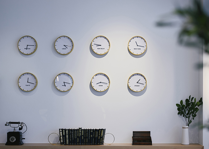
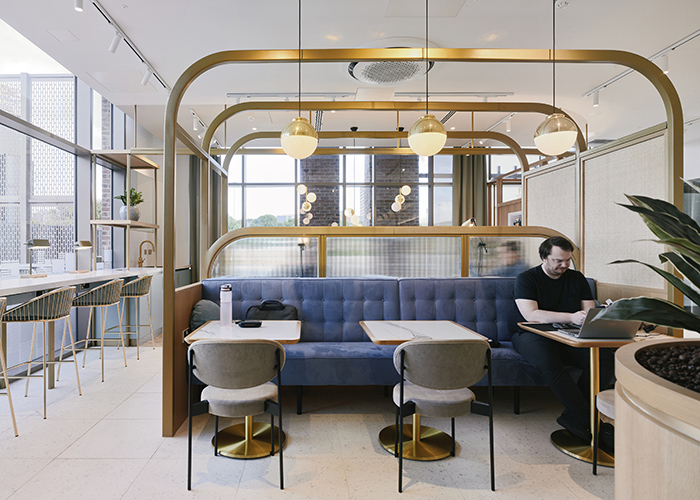
The site’s newspaper heritage influence can be seen in the choices of set dressing – from typewriters and a series of eight wall clocks showing the time in major cities throughout the world – through to the influence of printing production rails, whose echo can be seen in the dramatic, curved framework rails 74 designed around the booth and sofa seating in the centre of the ground floor space. Lighter touches reflecting printed text, the formation of lettering and newsroom styling also find their way subtly into the design via the scheme’s wayfinding, which was created by f.r.a. This was complemented by the work of Widd Signs, who fabricated and installed all the enhanced wayfinding, including the main building sign.
