SpaceInvader creates a ‘Nest’ for digital & tech businesses at Glasshouse, Alderley Park
Developers Bruntwood SciTech invited SpaceInvader to consider the best usage for the lower ground space within the newly re-developed ‘Glasshouse’ building at world-leading life science and innovation campus, Alderley Park. Glasshouse is the redevelopment of a former toxicology lab, comprising 16 separate buildings around a central courtyard garden, into a single, new 150,000 sq ft commercial office building, specifically designed for digital and tech businesses.
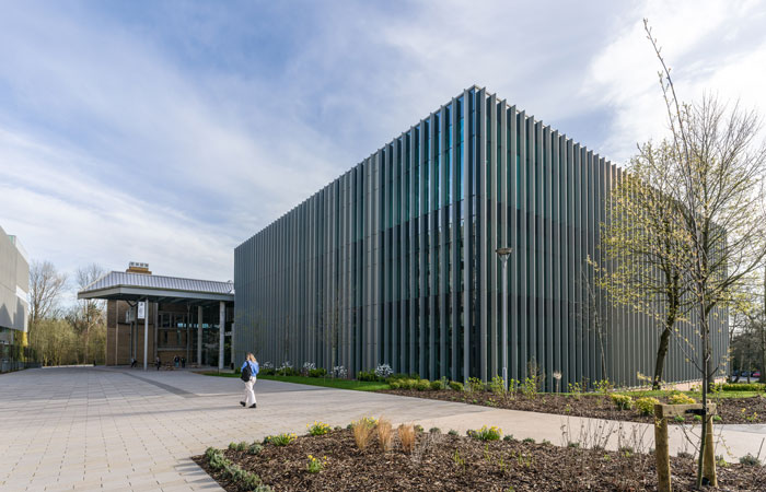
Glasshouse at Alderley Park
The lower-ground floor, which originally offered 1,425 sq m of open space, presented a challenge, with only one glazed area facing out onto a sunken garden. This, combined with changing market needs and more demand for fully-fitted space and a growing focus on employee wellbeing, presented the perfect opportunity to create something truly unique.
‘Rather than giving us a brief, our client simply asked, ‘What can be done here?’ John Williams, SpaceInvader Director/Founder explained. ‘Our response was to find the light within the dark and seek to transform the feel completely. At the same time, we realised we could also make a virtue of its safe and cosy feeling of enclosure, creating a kind of hideaway that tied in with some elements of the rest of the building for the sake of integrity, but which was also distinctly individual. It was the kind of challenge we love.’
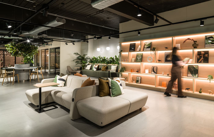
Wellness and Relaxation Area immediately on arrival
Glasshouse has a specific focus on technology and innovation. The plan for the new Nest space was to create two small, dedicated work suites that could be rented out to smaller-scale tech companies, whilst the rest of the space would be designed as a collaboration and co-working area, open to everyone in the wider building.
‘This treatment and solution have proved extremely popular’ John Williams added. ‘People really love the finished space. It’s gone from being something of a hideaway to one of the most desired areas of the building to spend time in.’
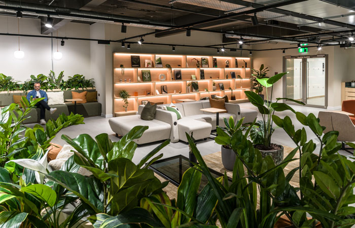
View back to entrance doors from planting divider
Space Plan and Brief
The glazed wall on the space plan had to be allocated to the rentable suites from a sales perspective. Suite 1 glazing therefore, at the north of the plan, runs along 18.3m of the plan, whilst glazing down the left wall runs across Suites 1 and 2 and measures 24.8m.
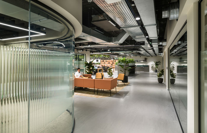
Lounge seating outside the formal meeting rooms
Functionality was high on the client agenda for the whole space, which needed to hit the mark on acoustics and the offer of a variety of zones, including comfortable destination tables and eye-catching feature lighting, as well as joinery pieces which incorporate planting and plenty of places for people on laptops to move around in.
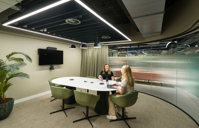
6 person meeting room
Meeting rooms requirements were for one 6-person room, which could potentially be configured to be part of Suite 2 if required, a Suite 1 meeting room, a boardroom and three 8-person meeting rooms. There also needed to be two teapoints and six Teams Rooms with low-lighting, where people could also work in peace and privacy if they wished, with the spaces offering extensive acoustic protection, as well as relief from sensory overload for neurodiverse workers. A final requirement of the brief was for a Yoga Studio and wellness space.
Design Approach
‘Our overall design approach’, commented Mollie Ruttle, Interior Designer on the project, ‘was to design a space that immediately felt serene and uplifting when you entered it, through the incorporation of great lighting and biophilic cues, whilst also making the best use of natural daylight. Our client wanted to create a design-literate space for people who appreciate high-quality interiors, with an added focus on wellbeing. We looked to use clean lines, with a less-is-more approach, plus bespoke joinery with radius corners for softness and visual interest, including curved timber rafts, alongside materials such as reflective steel and natural timbers.’
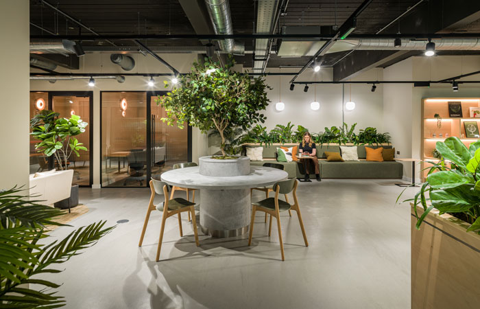
View of circular table with tree at its centre
Lighting design was key to the success of the scheme, with the designers taking inspiration from the hospitality sector in terms of creating atmosphere where there is a low level of natural daylight, whilst pairing this with a practical mindset, to make sure users could work easily in any part of the space. As well as diffused light created by track lighting, other key elements included light panels; curved lighting features; backlit planting; dramatic wall-to-floor lights and curved suspended lights.
‘We introduced a lot of soft furnishings’ Mollie Ruttle added. ‘A ‘Nest’ needed to prioritise comfort above all and be a place people want to sink into and dwell in. We worked closely with Paul Mann and Sam Noton from Penketh Group to specify furniture that would suit both the concept and the scheme’s budget.’
For the furniture choices, the colour scheme is a range of oranges and greens, alongside aluminium and brushed steel. As Nest leads directly into the atrium space, it was important to relate the colours to the atrium scheme, but in subtler manner to suit the low levels and overall feeling of tranquillity we were trying to create.
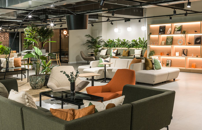
Furniture in this space includes Sixteen 3 Odyssey Chairs
The scheme also features a selection of art prints created by SpaceInvader Branding and Graphics Associate Jenny Crossland, designed to expand on three themes: Modernism / Plants / Data, all of which reflect both the design treatment and the tech teams using the space.
Design Detail
Two teapoints serve as welcome areas for all users settling into the co-working spaces. These have a different feel with one in a metallic finish, positioned to the left of the scheme and the other timber-clad and positioned on the right side of the space in the wellbeing area.
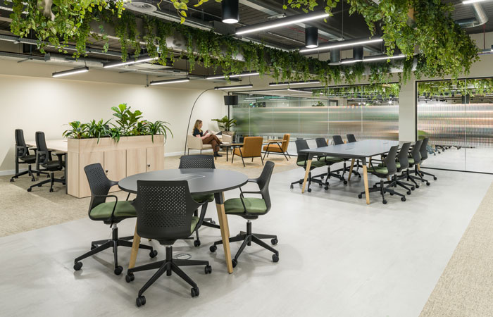
A curved ceiling raft houses hanging planting in the second co work area
Flooring includes Nora Interface rubber flooring with a concrete effect finish, which looks great and is also nice and quiet underfoot, with a 20db sound impact reduction. This flooring material also boasts low-emission, low-pollutant, PVC-free and phthalate-free properties, ensuring it contributes to a healthy indoor floor quality. Elsewhere, floor tiles from Amtico’s LVT range are used, including a Terrazo tile with speckles of green and orange. An inset carpet under the furniture settings in the lounge / co-working spaces is from the EGE ‘Mark of Time’ range, with an orange-yellow tone.
The ceiling is exposed in order to maximise a sense of height, though this design decision was also chosen on an aesthetic basis to suit the functionality of the space. Subtle track lighting features throughout, with the layout in the central lounge space surrounded by a single, long, curved feature light.
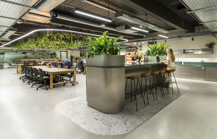
A high work bench at one end of the co working area is a bespoke metal unit
The sturdy timber co-work tables in the central area are by Orangebox, with the warmth of the timber lending an almost-domestic ambience to the space. This space, the main focus area of ‘Nest at Glasshouse’, is given further emphasis by three large, curved timber rafts, complete with suspended lighting and hanging plants. At one end of the co-working area, there’s also a high work bench, in the form of a bespoke metal unit in Formica brushed stainless steel laminate, with a rich green Hi-Macs work surface slicing through the end sections.
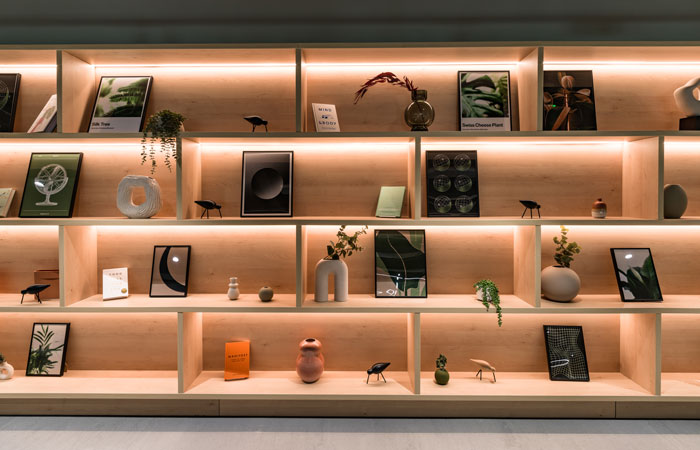
Shelving unit housing set dressing items and bespoke prints
An eye-catching, floor-to-ceiling timber shelving unit draws the eye to the more informal lounge space beyond. The shelving unit houses set dressing, along with bespoke prints created by Jenny Crossland of SpaceInvader, with further prints also used in the meeting rooms. ‘It was important that the themes for the art prints tied the concept together, as well as enriching the space’ Jenny Crossland said. ‘They include data and nature fusions, such as sun charts and scientific diagrams that also reference the light and dark concept, as well as fluid, repeat patterns and grids that reflect tendencies in both data and natural, organic forms.’
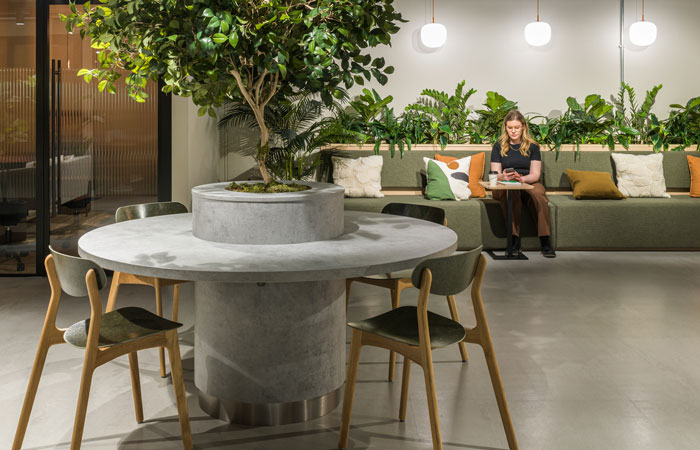
FL04 Muuto Rime Pendant Lamps hang above the banquette to the rear of the wellbeing space
Soft furniture in the wellbeing lounge and co working spaces includes timber-effect banquettes, upholstered in a soft herringbone pattern and stand-out, large-scale Sixteen 3 Odyssey Chairs, which invite users to settle in for comfortable dwell time. Three FL04 Muuto Rime Pendant Lamps with orange cords hang above the banquette in the wellbeing space. Large plants in pots also feature in this very relaxing zone, which also features a circular table with a tree at its centre. With sustainability being key for the client, furniture includes chairs made of a textile created from recycled naval suits or from hemp.
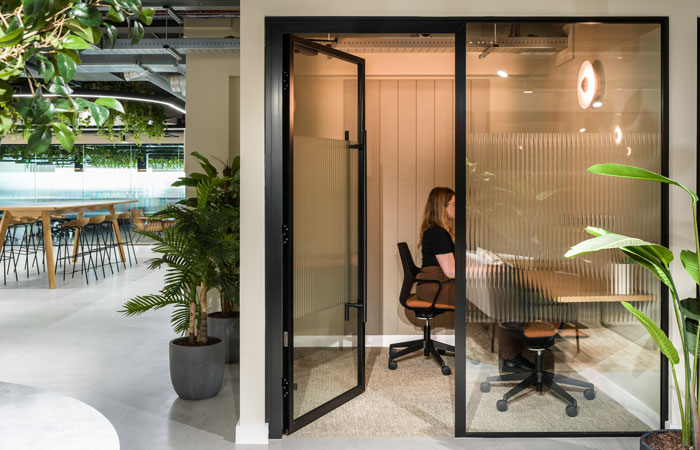
Quiet rooms with fluted glazing
The smaller meeting or quiet rooms leading off the lounge space feature fluted glazing for a semi-private feel. All larger meeting rooms also have suspended acoustic baffles within the linear light feature. Flooring in the meeting rooms and the work suites is a Tarkett carpet, selected for its health-enhancing features and cradle-to-cradle certification.
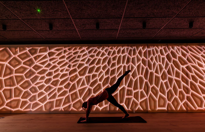
The light wall is made of Corian with backlit LEDs
One of the most spectacular and unusual features in the whole scheme is located within the Yoga Room – a light wall made of white Corian, which changes colours on a spectrum using backlit LEDs. The wall, which runs the full length of the long wall at the back, is visible through, above and below the room’s glazing, which has a fluted central section – and is more clearly visible when the doors are open.
‘This stand-out feature really finishes the scheme off in style’ John Williams commented. ‘It’s intriguing when glimpsed and highly impactful when seen in full, functioning as much as an art piece as a mood-defining piece of design.’
