Studio Tour: Nissen Richards
We are thrilled to bring you the latest article in our Studio Tour series. We spoke with Pippa Nissen, Director at London-based design studio Nissen Richards Studio. Pippa told us about her business, her team, their design ethos, their projects and what they have planned for the future.
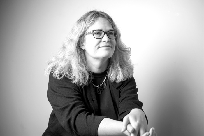
Pippa Nissen
ONE: Business
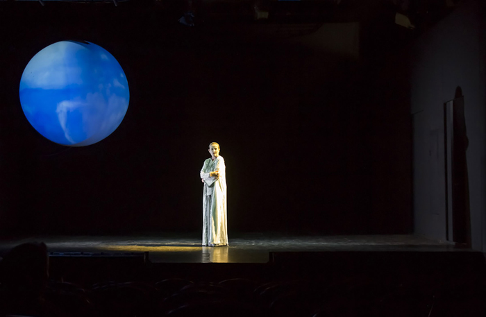
Background in Theatre Design.
We launched Nissen Richards Studio in 2010 – ten years ago this year. I’d previously worked as a theatre designer and a partner in an architectural practice I started in 2002. I’d spent a long time in my 20s studying widely – art, music and theatre – as well as qualifying as an architect. In 2007 I’d worked on an exhibition for the V&A, Telling Tales, and loved every second. It felt like it was bringing all of my interests together in one total experience for the first time. I really fell in love with exhibition design and it became the starting point for the new practice. When I was named one of the AJ Corus 40 Under 40, it gave me the confidence to strike out on my own and do what I really wanted to do.
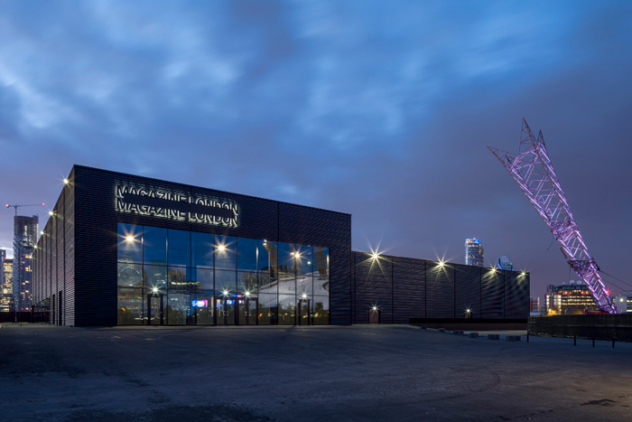
Jim Richards architectural design flair as seen in the award winning Magazine London project.
My ambition was to create a multidisciplinary team to work on projects in a collaborative way, and this has remained the driving idea. My husband, Jim Richards, joined soon after, and we now feel as if the company is an extension of our family. Jim brought in great expertise on the technical side of the practice, as well as design flair in architecture, and huge knowledge about the treatment of existing buildings.
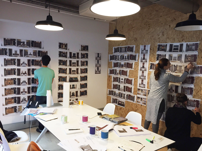
Process leads to solutions in our studio.
Our values are all about good design and an intelligent solution for each project. We pride ourselves on thinking hard to arrive at each solution, without a given style or methodology. We believe the process itself should lead to the solution. We also love collaboration and working with different and interesting voices.
TWO: Building and Workspaces
We’re based in Haggerston in London’s Shoreditch. We’ve been here 9 years now and the area has totally changed since we arrived. It would have been classed as edgy at the beginning but is now the heart of London’s creative scene. We’ve also moved within the building to a unit three times the size of the original, overlooking the Regents Canal, with huge windows. It’s fantastic to people-watch and see the wildlife and even schoolchildren boating past. The area is brimming with artistic spirit, with creative graffiti serving as a wonderful changing external exhibition and lots of local artistic businesses, from graphic and web-based designers to craft-based makers.
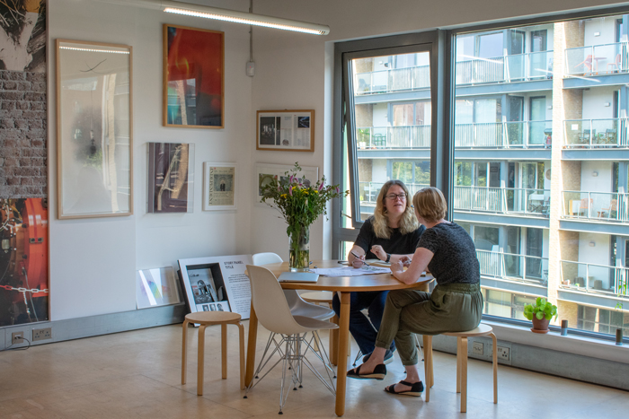
Our studio in Shoreditch has huge windows and overlooks Regents Canal.
The building and workspaces were developed by Shoreditch Trust, a charity working and engaging with the community. This sits very comfortably with our ethos. We’ve worked with them in the past on community engagement education projects, which have been extremely rewarding. They also run a restaurant with a training kitchen to encourage people back to work, for which we reorganised the kitchen spaces. During lockdown the Trust helped with organising food delivery to vulnerable members of the community. It’s a good to know our rent is going to such a brilliant charity.
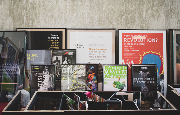
The studio space features raw materials such as concrete.
The office spaces themselves are quite raw – concrete, ply floors and large windows with lots of light. We’ve surrounded ourselves with samples, models and evidence of our experimental work, which all feed into our process. We put up ideas on the walls and work through them in a very active way. I love everything about where we work – the space, the neighbourhood, and the quality of light. The spirit of our immediate city definitely feeds into our work.
THREE: Team
We’re a multi-disciplinary, medium-sized practice with a pretty flat hierarchy, although ultimately myself and Jim are responsible for the quality of work coming out of the studio. We thrive on people having their own projects to feel ownership over and also enjoy people with different experiences contributing to the same idea – whether a graphic designer, film maker, architect or curator.
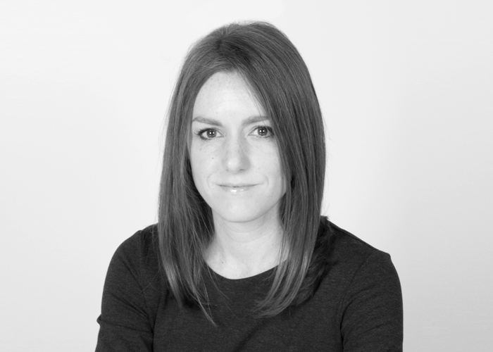
Candy Wall.
If I were to pick out a few people for special mention, I’d start with Associate Candy Wall, who heads up our graphics team. Candy has worked with us for 6 years and has transformed our graphics department. Interestingly, she originally applied to study architecture before the graphics switch and this natural three dimensionality comes through in her work. She thinks very similarly to me, but in a different medium, which I really enjoy. When we start a project, she’ll plan out the materials, tone and colour, as well as finding decorative or gestural lines that become text and typology. Candy loves to travel and explore other cultures, and this also comes out in her work. She is able to pick a colour or texture that can give a sense of another place or time.
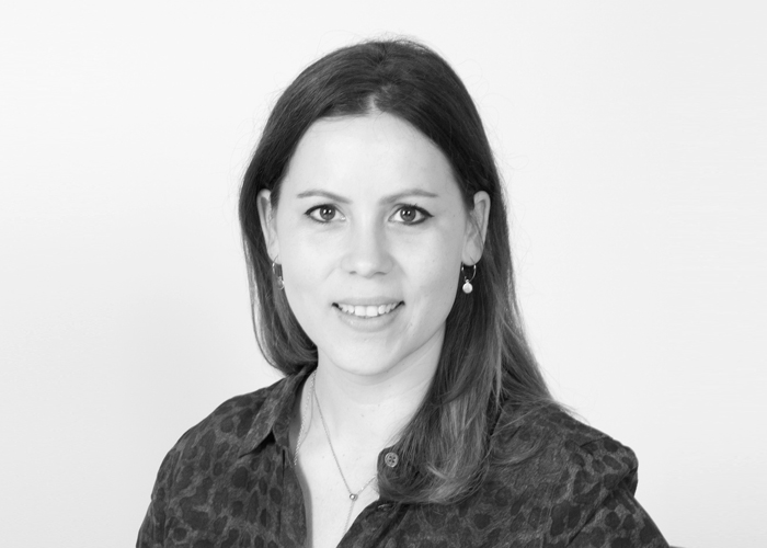
Marie-Lise Oulmont.
Marie-Lise Oulmont is an Associate too; an architect and an exhibition designer. She joined close to the beginning of the practice and has become a core part of the team. She works with myself and Jim across both disciplines and really understands how we work and think. Her father is an artist and she has a very good eye for form and colour. You can always see the artist side of her work as well as the more technical, architectural side. We started teaching at London Metropolitan University together this year and it’s obvious that Marie-Lise is a natural communicator. She can condense complex ideas into a straightforward sentence – a real skill!
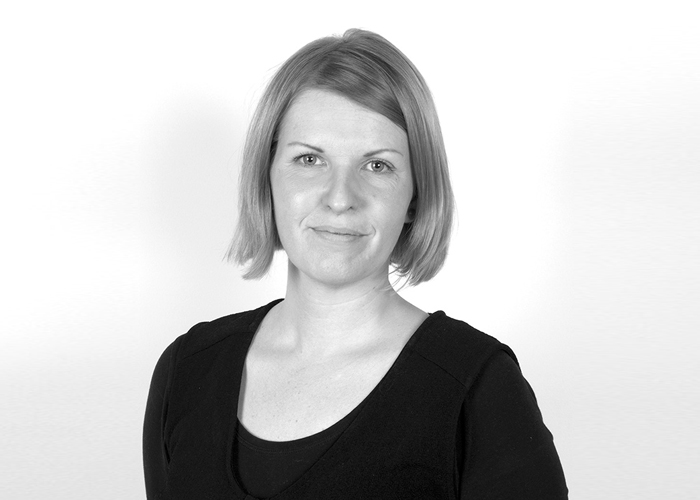
Elin Simonsson.
Elin Simonsson is our Head of Interpretation. She joined us a few years ago but I already cannot imagine the practice before her. The interpretation side of the studio has really shaped our recent work. We originally met Elin as a client at the Natural History Museum and really enjoyed how we collaborated. She has broad experience, from roots in archaeology through audience research to carefully-written text and the specialist discipline of interpretation in exhibition design. She can create a really clear tone of voice that perfectly captures subject matter. For us, she has transformed how we work and now mentors designers in our office to help them visualise complex curatorial ideas.
FOUR: Design Approach
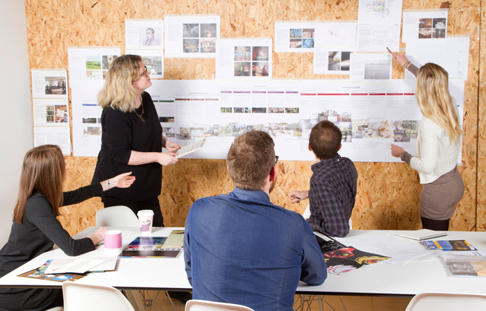
We plot designs with the phrasing of a musical-piece.
We believe strongly that good design arises out of thorough research and process. We start with a very broad concept period, where we think about many options and try to conceive a total visitors’ journey. We spend time plotting this, so we can plan the pacing of the visitor journey very carefully. Like the rhythm of a piece of music, we know that creating varieties of slower, faster and nuanced phrasing ensures an exciting and dynamic experience.
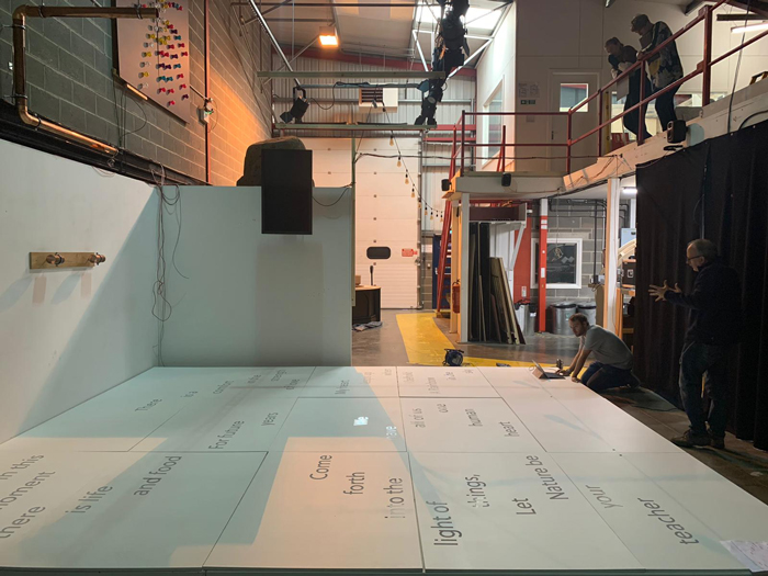
Forming the punctuation and structure of projects takes time.
We always start very broadly and gather as much information as we can to produce options and different directions. Then, slowly, the final punctuation and structure of designs start to form before we go on to create the final, detailed designs.
FIVE: Projects
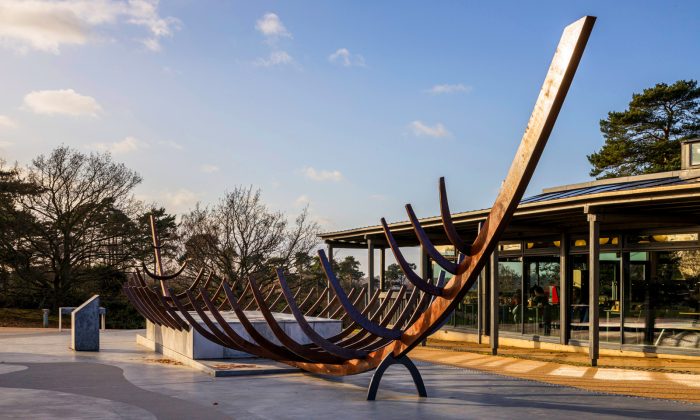
The replica ship installation at Sutton Hoo.
We recently completed Sutton Hoo, where we were engaged to work on the architecture, exhibition, interpretation, and graphic design. The project’s aim was to create an experience where visitors could understand the story behind the Sutton Hoo Scheduled Ancient Monument and Anglo-Saxon burial grounds. This was a tremendously exciting project where the visitor experience ranges from an installation of the burial ship on arrival to Tranmer House, where the site’s archaeology is introduced. Next, the visitor taken through the landscape, walking the same route the funeral procession would have walked, whilst a new tower at the edge of the burial ground means views connect the water where the ship would have arrived with the final burial ground, before a final exhibition telling the fuller story and setting the scene for the objects discovered. The story behind the discovery is about to be released as a film called ‘The Dig’, starring Ralph Fiennes and Carey Mulligan.
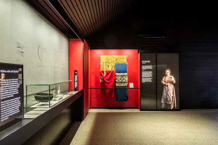
Designing the total experience at Sutton Hoo.
At the start of 2020, we completed a permanent exhibition at The National Library of Norway, called ‘Opplyst’, which has just won the Gold Award for International Public or Institutional Space at the London Design Awards. It’s a fantastically dramatic and dark space, where every surface has been bespoke-designed and contains thirty highly-significant objects from the country’s history – fragments that helped shape the nation. Light and dark are metaphors, suggesting the concept of knowledge arising like light out of the darkness, and also structuring devices.
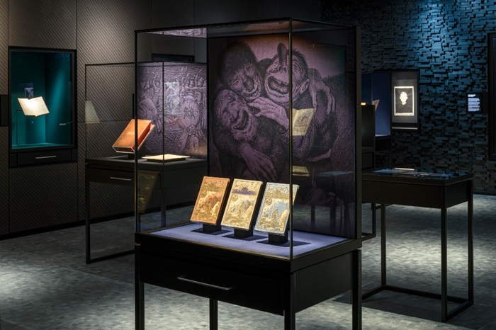
Opplyst at the National Museum of Norway.
Opening at the beginning of 2021 is a new exhibition all about touch called ‘The Human Touch: Making Art, Leaving Traces’, at The Fitzwilliam Museum, Cambridge. The exhibition examines how the language of touch shapes and has shaped our existence, with the theme of ‘touch’ resonating in a way no one expected when it was first commissioned.
SIX: Future
We feel very lucky that as the lockdown started, we had quite a broad series of projects on the books, from architecture and housing developments, to smaller experimental projects. We always enjoy this breadth as a way of working and it definitely makes us more robust in uncertain times!
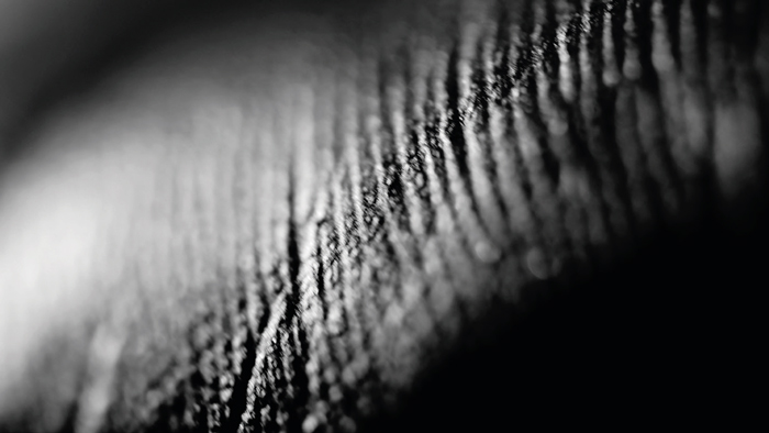
Creating a film for new exhibition The Human Touch.
We need to be really agile in the next few years as budgets for museums and arts institutions have changed so radically. All the same, this has been an interesting and surprisingly fertile time, as we’ve had several very quick, creative projects where we are trying out different things. For example, for ‘The Human Touch’ exhibition, we also made a film that created an atmosphere for the exhibition and became an extension of the designs. At the Wallace Collection, we’ve worked on a couple of projects, where we designed settings for objects as quick installations within existing galleries to refresh the permanent collection.
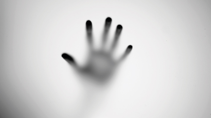
The Human Touch film at The Fitzwilliam Museum Cambridge.
Working in a sustainable way will also become essential in the future – using surfaces that can change and have impact but be re-used, including digital surfaces, and creating our own imagery, using materials that can tell a story, that change and are imperfect. We believe people will crave what is real, human and authentic, rather than too much smoothness and gloss as we move beyond the pandemic.
Contact Nissen Richards


