


Summer Shades: Alina Schartner on Colour Trends & Design Magic
Design Insider is thrilled to present a fascinating interview with Alina Schartner as the launch article for our summer content campaign focused on colour, the perfect campaign for the summer months, vibrant and emotive!
Alina is an independent, award-winning design consultant, trend forecaster, designer, editor, and speaker specializing in colour, product, and interior design. She collaborates with international brands to develop concepts and collections and shares her expertise through thought leadership, panels, workshops, and keynotes. Additionally, Alina serves as the brand ambassador for RAL COLOURS.
In this insightful interview, Alina delves into her journey in the design world, her unique approach to trend forecasting and colour consulting, and her work on significant projects like the RAL Trendbox 2025+. She highlights the importance of integrating visual storytelling and how a deeper understanding of colour is reshaping design.
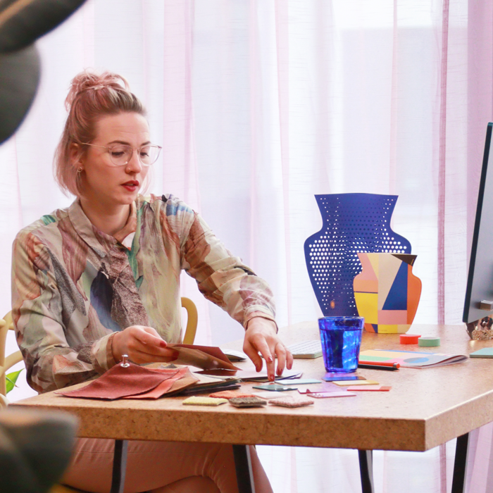
Alina Schartner. Photo by Tim Conrad
Alina, could you please introduce yourself and share some insights into your journey in the design world? What inspired you to pursue a career in design and colour consulting, and how have your experiences shaped your role and approach in this field?
I’m an independent design consultant, trend forecaster and designer specialising in colour, product and interior design. I work for international brands and organisations, developing concepts and collections for living, working and third spaces – usually 12 to 24 months before launch. Additionally, I’m the brand ambassador for RAL COLOURS.
I’ve always had strong creative, analytical, intuitive and empathetic skills. I went to school for graphic and communication design. I then worked in interior design consultancy, furniture and home decor sales and visual merchandising before returning to university to study colour and surface design. There I focused on trend forecasting, colour psychology and purposeful design. This experience helps me to understand how different people work with my advice.
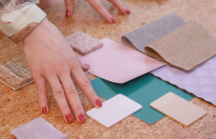
Photo by Tim Conrad
Your approach to design and colour consulting emphasises fresh insights and inspiration. Can you describe a particularly challenging project where your unique perspective on trend direction significantly impacted the final outcome?
On a project for a world leader in home appliances, I was given a very specific and detailed brief. When I presented my findings, they were surprised that I had given them everything they wanted, and I also opened their eyes to many other aspects they had not considered. But my going the extra mile was the turning point for their challenge. It’s my external, holistic view that sets me apart from in-house experts.
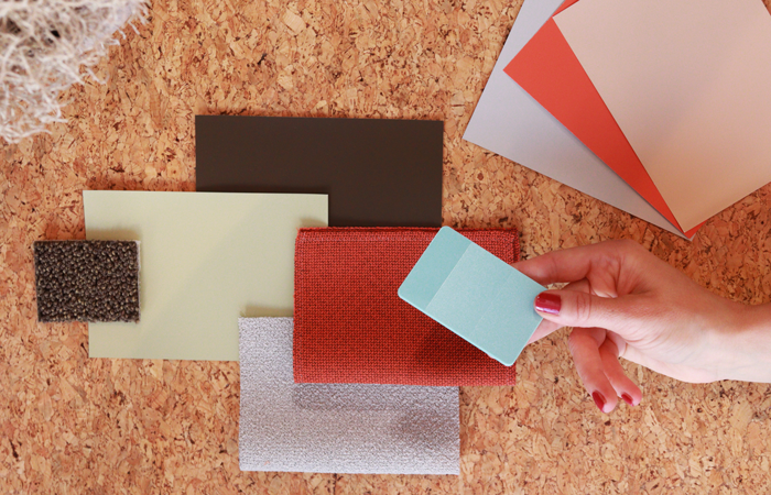
Photo by Tim Conrad
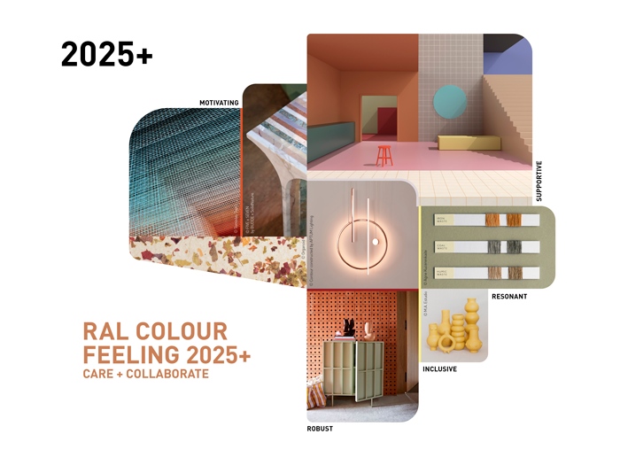
In your work on the RAL Trendbox 2025+, how did you and your team approach the research and colour selection process to ensure that the colours chosen would remain relevant and appealing in the long-term?
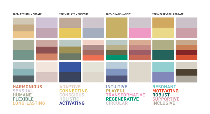
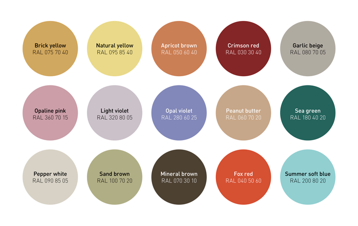
We’re a team of CMF, design, trend and industry experts. Beyond aesthetics, we look at colour trends through the lens of culture, technology, economics, sustainability, design principles and more. The RAL Trendbox 2025+ is part of the first major publicly available colour trend project that shows it’s possible to create a fresh feel without rushing to replace everything. Five colours from the previous edition are updated with ten new colours. We made sure they are easy to use and work for different functions and moods. I’m so proud that we won gold for the RAL Trendbox at the German Design Award 2024. Finally, colour design get’s the recognition it deserves.
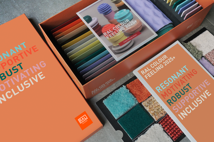
RAL COLOURS Institute International Trendscouting. Photo, Timo Rieke
Your expertise spans various areas, including visual storytelling and sustainability. How do you integrate these elements, and others, to create a cohesive and innovative design strategy for your clients?
A successful design strategy must be considered 360. I help my clients to see the big picture as well as the details. Sustainable products that aren’t visually appealing or engaging usually don’t sell well enough. If the storytelling doesn’t match the sustainability claims, it’s greenwashing. People are much more educated now. I inspire brands to be more in tune with our planetary wellbeing and their social responsibility.
With your extensive experience in trend forecasting, how do you differentiate between fleeting trends and those with the potential for lasting impact, especially in the context of interior design and lifestyle?
Interior design and lifestyle trends are an expression of what is happening in the world. All my work is based on understanding the relevant mega, macro and micro trends, as well as the mindsets, needs and aspirations of different target groups. Another influencing factor is the product segment. Trends in sanitaryware, for example, are longer-term than those in soap dishes or fast-moving consumer goods. There’s finally a shift towards longer-term thinking in trend forecasting, and I’m a big advocate of it. Wherever I can, I push for a seasonless approach.
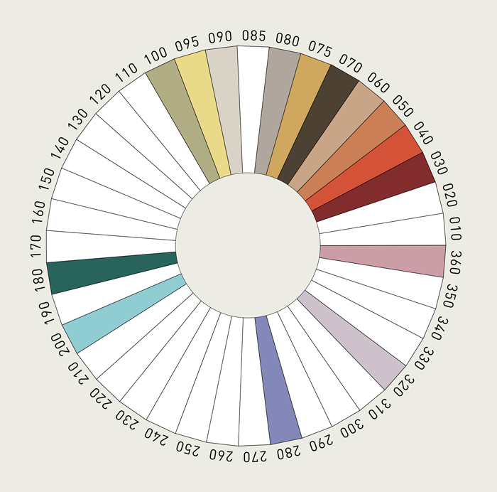
RAL Colours
During your keynote speaking engagements, what key messages do you aim to convey to your audience about the importance of colour and design in creating engaging and sustainable environments?
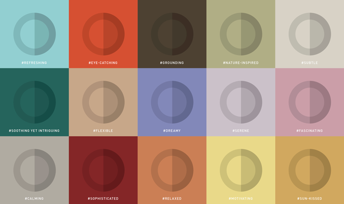
Good use of colour and design has a positive impact on people’s physical and emotional wellbeing. Research shows that working and living in predominantly achromatic and sensory bland environments is detrimental to our quality of life, especially for those who spend too much time indoors. Designers should consider colour, material and finish at the same time as the shape of a product or the layout of a room. Beware of colour stereotypes – not every green feels natural and not every red feels warm. We also need to design more inclusively, taking into account the needs of different people.
RAL Colours
You mention the ability to balance novelty with commercial viability in your work. Can you share an example of how you have applied this balance to a project, ensuring both innovative design and market success?
For example, when I help a brand develop or update a range, the challenge is often to create a visually appealing collection that feels contemporary, while incorporating colours that have always been successful for the brand. Often it’s the classic neutrals that sell the best. But if we built a whole range around them, there would be little interest. Unfortunately, this is often forgotten when brands focus too much on financial data to decide which colours or designs to keep.
RAL Colours
You’ve recently published insights into the theme of embracing all emotions. How do you see this understanding influencing future design trends and the way we interact with the spaces we spend our time enjoying outside of the home?
Human emotions are multifaceted and we need spaces that support us through all the natural ups and downs of life. Toxic positivity isn’t good for our health. Spaces outside our home can often be bolder, especially if we spend shorter periods of time there. Very bright colours and huge, vibrant patterns that might be overwhelming at home can work really well in a retail or hospitality environment, for example. But there’s also a growing appetite for dark and gloomy atmospheres that give us goosebumps or transport us to fantastical realms.
RAL Colours
As we look toward the future, how do you foresee the use of colour impacting the way we experience commercial spaces?
Social media is educating more people about the emotional and functional qualities of colour in interior design – raising the bar for commercial spaces. The increasing convenience of online shopping, food delivery services etc. means that physical commercial spaces need to offer even more engaging experiences. I also think it’s crucial that the needs of the visually impaired, neurodiverse or those with mental or physical health issues are taken into account much more everywhere. People will also look more closely at how products are coloured. There’s a growing awareness of non-toxic dyes in fashion. It’s only a matter of time before interior design follows suit.
RAL Colours
In your collaborations with clients, how do you leverage your expertise in colour forecasting to align with their unique brand identity?
I always triangulate market and consumer insights with colour perception, colour theory, colour psychology, colour forecasting and my client’s brand identity. Not every colour trend is relevant to every brand. Another important factor is the art of colour proportion. In general, directional brands can use larger quantities of trend-led colours, while traditional heritage brands are often better off using just a few to keep their collections contemporary. But it can also be done the other way round in order to provoke a reaction. The approach I suggest depends on the objective of the project and the brand.