Surface Design Show: Buckley Gray Yeoman
The shortlist for this year’s Surface Design Awards consists of an impressive 43 projects across seven categories, each entry an exemplary example of creative and innovative use of materials and lighting in both interior and exterior schemes. Some projects won nominations across several categories, resulting in 48 finalists.
As proud media sponsors of the Surface Design Show, Design Insider were keen to use our own expertise in commercial design to select the projects which stood out for us.
We begin this series of articles with our selection from the Retail Exterior Surface category where Buckley Gray Yeoman created new public spaces with elegant attention to detail.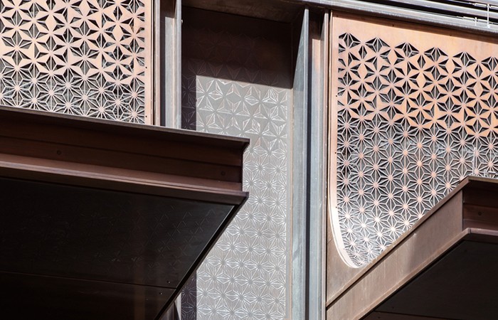
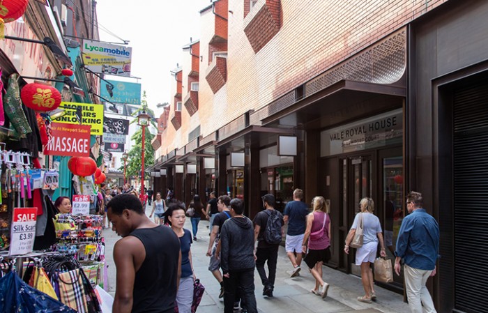
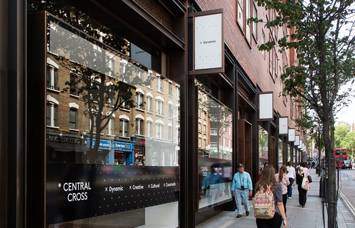
Buckley Gray Yeoman has reconfigured 32,000ft of retail and 13,500ft of restaurants at the Newport Sandringham building, which spans the block between Newport Place and Charing Cross Road in London’s West End. Commissioned by the building owners, Shaftesbury, the designs have dramatically improved many areas: the retail frontage of the building; in-filling a dark and cluttered colonnade to improve the streetscape of Charing Cross Road; and enhancing Newport Court, an important pedestrian route into Chinatown.
The Newport Sandringham scheme is a brilliant opportunity to create high quality public spaces that will bring real improvements to the experience of the eastern end of Chinatown, as well as over 100 metres of retail frontage along Charing Cross Road. They came up with a design for the retail frontages that is modern and sophisticated while retaining the cultural identity of Chinatown. This design will help enliven Newport Place and compliment the future public realm scheme.
Shaftesbury were keen to deliver a retail development that was consistent with the quality of design and materials associated with Regents Street and Oxford Street. In addition to quality, the high footfall and bustling location meant that the materials needed to have longevity, robustness and offer the client a finished product that could be kept and maintained to a high standard to attract world class retailers.
Traditional shopfront techniques were paired with contemporary detailing to fold sheet brass onto a timber subframe to create new metal shopfronts. The brass was treated in two ways to create contrasting tones of metalwork. An acid is used to ‘age’ the brass adding a dark patina, and a bronzing powder is used to ‘tone’ the metal to provide a rich bronze colour.
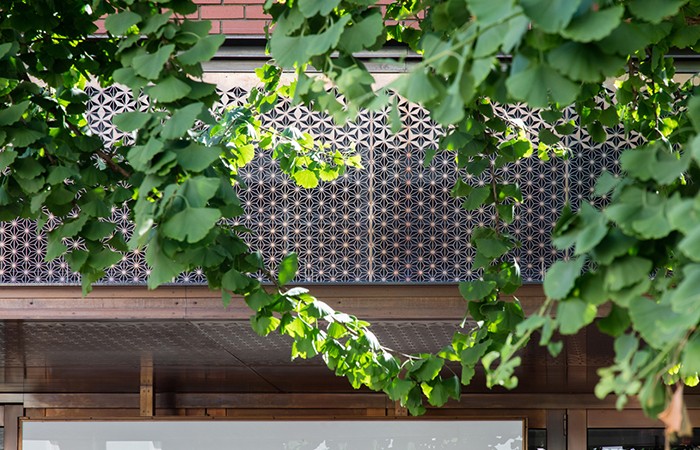
The requirement for large amounts of ‘louvered’ area, lead Buckley Gray Yeoman to develop an East Asian pattern that could be laser cut from brass sheet to form bespoke ventilation grilles and etched onto metal cladding panels to emphasise the proximity to Chinatown. The pattern has been continued onto projecting brass canopies which feature etched soffit panels and carefully set out laser cut ventilation grilles.
The greatest challenge was creating a pattern that has a gradation from solid to open, that could be applied to a number of different panel sizes and shapes. In order to achieve the free air requirement, the pattern had to achieve a minimum free area of 60%. This extent of cutting compromised the rigidity of the metal, particularly the curved panels which were subject to warping. The substructure was developed using curved steels and timbers in order to provide a consistent fixing and avoid ‘pillowing’ of the metalwork.
Etching the metal work at low level involved trial and error in order to agree the correct depth (0.5mm) to achieve the desired look. A number of mockups were developed to test the patterns and agree the overall material choice.
This is part of a series of posts for the Surface Design Awards, hosted at the Business Design Centre in Islington between the 5th and 7th of February. If you would like to register attend, you can click here. Alternatively, you can read more about the Surface Design Show on Design Insider.
