The Colour Bible: Interview with Laura Perryman
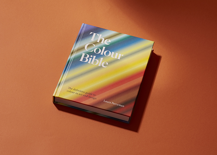
Colour is intrinsic to our lives. So intrinsic, so utterly ubiquitous in fact, that it’s easily taken for granted. It’s easy to miss the innumerous shade variations that go on around us everyday when there are so many other things to concentrate on; not least our digital screens. Even for designers and architects, colour is often saved for later down the line, with seemingly more important things being granted greater time and attention within the design process. But that doesn’t lessen the impact that colour has upon us, nor it’s innate involvement in all the things that we design and create. That’s certainly the view of Colour and Material Consultant, Laura Perryman, who I first interviewed in 2019 when her work was largely focused around colour and material trend forecasting and consultancy under the banner of Colour of Saying. It’s safe to say that a lot has happened in life since then, not least in Laura’s; having researched and written what she describes as “The definitive guide to colour in art and design.” The Colour Bible, which was released in late 2021, is a handbook of sorts; a guide to the science and psychology behind colour and an insight into the origins, evolutions and historical usages of a selection of 100 pertinent colours for designers in the 21st Century. And that’s not all Laura’s been up to either. Workshops, an online course, as well as a consultancy project with Graphenestone Paints and the creation of The Circular Colour Report have all come to fruition alongside the book. I caught up with her to find out more about the colourful journey she’s been on and to discover more first hand insights into The Colour Bible.
Jim Biddulph (JB): There’s so much to cover about the book and all the other projects you’ve been working on since we last spoke, but perhaps a brief synopsis in your own words about the book and why you focused on colour is a good place to start?
Laura Perryman (LP): Colour is an incredible tool – but it embodies a lot of aspects. It’s way beyond what we see – in fact now it’s an essential area to understand if we want to influence the way people perceive and accept and experience. Today, colour is a broad subject; colour is deployed in a variety of contexts and has a much more diverse portfolio of use than it’s ever had before. So, anyone really working with colour; from branding to art or interiors, this book gives you the highlights and what you need to know.
JB: There’s so much to cover within The Colour Bible, but one thing that really sets it aside from some of the other books of its ilk is the level of nuance that you manage to uncover for the colours you delve into. It’s not just about how a certain colour looks or how we might use it, instead it really feels like you offer the full character or personality of a colour; including how it might make us feel. Can you explain a little bit about how you managed to extract this much information from such specific colours?
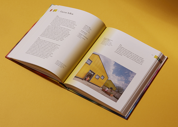
LP: The stories and facts behind individual colours are what ultimately inspired me to create the chapters of the book. I created a list of over 250 colours dug up from archives and pigment libraries, but also my time in colour trend forecasting – I had experience in curating and even naming large collections of colours for paint and surface brands. It all played a part. I’ve noted down names of colours over the years, almost like I knew I would come back to them. However, lockdown meant that in some cases I couldn’t access some of the expected archive materials. This led me to utilise my experience of trend forecasting, and instead I developed the “Now / Use” side of each individual colour in more detail. Tracking visual signals, social-cultural changes, and the impact of advancements in science, technology, fashion, design is something I do naturally in my work as a Colour & Material Forecaster. As a result, each colour in the book draws upon incredible artworks, and the stories behind them, from across the decades – historical through to the 21st century.
It’s been a dream to curate some of my favourite examples in art or design to unpick individual colours, their histories – and importantly what benefit or meaning they have for us today – because that highlights their relevance. The 100 colours I’ve chosen are all in there for a reason because they, no matter their age, are relevant today in one way or another. Why have interiors become so obsessed with pink? It’s been building – nuance by nuance – over past decades and is proving itself way beyond just aesthetic application.
JB: That brings me to another fascinating thing about colour and the tussle between what is objective and subjective in how we view certain colours. Would you say that there are still connotations or expectations of some colours?
LP: I had an understanding that some colours already had certain associations and effects. But an often-dismissed colour area – pink (for its obvious gendered connotation) I found is a fantastic secret weapon with an array of nuances, all with very interesting background histories. I selected one of the book’s entries Baker-Miller Pink because of its proven ability to lower heart rate and have a calming effect, its past; a paint colour created in the 1950’s to combat aggression in prison inmates, also points also to the future, and the emerging field of neuroaesthetics (the scientific study of aesthetics and colour on brain function). This area of research is starting to prove with data just how beneficial applying the right colour is. For instance, the performance clothing brand Vollebak, has designed clothing specifically in this shade to help athletes prepare for endurance events. User’s zip-up entirely; enveloped in the colour and their heart rate slows, which is key if staying calm is a matter of success or failure.

JB: Another standout element to your approach is in underlining the materiality of colour; it’s physical qualities, what it’s made from and how. Was this a very conscious decision to make when setting about producing a handbook about colour?
LP: My background – certainly in textiles and mass manufactured materials – ultimately played a role. I learnt how to make dyes from natural ingredients to synthetic matter so ultimately colour has always been material in my practice. I’ve been questioning what things are made from an early education point at The Royal College of Art and have taken this forward into industry too. If you look at the history of colour there was matter; soils, ochres, minerals, plants, all sifted from the earth which had innate colouration. Before all the theories and fixed measures, there was substance, cells, particles, and atoms. Basic it may have been, but some of the first colours were made in by no means in an easy way, from stuff.
I often imagine how early humans must have felt as they roasted an earthy ochre for the first time; in the heat, the substance deepening, darkening and then igniting into a fiery red, through its different states of oxidation. The experience may have been individual, but it caused a primal response to repeat it, again and again – and nuance was right in there too. Before the age-old trick of adding white to mix a pale shade, Japanese artificers took raw Azurite, ground the mineral to achieve different levels of shade, and manipulated the size of particulate matter. A deep blue is composed of larger specks, while finer ground micas formed brighter shades. Of course, that was then, but the sheer experience of the changeability and splendour of colour had a significant effect on humans and arguably one that modern creatives are still pursuing; and as a society we are perhaps still consuming. Synthetic and repeatable colour is much more where it’s at today with bold fashion shades of lime, shocking pink and emerald green going in cycles down the catwalk.
JB: You mentioned synthetic colour there and whilst it isn’t the primary focus of the book itself, I couldn’t help but pick-up on the book’s points regarding the need for more ethical practices in how we make colour and colour our objects, as well as some of the references that address ecological issues.
LP: We might feel liberated by being able to have an endless list of colours to choose from thanks to chemical synthetic dyes. But one of the issues of being able to choose any colour from a Pantone swatch card is we lose the connection from what it’s made from. I’m continually fascinated by this. Lots of colours have names that even relate to what they are made from such as Carbon Black, Red Iron, and Turmeric Yellow, but the reality is a modern designer has probably never even seen the material-form firsthand. Things have become very abstracted. If we could touch or see in a material form how much our carbon footprint is, or how much polluted wastewater is generated from dying a fashion item bright pink, we might just make a different and more informed decision. Although the book doesn’t do this directly, it highlights several projects where designers have chosen better sources of colour because of their direct waste-limiting or less-harmful impact on the biosphere of the planet. Take Beetroot, Living Lilac or Pearl for instance. And thus, it underlines designers who are now faced with having to make more ethical choices than ever before.

JB: The notion of sustainable colour feels like a relatively new one but as with some many waste-based ecological issues surrounding manufacturing, it feels like a prescient point to raise. Is that the reasoning behind The Circular Colour Report?
LP: The topic of sustainable colour was almost too large for The Colour Bible, and it fell out of the remit and there simply wasn’t enough space left on the pages. The Circular Colour Report (2021) was Colour of Saying’s first annual report or guide for sustainable design and thinking. It highlights 24 colours that in some way or another relate to the principles of the Circular Economy – either colours derived from waste that is endlessly reincorporated or colour derived from organic sources that decays within natural cycles, leaving very little footprint. Some of these are natural plant-based; Indigo and Primrose for instance, but other inter-tone colours are made from recycled plastics and again man-made waste. Its material abundance that makes waste’s impact on future colour inevitable, but its variety makes the challenge an intriguing one. Driven again by change-making makers, circular designers, and manufacturers, their work pragmatically highlights waste as simply matter in motion, shifting through different expressions and phases. Colour into the 21st century will undoubtedly be a melting pot of second life colour and responsible colour – and I hope we learn to embrace and accept imperfection.
JB: With all your experience of working in trend forecasting, do you feel the concept of “trends,” – particularly when it comes to the applications of materials and colours – are problematic now given the environmental issues we’re faced with?
LP: Of course, trends are important, they help us gain a deeper understanding of the desires and behaviours of consumers. But we have seen the planet and climate change take a huge focus, with governments implementing policies around carbon emissions, the fashion industry beginning to drop its traditional structure of Autumn/Winter Spring/Summer and designers exploring more local materials. Global consumerism cannot continue in the same way, so in some ways we cannot consume trends in the same way. What I’m finding is an ethical approach that addresses colour choice in context, that has benefits from a short-term point of view is key. Therefore, creating palettes addressing circularity on a far-reaching timeline is a much more responsible way of designing.
A good example is the palette and colour communications work completed recently for carbon-neutral paint manufacture Graphenstone UK. Helping them identify a micro collection of five colours for health and wellbeing. Their paint has substantial ecological accreditations and awards due to its recycled content and ability to absorb carbon in the atmosphere when applied wet to walls and surfaces. Beyond just the planetary benefits, there are human ones too – less carbon means less harmful VOC’s but matched with colours that we know can calm and restore our emotional needs. From this, a mutual wellbeing interior palette was created. From a deep blue to a restorative dark pink to help with sleep – each of the five shades were chosen specifically to support mental health and wellbeing. Proving colour is an important and powerful tool that can help to lift a mood or calm the senses too.
For more information about Laura and the The Colour Bible visit www.lauraperryman.co
Click here if you’re interested in signing up to her new CMF (Colour and Material Finish) workshop for Domestika.


Comments