The Shape of Freedom with Nissen Richards Studio
The Shape of Freedom is a new, temporary exhibition at MUNCH in Oslo, which has just opened and is set to run to 21 May 2023. The exhibition brings together high-profile artworks from collections worldwide and examines the story of the great 20th century post-war art recovery, especially through the Transatlantic dialogue between the USA and Europe after the Second World War and the birth of abstract expressionism and its European counterpart, art informel.
The exhibition design for the project, including graphic design and bespoke furniture, is by Nissen Richards Studio, with the collaboration representing the studio’s second commission from MUNCH, following the success of ‘Playing Pieces’ in 2022, which presented the Sparebankstiftelsen art collection, shedding light on the organisation’s activities as an art collector and its role in Norwegian cultural life.
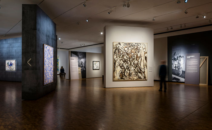
The Shape of Freedom will draw connecting lines between Europe in the aftermath of war, and America’s burgeoning, influential art scene over the same period. On both sides of the ocean, society was reacting to the horrors of the war, the Holocaust and the coming of the atom bomb. The exhibition shows how artists searched for new ways to deal with these shattering events and includes artworks by Sam Francis, Helen Frankenthaler, Lee Krasner, Joan Mitchell, Ernst Wilhelm Nay, Barnett Newman, Jackson Pollock, Georges Mathieu, Mark Rothko, Hedda Sterne and Clyfford Still. In a variety of different ways, these paintings display a unique sense of the moment, which the exhibition aims to encourage the public to experience in the modern day.
Stories will range from tales of community and freedom to artists making long journeys and launching big careers, with a focus also on the female artists too often overshadowed by their male colleagues. Curatorially, the exhibition looks to broaden the understanding of breakthrough in art this period, with the artists on show not just the great, established names of the era, but also a number of under-celebrated artists. By integrating historically-smaller works in prominent locations, the exhibition seeks to shift and widen accepted learning on the key players in these movements.
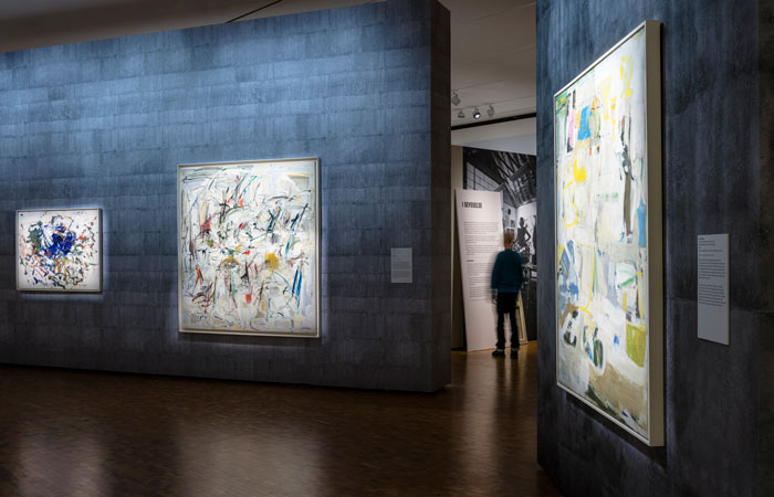
Thematically, following on from the introduction, the six key themes of the exhibition are: In Search of the New / Action Painting / Lost in Colour / Painting the Unspeakable / Abstraction after Year Zero / Freedom as Spectacle. Nissen Richards Studio’s design approach was to create a loosely linear journey through the space. Throughout the visitor journey, interrelations and linking views are created between themes, with the forms that enable this a series of monolithic, temporary walls, as well as a number of ‘disruptor’ angled walls, showcasing key works in the exhibition and altering the exhibition’s flow, whilst encouraging visitors to stop and think.
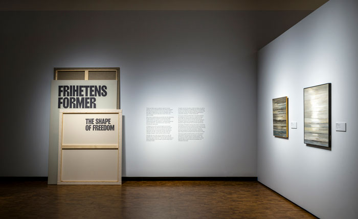
‘The works on show are so bold and visually arresting’ Nissen Richards Studio Director Pippa Nissen commented, ‘that only a fairly neutral backdrop would serve them well, but of course we wanted to avoid that being in any way bland or uninteresting. We very much also wanted to capture a sense of the artistic process and the unfinished and the raw in the physical materiality of the exhibition. Textural interest was therefore added through a series of bespoke graphic wallpapers, based on photography of concrete, which ensure a deliberately unpolished feel, whilst interpretation takes the form of totem-like panels on double backgrounds inspired by artists’ canvases.’
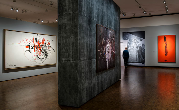
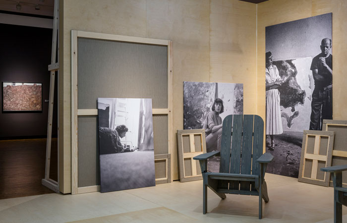
The colours used to present and background the artworks are made up of a spectrum of six core colours, ranging from grey to brown, plus six additional shifting tones. A further six ‘concrete’ wallpapers then added to the palette of possibility for contextualising the artworks. A number of pieces of bespoke furniture in the space were inspired by real life artist studio furniture, particularly those from Mark Rothko’s studio. These include two ‘Chapel Benches’ located in the main space and two ‘Studio Chairs’ in the ‘Happening Space’.
‘For the graphics and interpretation’ Kate Coghlan, Associate Architect at Nissen Richards Studio added, ‘each theme is communicated via a cluster of panels, which use punchy typography and serve to provide dual-language (Norwegian and English) information on each individual section’s rationale, including artist biographies, portrait photography, contextual imagery and section info. The clusters of graphic panels portray both the front and the back of canvases to suggest both the world of the studio behind closed doors and the artist then facing the world with his or her final artworks.’
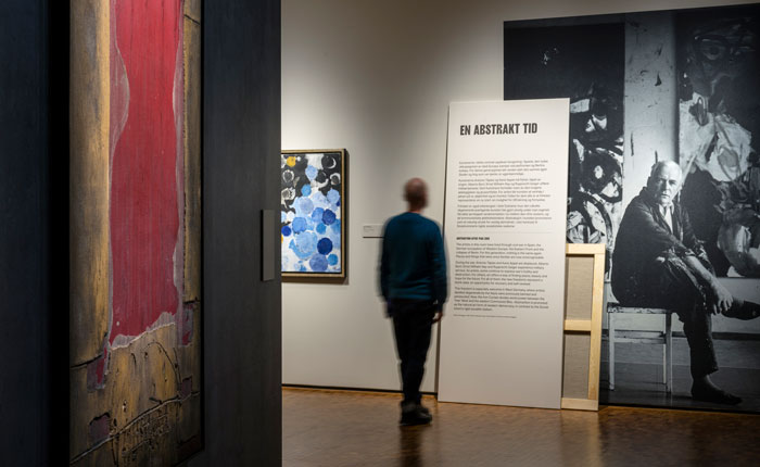
The centre of the space also features a semi-contained ‘Happening’ space, with the back of the wall revealed first to the visitor and a more finished feel inside, again drawing on the studio/outside world dichotomy. Reflecting the great ‘happenings’ of the late 60s, this is a creative space for new things to happen in, from music to talks to films, with an emphasis on spontaneity and testing things out.
Photography: Gareth Gardner
Exhibition and Graphic Design: Nissen Richards Studio
Lighting Design: Light Bureau


