Wanderfinding with f.r.a. at Borough Yards
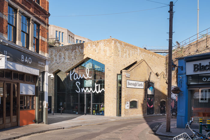
Borough Yards is a 160,000 sq. ft mixed-use development on the western edge of Borough Market in London’s Southwark. A new space blending cathedral like railway arches, public squares, and secluded shopping ‘streets’. f.r.a. were appointed to design the wayfinding and placemaking for Borough Yards.
Design Insider filmed Wesley Meyer, Director at f.r.a. speaking about his ‘wanderfinding’ designs for this project as part of the Design Insider Instagram Event on the 6th & 7th July 2022.
Through a collaborative process with the client’s team, including architects SPPARC, f.r.a. are blurring the lines between wayfinding, storytelling and art. It’s a process the f.r.a. team came to call ‘wanderfinding’ throughout the project.
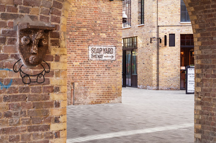
Wall murals and ghost signs are used throughout the site. These placemaking interventions aid the wayfinding and help to blend the new and historic components of the site.
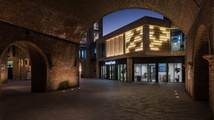
Each of the five entrances are uniquely designed to melt the boundaries of the site into the surrounding neighbourhood. f.r.a. designed a bold work of neon art at the principle entry. This ‘clock’ recounts the diverse characters who historically called Southwark home; from Judges and Lord to Revellers and Pickpockets. Many of whom are still here.
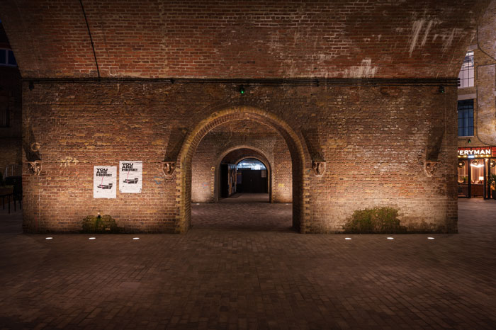
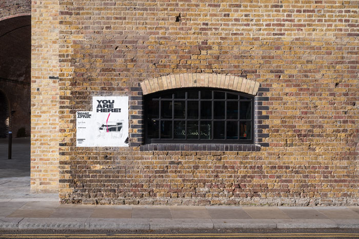
Wayfinding signage for tenants at Borough Yards are simple paper fly posters applied directly to the brickwork on site. This design is wonderfully tactical, accentuating the site’s signature material. f.r.a.’s design not only fits the brand but allows for rapid and economical updates to the signs addressing a very real design challenge for post-pandemic wayfinding.
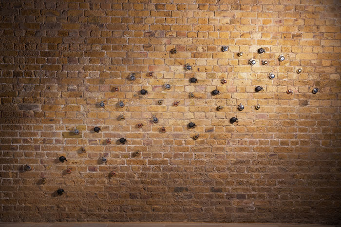
The wayfinding at Borough Yards is about more than finding what you’re looking for. This idea, f.r.a. call wanderfinding, is about encouraging people to discover and explore the site in a non-linear manner. It’s about more than navigation. It’s about experience, engagement and joy. To do this, the site features a number of smaller ‘hidden’ designs that can be discovered overtime.
‘We’ll not give these away but they feature everything from a human tooth to a pretty obscure Simpsons reference. We also reused many of the sites existing features, such as industrial brackets that resembled a face. These ‘gargoyles’ have become a whimsical entry feature to the site.’
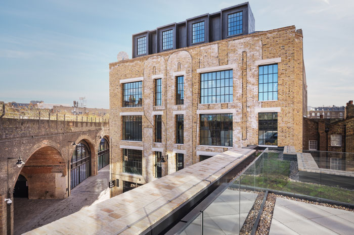
f.r.a. provided a full range of services on the project including project management and quality assurance. f.r.a. found new ways to collaborate with multiple fabriactors and trades to bring these grand ideas to life. The neon feature sign actually has 180+ power leads carefully coordinated into the brick façade. To keep that design holistic f.r.a. were also commissioned to design the tenant signage guidelines and hoardings across multiple phases of the project.
Client: MARK
Location: Southwark, UK
Design Team: SPPARC
Size: 116,000 sq ft
Services: Strategy, Design, Placemaking, Project management
Awards: MIPIM 2022 for Best Urban Project
Simon Callaghan Photography for f.r.a.


Comments