What is a ‘cool office’ and should we even want one?
 The term ‘cool office’ has been floating around for quite a while now, but what is one? and do we really want one? We asked Nigel Tresise Director and Co-Founder of Align for his thoughts on this topic…
The notion of ‘cool’ is as subjective as the notion of beauty. Unfortunately, what’s often meant by a ‘cool office’ is a bells-and-whistles riot of garishness and gimmickry. It’s not hard to find clients and designers willing to create such schemes, but, after the ego is soothed and the Instagram splash made, they mostly turn out to be a complete car crash. Nothing dates faster after all than a fad – and today’s passing trend is all too soon tomorrow’s laughable misjudgement.
Conversely of course, who on earth would want an ‘uncool office’? What a waste of opportunity and a failure of creativity to roll out a dull, by-numbers scheme of the ‘reassuringly classic’ variety and fail in the process to demonstrate ambition or get anyone’s heart racing!
If you’re going to use it at all, the word ‘cool’ needs defining very carefully, very early on in a brief, by the client and design team. That way, everyone might find themselves on a path to creating something exciting and unique, which also possesses that indefinable smile factor.
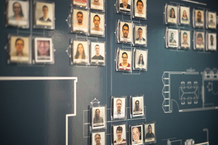
Staff blueprint wall graphic at Mendeley, with magnets showing who staff are and where they can be found
Ever since the game-changing Google offices and the youth-plus-money explosion of the early dotcom days, one of the most enduring aspects of what’s considered ‘cool’ in workplace design is the incorporation of a sense of play. There’s barely an office in the creative sector today as a result without Playstation, table football or ping-pong. There’s nothing wrong with that, where appropriate; after all, the era was the welcome beginning of acknowledgement that some degree of playfulness has a serious breakout role in the world of work – but ‘appropriate’ is definitely the key word here. As office design guru Jeremy Myerson said in Dezeen last year,
‘One of the things the Google effect has had is the idea that work is somehow a playground and you can infantilise your staff.’
The increased understanding of holistic health and wellbeing, as defined by ‘The Well Building Programme’, has also seen the introduction over recent years of everything from healthy food provision and filtered water to bicycle access and visiting massage and yoga experts. Good ergonomics have long been a laudable aspiration too, with sit/stand desks more recently giving workers welcome choices of posture. Looking after your staff properly is certainly ‘cool’, as is another entirely positive development: the expanding boundaries of personal expression, via hot-desking choices and mobile storage systems to personal storage lockers and individual furniture colourway choices.
Genuinely ‘cool’ aspects of workplace design are those that embrace different personalities, different work states and the need for different zones; design, in other words, that liberates staff from the old-fashioned world of regimented worker-bees.
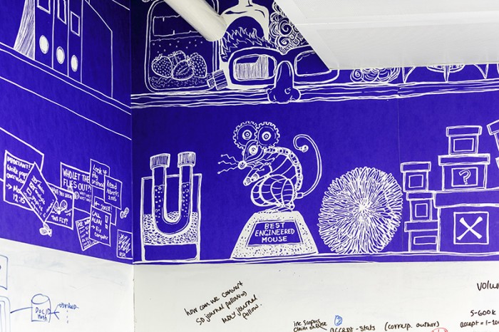
Feature wallpaper – Mendeley meeting room, by artist Claudia Stocker on a lab-rat theme
When it comes to attention-grabbing design features, the success of these largely depends on the client’s work sector. Often in professional services, for example, clients have an aversion to anything that looks too bling or ostentatious, wary of generating comments of the ‘so that’s where our fees went!’ variety. There’s a difference between creating spaces that are ‘cool for staff’ and ‘cool for visitors’ too. If you want to make a real statement, then the best time to do it is as clients arrive, such as the helix stair we designed for BrandOpus or the huge super graphic illustrations in our Mendeley offices project.
For clients in formal sectors who value understatement and discretion, we often fly the flag for proper break-out spaces and meeting rooms with varying degrees of formality and informality – after all, around half of all meetings needing a separate space are internal, including sensitive subjects such as finance or HR.
“At the moment, for example, it’s all about Douglas Fir flooring, the colour teal and warm metals, from bronze and copper to natural brass…”
‘Cool’ can also mean small and light touches across all types of client sectors. There’s something very pleasing about features you don’t necessarily see immediately. Ideas might include showing who’s who and who’s where via a board of magnets, perhaps sitting on a blueprint of the office, as in the one we created for Mendeley in TechCity – or else theming meeting rooms imaginatively. For branding design client BrandOpus, for example, meeting rooms followed a home-from-home genus – Drawing Room, Conservatory, Lounge, Snug and so on – whilst for Cathay Pacific, rooms referenced significant areas relating to the company’s London and Hong Kong locations, such as ‘Westminster’, ‘Hammersmith’, ‘Kowloon’ and ‘Lantau’. Toilets are a great place to have a bit of design fun too. I’ll never forget the impact of seeing the VitraHaus toilets for the first time, by Herzog & De Meuron; black on the outside and red on the inside.
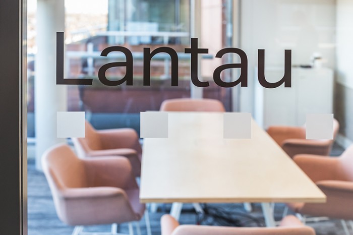
Lantau meeting room – Cathay Pacific offices
When it comes to ‘cool’ materials, designers should be at least aware of current materials trends, even if only to avoid choosing them! At the moment, for example, it’s all about Douglas Fir flooring, the colour teal and warm metals, from bronze and copper to natural brass…
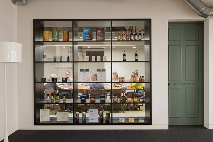
‘Drawing Room’ – part of the ‘home from home’ meeting room naming genus at BrandOpus
Ultimately, however, ‘cool’ elements need to be strategic to make an impact on visitors or based on genuine staff wellbeing and subtle and not grating – and above all appropriate to each particular client and their DNA, philosophy and mission. In our book, fad-driven gimmickry is very much not cool, whilst thoughtful and considered statements, the introduction of bespoke, playful and surprising elements, plus anything that promotes tolerance, inclusivity and wellbeing are not only cool but permanently in vogue.
Want to learn more about Align, then visit their website for some great insight into they work they do
