WHY FLOORING SELLS
For this month’s focus on flooring we take a closer look at the role flooring plays in a retail environment. We caught up with Lewis Taylor, Design Director of David Collins Studio who have an international reputation in luxury retail design and our BCFA members to understand how flooring sells.
As the largest surface within a retail space, the importance of getting the flooring right cannot be underestimated. With so many key considerations to account for, design and selection is vital: it has to tie in with the scheme, it is very visible, it has to perform within what may be a high-traffic environment, it has to work within the budget and it has to age well and over time.
We soon discovered that within a luxury retail space, like every other design element, the flooring needs to fit with the brand’s DNA and synergise with the rest of the store design. At its most effective, flooring design can become a brand signature which is instantly recognisable, like the OMA-designed Prada monochrome marble floor.
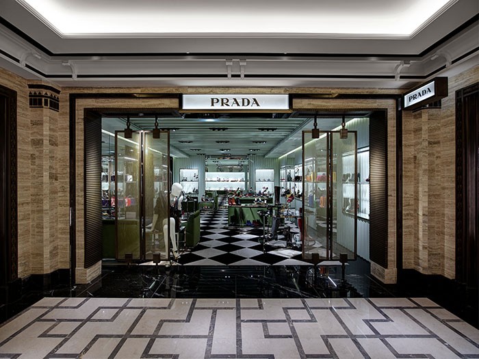
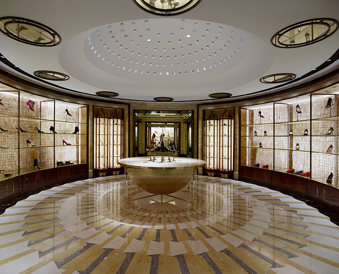
Flooring needs character and personality but also needs to sit within the design palette and be functional. We asked Lewis to take us through his design process, “there are so many considerations to think about when selecting floors: budget, strength, noise reduction, availability, lead time – just like every decision we have to make! We work on the global roll-outs for Alexander McQueen, Jimmy Choo and De Grisogono, and we of course have to consider the materials that we implement in our designs. When we design a flagship space it is obviously designed judiciously but with a premium budget. Concession stores or stores which are not flagships need to have the same interior language, feel and layering but may not have the same budget allowances – this means local or substitute materials need to be used in very resourceful ways. As a Studio we work closely with our suppliers and clients in value engineering, this protects the overall design whilst recognising the budget needs for each project.”
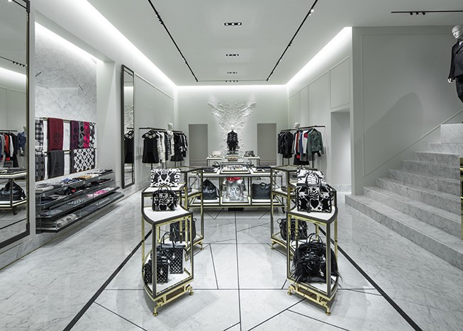
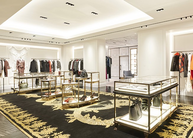
For their Alexander McQueen stores David Collins Studio worked with carpets in nude tones and reds to represent the womenswear and the menswear respectively. The pattern or language within the flooring was inspired by the work of Sarah Burton. The marble floor tiles were smashed and re-set to create a distressed pattern within the flooring in different black or white marbles depending on the store location and design. Lewis explains, “when we implemented the design in the Paris Flagship, we wanted to create something unique that represented the location – so we evolved the design and created a version of Parquet de Versailles that took the form of the smashed and re-set marble floor. Within the same store we used nude carpets and a custom Rug Company Alexander McQueen design Military Brocade rug that is very beautiful and refined and impressive in its size.
“store design is the most successful where the designer has created a whole retail world that totally represents the brand.”
Different materials bring a different feeling to the space. Lewis will often use stone to infer luxury and to create a bold statement, such as at Harrods Shoe Heaven and in their Alexander McQueen stores. Timber can bring a warmth and heritage to a space, in their Louis Leeman store on Madison Avenue they used 400-year-old Parquet de Versailles to bring an authenticity to the concept.
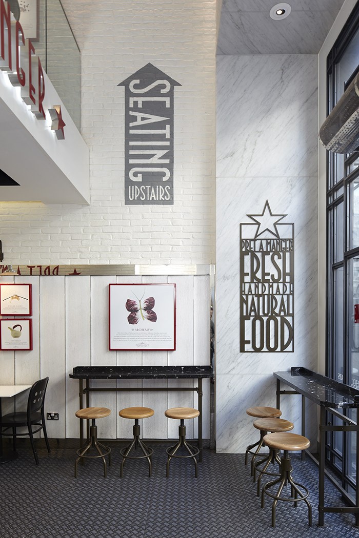
Responsible for the current Pret A Manger design globally, David Collins Studio worked with Amtico flooring to develop a design which is instantly recognisable as “Pret” but at same time needed to evolve the original metal flooring concept, to refine it and bring it up to date.
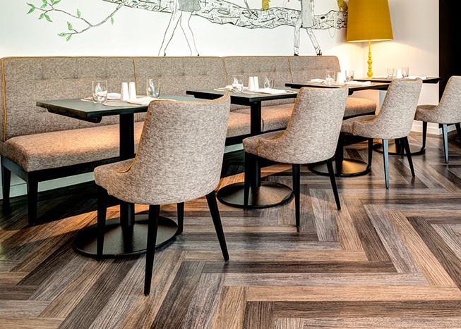
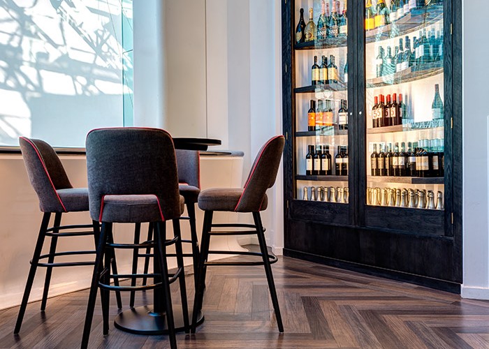
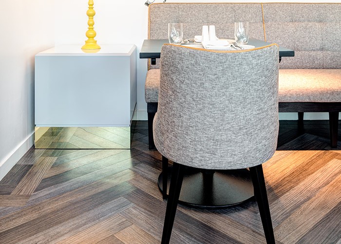
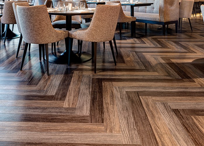
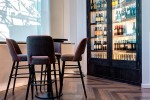
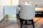
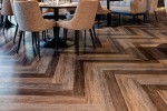
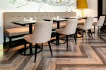
Amtico can also be found in the latest addition to Selfridges’ selection of eateries. Sears Balcony Champagne Bar resides on the fourth floor of the Birmingham store, with stunning views over the bustling shopping district it’s the the perfect spot to indulge in some luxury. Local design firm Harrison were tasked with updating an existing restaurant, working closely with Selfridges’ in-house team to create a haven in this busy department store. Amtico Signature Quill products in Sable, Kohl and Gesso have been used in a striking Herringbone pattern across the 220 sqm space.
READ FULL CASE STUDYLast year, F. Hinds jewellery reopened their flagship store at Manchester’s Trafford Centre after a comprehensive £300,000 re-fit. Having worked with Milliken on previous projects, the new store is contemporary and bright. Milliken’s Nordic Stories collection was selected as it provided a textured luxurious effect at a competitive price. The combination of purple carpet with crisp white ceramic tiling creates greater visibility and clearer sight lines into the store. The design resembles a broadloom carpet rather than a carpet tile, whilst providing all the advantages of a speedy installation and the simple replacement of worn or damaged areas. It also gives excellent underfoot comfort and superb acoustics that add to overall ambience of the customer experience in store. READ FULL CASE STUDY
Cumbria based Burlington Stone’s highly-skilled stone engineers craft a diverse range of luxurious signature natural British stone products. This made them the natural flooring choice for Booths, a chain of high-end supermarkets in Northern England. A combination of three British stones were used to striking effect. All quarried from the heart of the English Lake District and formed around 450 million years ago during the Ordovician period.
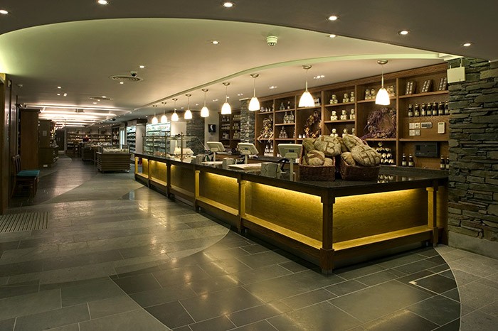
The technical characteristics of the stones ensure a long term sustainable solution by reducing maintenance costs. These durable, dense natural stones hold their aesthetic beauty as they are colour fast, stain resistant and non-combustible. And due to their low water absorption properties, these stones can be used in a wide variety of projects. READ FULL CASE STUDY
Whether its stone, carpet, wood or vinyl, flooring is the design base of all interiors. And good flooring design can make the ultimate brand statement, in look, in comfort and in longevity…which means, flooring sells.



Comments
This is an arltice that makes you think “never thought of that!”