Workplace hub for PRS for Music: Ekho Studio strikes right note!
Ekho Studio has completed the second stage of a new London HQ workplace project for PRS for Music, the home to the Performing Right Society (PRS), who ensure royalty payments for members whenever their music is performed, broadcast, streamed, downloaded, reproduced, played in public or used in film and TV. PRS for Music also supports its members by influencing policy and supporting and hosting awards and events and is committed to protecting the value of music.
Ekho Studio was appointed to design the workplace scheme at Hay’s Galleria at London Bridge in January 2022. A first, smaller phase of work had already been completed, with Ekho Studio Founding Partner Sarah Dodsworth also working on this with a previous agency, prior to the formation of Ekho Studio and where the focus was on collaborative spaces. This larger second phase, comprised of 150 desks over 18,600 sq ft, was designed bring the organisation’s full team together for the first time after a lease break allowed its main body of staff, previously in a separate Streatham location, to join the primary, central-London location.
Hybrid and Agile
‘A lot of user group research was undertaken at the outset of the project, to see if the new proposed unified footprint would permit a more agile way of working, as well as ascertaining levels of enthusiasm for hybrid working. We tested out ideas and took on feedback, ending with a very clear direction and a dedication to both agile and hybrid working, with many different work missions to be accounted for, so that team members can come in and accomplish what they need to do on any particular day with both clarity and ease.’ Ekho Studio Founding Partner Sarah Dodsworth
As well as workshopping agile / hybrid working, the design for the new scheme was underpinned by five design principles from client PRS for Music:
- Maximise value for its members
- Support new ways of working and the PRS values
- Promote wellbeing and safety
- Allow for future flexibility
- Be sustainable and environmentally conscious
Look and Feel
The design narrative had a clear and simple aesthetic rationale, which aimed for coherence with Phase One of the project, whilst also encompassing new opportunities to evolve the scheme’s branding elements, specifically in terms of how these contributed to the team’s experience of the new workplace. These needed to exemplify PRS for Music’s contemporaneity, for example, and its vital relation to today’s music industry, with visual reference to ‘the textures of music’ to be integrated in a nuanced and abstracted way, and with an increased use of colour, alongside the main scheme. The scheme’s tone of voice was to be ‘confident, open and warm.’
‘The new scheme has a minimalist and architectural feel overall, with clean and simple lines, areas of exposed London brick, bold graphics and some great pieces of joinery. Feature elements, lighting, planting and artwork provide colourful punctuation, whilst a subtle electric undercurrent of music permeates throughout and is mostly expressed through abstract allusions.’ Ekho Studio Interior Designer Ellie McCrum
Scope of Works
The overall building envelope had been subject to a Cat A refurbishment in the recent past, meaning that the inherited base build was in good condition. The design team sought to re-use existing materials and treatments wherever possible for cost and sustainability reasons, with any replacement items having to win a strong functional argument for inclusion. Acoustics had a high priority in the base build, for example, including an existing, acoustic-sprayed ceiling soffit with downstand beams and galvanised duct work. Hays Galleria itself features retail and hospitality offers at ground floor level, with the PRS for Music offices sitting directly above on Level One of the building, whilst wrapping round three sides of the Galleria Courtyard, with views down onto the bustling commercial activity below. All window treatments remained untouched therefore as inherited in excellent existing condition.
As well as a reception area with a video wall, open plan work areas and a large series of meeting rooms, this second project phase also needed to include a dedicated, soundproofed Filming Room; an Innovation Room for new content creation and a Collaboration Corner, as well as a larger multi-use breakout event space. There were also to be several phone booths and five 2-person meeting pods. As much furniture as possible was to be UK-sourced or UK-manufactured, both to showcase the best of British design and to reduce the carbon footprint during travel and delivery, as well as to ensure good lead times, which was particularly relevant at the tail end of the pandemic.
When it came to energy use on the scheme, Ekho Studio were thinking about the scheme’s BREEAM rating from the outset, with consideration of energy ratings informing the specifications of materials, products and upholstery, and with a high percentage of repurposing existing furniture from previous sites, with a dedicated external consultant advising at all stages of the project.
‘We wanted to make sure we were ahead of the curve even at concept stage on BREEAM certification’ Ellie McCrum commented, ‘so that this aspect of our approach was always front of mind.’
Design Walk-through
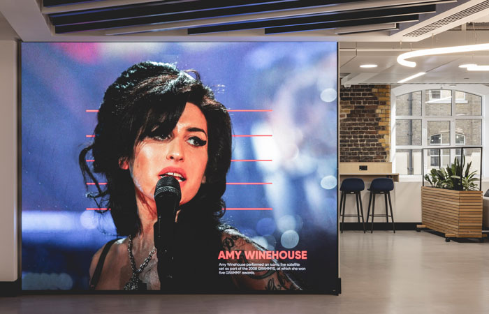
Arrival into the reception space is via three lifts with a 1-or-2-person host desk opposite and a grand piano (installed as part of Phase One) located to the left. A dramatic ceiling lighting feature in this space – The Alphabet of Light by Artemide – immediately catches the eye, taking the form of an open-ended, single, tubular abstract bending loop as an expression of musicality and rhythm. A lounge/waiting space also features here, with strong and sculptural planting integrated, with Ekho Studio working closely with PlantPlan on this element. The earlier Phase One collaborative spaces are located directly behind the lifts, with seating and work-settings from this phase extending seamlessly into the new reception.

The first and longest section of the new office space-plan then begins, featuring desk seating along both walls to benefit from natural light, and with two blocks of meeting rooms of varying types down the centre of the space, behind reception, along with WCs and a staircase circulation void at its centre. The scheme’s Collaboration Corner is then nestled into a purposely formed nook off the main circulation run, and features fabric-wrapped wall panels from Camira Fabrics for acoustic enhancement and reverb control, as well as back-painted glass whiteboards and a feature ceiling raft with acoustic properties. This includes integrated, drop-down, small red pendant lights (the Sprinkle pendant from ZERO Lighting), which serve as both a branding allusion (in red) and a nod to music studio microphones. Directly next to this is a Filming Room, with whiteboards, AV screens and a second iteration of the ceiling raft grid, this time playfully integrating acoustic foam panels using a 3D sculpted form, typically associated with music studios, along with striking black and red linear lighting. A third ideas space is at the end of this section, in the form of an Innovation or Brainstorm Room, once again featuring whiteboards, AV and the same ceiling grid treatment.
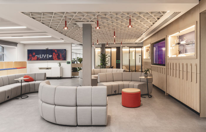
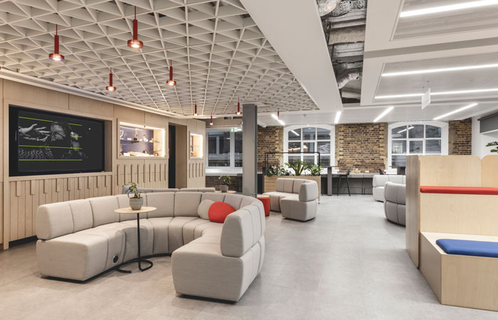
At the first corner, also the widest part of the floorplan, the Forum is located, a modular, multi-use breakout, event and collaboration space, where a mix of casual, drop-in furniture clusters are focused around large-scale AV facilities. These include bleacher seats, so that the space can be easily re-configured in different ways within an area that can hold up to 80 people for events or Town Hall meetings. Four modular sofas from Davison Highley offer further flexibility, with low backs so that people can always see what else is going on. The area also has power points for flexible working, should the area be required for overspill.
A large bespoke ceiling raft features the fourth iteration of the small red pendant lights, helping to delineate the presentation zone. An integrated AV screen allows for a mixture of scrolling news stories and PRS for Music creative content, sitting between two inset ‘artefact showcase’ areas, measuring 9m x 2.6m in total, showcasing some of the many unusual artefacts and gifts given to the organisation over the years, from a Japanese wooden samurai helmet to a tapestry displaying the PRS for Music coat of arms, a leather bound book containing messages from composers and industry figures, and an Ivor Novello Award. The bespoke joinery wall surrounding these elements is formed out of birch-faced plywood with an embedded relief detail which subtly alludes to the theme of musical rhythm and instrumental keys, whilst the area is bordered by timber planting trolleys on castors for easy reconfiguration, and the surrounding walls provide a canvas for artwork installations.
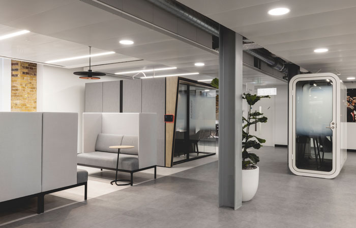
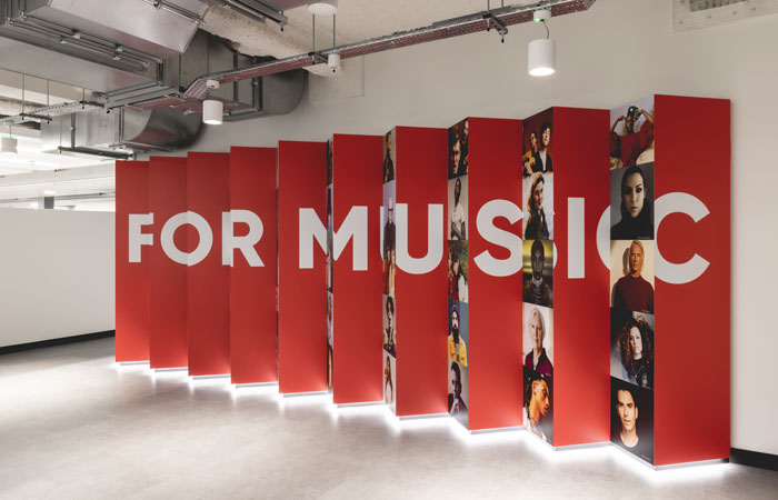
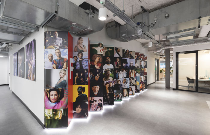
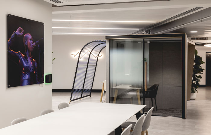
Further meeting and focus rooms are located in second section of the floorplate. This area also includes a quiet zone and an executive zone, and also features one of the scheme’s stand-out visual features – a lenticular wall, with a geometric ‘zig-zag’ form showcasing a visually-striking combination of the PRS for Music logo on a red background on one side and photos of PRS members applied via simple and effective digital wallpapers, creating a visual illusion when seen from opposite directions. The wall can also be glimpsed at many points of the approach through the first and longest section of the floorplate. In the scheme’s third and final section a partners’ zone is located, as well as more general open-plan desking and a potential group booking zone (one of three overall), as well as the final central core of meeting areas.
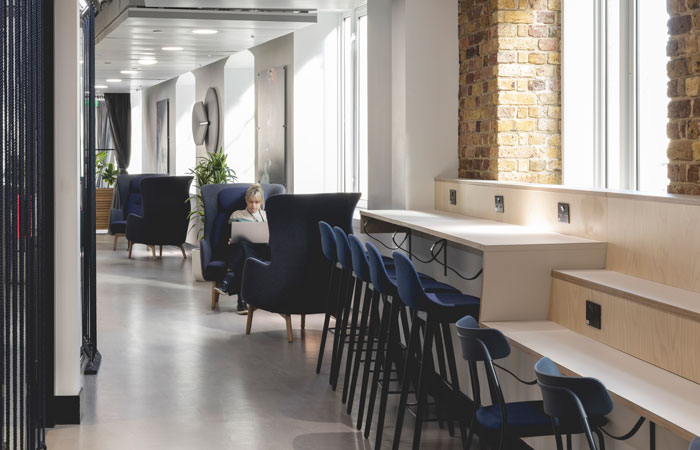
The neutral, tonal colours palette of the scheme include a two-tone grey ‘monolithic’ flooring design, using a luxury vinyl tile from Amtico, with paler grey for working areas and a darker shade for circulation. Whilst a different specification to the Phase One flooring, the tiles nonetheless offer the same look and feel for visual unity. The flooring extends to the new meeting rooms, bar one or two which feature a woven effect LVT from Interface for visual differentiation. Ribbed acoustic wall panelling in the meeting rooms is in recycled felt and is highly sustainable, making it a permittable exception to the UK-manufacturer directive, with the material sourced from Scandinavian company Devorm. The meeting room ceilings are made of ‘Woodwool’ by Troldtekt Acoustics, which is a wood and paper composite that adds texture as well as acoustic quality.
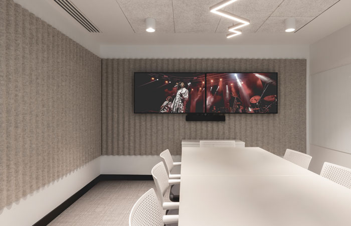
Ekho Studio worked closely with Delta Light on the lighting scheme throughout, especially on the architectural lighting, whilst decorative lighting is a fun element of the meeting room designs and includes lightning-bolt Alternative Bolt Pendant light from Hollis Morris and Slice pendant lights reminiscent of two stacked discs from ZERO Lighting. Further musical elements incorporated into the meeting rooms include an allusion to stringed instruments in the form of bespoke navy rope detailing outside the glazing, which is a simple but effective device used several times in the scheme and which also contributes to visual privacy between spaces.
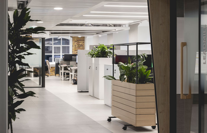
New walls are painted in a minimalist white, contrasting respectfully with the three exposed areas of London brick across the perimeter walls. All desks are new, at a reduced size from the previous office iteration as a better fit for the new floorplate, whilst task chairs by Knoll were imported from the previous office, as these were in great condition. Wheeled planters offer flexibility when it comes to demarcating different areas, with some zones more geared towards collaboration and other areas quieter.
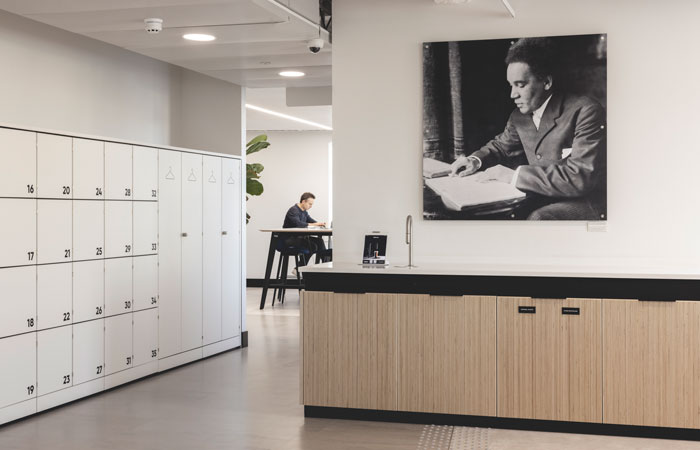
Bespoke joinery was designed by Ekho Studio for the scheme, whilst the internal creative team at PRS for Music created the imagery for the large-scale digital printed wallpaper in the scheme and the lenticular wall artwork. Individual phone booth pods dotted around the scheme are by Framery and the two five-person meeting pods are by Campers and Dens, sourced from Orangebox.
‘Overall, this scheme is a very good representation of the direction of travel of contemporary workspaces’, Sarah Dodsworth summarised. ‘PRS for Music now has an integrated HQ for all its staff in a high-profile London location, with a big enough footprint to ensure all its needs are met and all staff functions can take place with ease – and style! At the same time, the project is nimble, agile and clever and looks to the future in terms of sustainability, technology and ways of working.’
‘Having delivered a successful phase one fit out of the PRS office space, we carried out a robust tendering process for the second phase and appointed small, agile, boutique operation Ekho Studio.
We always found Ekho Studio engaging, acknowledging and supporting our five design principles and brought us back to them on a regular basis whenever our ideas were out of kilter. Sarah, Rachel and the team got the best out of the selected fit-out contractor through regular communications and practical advice. Most of all, they listened to our CEO and executive management team, delivering a design that fully met all expectations. A huge thank you to Ekho Studio for your support in achieving a fantastic workplace.’ Sean Folkes, Head of Facilities & Services, PRS for Music
Photography by Billy Bolton
